Thursday, Aug. 24, 2006
I was just joking when I said that we should start class at 7:45 next
Tuesday, at 7:30 next Thursday, and at 7:15 am the Tuesday after
that. Class will start at 8 am next week just like it did this
week.

No, not very much. Not much physics, math, biology, or
geology
either. But, stay open minded, you might find that these subjects
are more interesting
than you might have thought and not necessarily that difficult either.
Here's another student question that was asked last Tuesday.
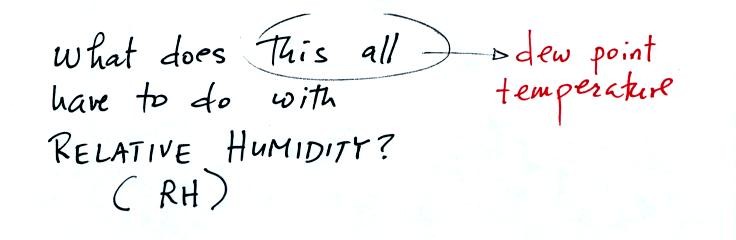
Does the dew point temperature have anything to do with
relative
humidity? They are related in the sense that they both tell you
something about moisture in the air.
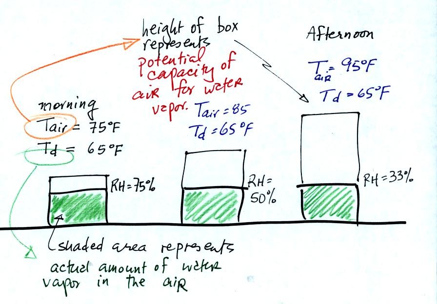
In the figure above the air temperature changes from 75 F in
the
morning to 95 F in the afternoon. The air's temperature (as we
will see when we get to Chapter 4 later in the semester) determines how
much water vapor the air can potentially contain.
The dew point temperature remains constant in the figure above.
The dew point is a measure of how much water vapor is actually in the
air, so in this example the actual amount of water vapor in the air
doesn't change during the course of the day.
The relative humidity tells you how close the air is to being "filled
to capacity" with water vapor.
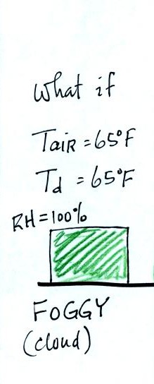
If the early morning temperature had been 65 F, the same as
the dew
point, the relative humidity would have been 100%. It would have
been foggy.
The relative humidity really tells you whether a cloud or fog or dew is
about to form. The RH also gives you an idea of how well your
evaporative cooler will work (it cools more effectively when the RH is
low). It is also hard for your body to cool by perspiring when
the RH is high (see heat index on p. 86 in the textbook).
Still
another question from a student that came to my office
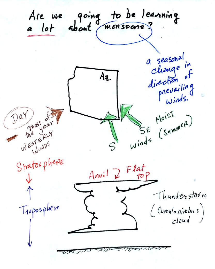
Many people think that the term monsoon just means
thunderstorm.
We will learn a fair amount about thunderstorms in this class.
The term monsoon really means a seasonal change in the direction of the
prevailing winds (we'll learn a little bit about what causes that
too). For most of the year winds in the Arizona come
from the west and are dry. For two or three months in the summer
the winds pick up an easterly component and are moister. When
there is sufficient moisture thunderstorms can form. In an
average year Tucson gets about half of its yearly precipitation during
the summer monsoon season. The website maintained by the
Tucson office of the National
Weather Service has a lot of additional information about the summer monsoon.
There is a
tropical storm (Debby) off the east coast of the US and a strong
hurricane (Ileana) off the west coast. You can learn more about
these tropical systems and see their predicted paths at the National
Hurricane Center webpage.
This was a good time to introduce the Saffir-Simpson scale used to
rate hurricane strength or severity.
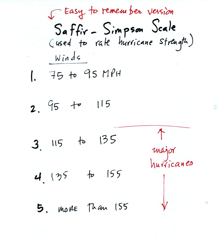
With sustained winds of 100 MPH, hurricane Ileana is
currently a
category 2 hurricane (winds were up to 120 MPH
yesterday). The hurricane center
expects continued weakening. Moisture from tropical storms and
hurricanes is
sometimes pulled into southern Arizona. This can lead to an
increase in thunderstorm activity and heavy rainfall.
At this
point, 20 or 25 minutes into the class period, we covered some new
material found on p. 1 in the photocopied Class Notes.
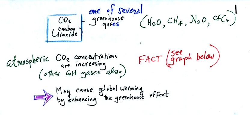
Carbon dioxide is one of several greenhouse gases (H2O,
CH4,
N2O, CFCs
are some of the others)
The natural greenhouse effect is beneficial. The
average global annual surface temperature on earth without
greenhouse
gases
would be about 0o F. The presence of greenhouse gases
raises this average to about 60o F.
Increasing the concentrations of greenhouse gases in the
atmosphere could enhance the greenhouse effect and cause global
warming. This could have many detrimental effects such as melting
polar ice and causing a rise in sea level and
flooding of coastal areas, changes in weather patterns and changes in
the frequency and severity of storms.
The evidence for increasing CO2 concentration is shown in
the two
graphs below
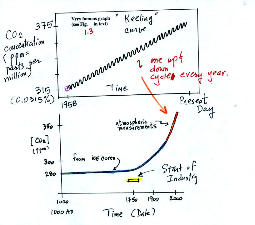
The top "Keeling" curve shows measurements of CO2
that
were begun
in 1958 on top of the Mauna Loa volcano in Hawaii. Carbon dioxide
concentrations increased from 315 ppm to about 375 ppm during this
period. The small wiggles show that CO2
concentration
changes slightly during the year.
Once scientists saw this data they began to wonder about how CO2
concentration might have been changing prior to 1958. But how
could you now, in 2006, go back and measure the amount of CO2
in the
atmosphere in 1906? Scientists have found a very clever way of
doing just that. It involves coring down into ice sheets that
have
been building up in Antarctica and Greenland for hundreds of thousands
of years.

As layers of snow are piled on top of each other year after year, the
snow at the bottom is compressed and eventually turns into a layer of
solid
ice. The ice contains small bubbles of air trapped in the snow at
the time it originally fell. Scientists are able to date and then
take the air out of these bubbles and measure the carbon dioxide
concentration. A book, The
Two-Mile TIme Machine, by Richard B.
Alley discusses ice cores and climate change. This is one of the
books available for checkout should you decide to write a book report
instead of an experiment report.
Using the ice core measurements scientists have determined that
atmospheric CO2 concentration was fairly constant at 280 ppm
between
1000 AD and the mid-1700s when it started to increase. The start
of rising CO2 coincides with the "Industrial
Revolution."
Combustion of fossil fuels needed to power factories began to add CO2
to the
atmosphere.

The figure above lists processes that add CO2 to
and
remove CO2
from the atmosphere.
We can use this information to better understand the yearly variation
in atmospheric CO2 concentration seen on the Keeling curve.
Atmospheric CO2 peaks in the late winter to early
spring. Many
plants die or become dormant in the winter. With less
photosynthesis, more CO2 is added to the atmosphere than can
be
removed. The concentration builds throughout the winter until the
rate of photosynthesis increases and brings things back into balance in
the spring.
Similarly in the summer the removal of CO2 by photosynthesis
exceeds
release. CO2 concentration decreases throughout the
summer and
reaches a minimum in late summer to early fall.
Some of
the release and removal processes listed above are more important than
the others. We can get an idea of what the dominant processes are
by looking at the next figure which shows the "Carbon Cycle."
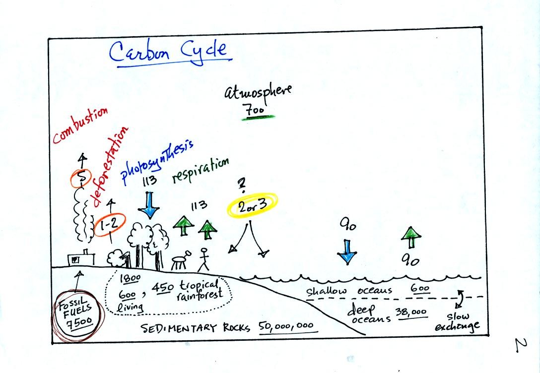
This somewhat confusing figure requires some careful analysis.
1. Underlined numbers show
the amount of carbon stored in "reservoirs." For example 700
units* of carbon
are stored in the atmosphere (mostly in the form of CO2, but also CH4,
CFCs
and other gases; note that carbon is found in each of those
molecules). The other numbers show
"fluxes," the amount of carbon moving into or out of a reservoir per
year. Respiration and decay add 113 units* of carbon to the
atmosphere every year. Photosynthesis (primarily) removes 113
units every year.
2. Note the natural processes
are in balance (over land: 113 units added and 113 units removed, over
the oceans: 90 units added balanced by 90 units of carbon removed from
the atmosphere every year). and won't change the
atmospheric concentration.
3. Anthropogenic (man caused) emissions
of
carbon into the air are small compared to natural processes. About
5 units are added during combustion of fossil fuels and 1-2
units are added every year because of deforestation (when trees are cut
down they decay and add CO2 to the air, also because they are dead they
aren't able to remove CO2 from the air by photosynthesis)
The rates at which carbon is added to the atmosphere by man is not
balanced by an equal rate of removal (2 or 3 units are removed every
year, highlighted in yellow in the figure. The ? refers to the
fact that scientists still don't know precisely how or where this
removal occurs). This will slowly cause the
atmospheric CO2 concentration to increase.
4. In the next 100 years or so,
the 7500 units of carbon stored in the fossil fuels reservoir (lower
left
hand corner of the figure) will be added to the air. The big
question is how will the atmospheric
concentration change and what effects will that have?
*units: Gtons (reservoirs) or Gtons/year (fluxes)
Gtons = 1012 metric tons. (1 metric ton is 1000 kilograms or
about 2200
pounds)
So here's what we have learned so far:
CO2 concentration was fairly constant between 1000 AD and the mid
1700s. CO2 concentration has been increasing since the mid
1700s.
The concern is that this might cause global warming. So what has
the temperature of the earth been doing during this period?
The next two figures (found on p. 3 in the photocopied notes) address
this question.

This first figure shows how the average global annual surface
temperature has changed over the past 130 or 140 years. This is
based on actual measurements of temperature made at many locations on
land and sea around the globe.
Temperature appears to have increased 0.7o to 0.8o C during this
period. The increase hasn't been steady as you might expect given
the steady rise in CO2 concentration; temperature remained constant or
even decreased slightly between 1940 and 1975 or so.
It is very difficult to detect a temperature change this small over
this period of time. The instruments used to measure temperature
have changed. The locations at which temperature measurements
have been made have also changed (imagine what Tucson was like 130
years ago). Average surface temperatures naturally change a lot
from year to year. The year to year variation has been left out
of the figure above so that the overall change could be seen more
clearly (click here to see a different
version of this figure that does show the year to year variation and
the uncertainties in the yearly measurements).
Now it would be interesting to know how temperature was changing prior
to the mid-1800s. There aren't enough reliable measurements to be
able to do that directly. Scientists must use proxy data.
When you can measure something
like temperature directly you might be able to look for something else
or measure something else whose presence or concentration depended on
the temperature at some time in the past.
Here's an example.
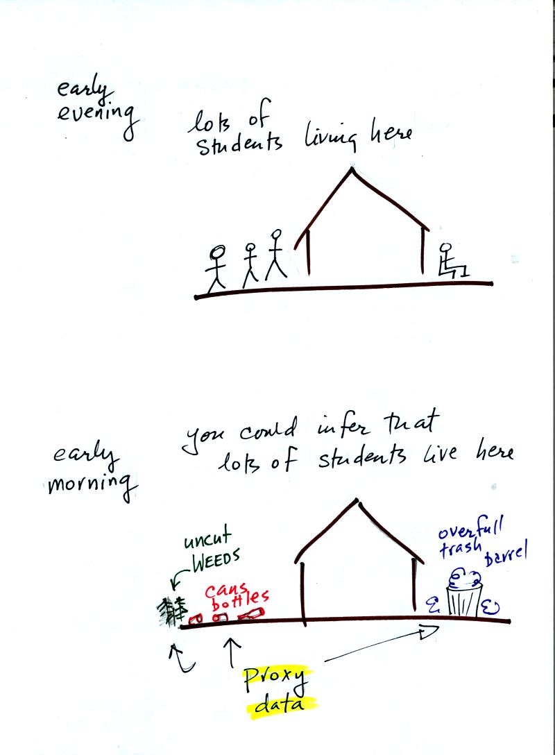
Let's say you want to determine how many students are living in
a house near the university. You could walk by the house late in
the afternoon and count the students if they were outside. That
would be a direct measurement.
If you were to walk by early in the morning it is likely that the
students would be inside sleeping. In this case though you might
look for other clues that might give you an idea of how many students
lived in that house. You would use these proxy data to come up
with an estimate of the number of students inside the house.
In the case of temperature scientists look at tree rings. The
width of each yearly ring depends on the depends on the temperature and
precipitation at that time that ring formed. They analyze
coral. Coral is made up of calcium carbonate, a molecule that
contains oxygen. The relative amounts of the different oxygen
isotopes depends
on the temperature that existed at the time the coral grew.
Scientists can analyze lake bed and ocean sediments. The types
of plant and animal fossils that they find depends on
the water temperature at the time. They can even use the ice
cores. The ice, H2O, contains oxygen and the relative amounts of
various oxygen isotopes depends on the temperature at the time the ice
fell from the sky as snow.
Using these proxy data scientists have been able to estimate average
surface temperatures for 100,000s of years into the past. The
next figure shows what temperature has been doing since 1000 AD.
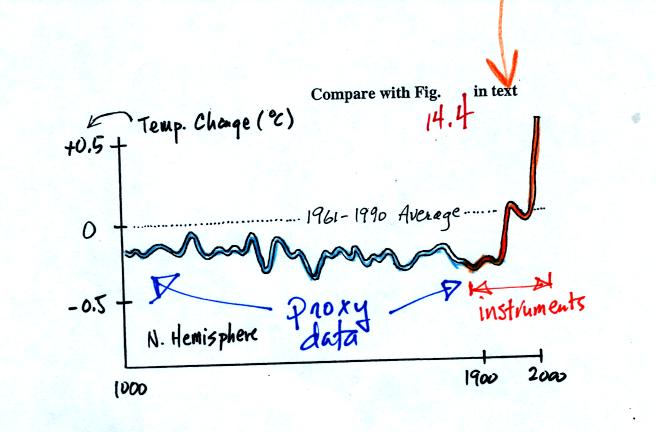
The blue portion of the figure shows the estimates of temperature
derived from proxy data. The orange portion are the instrumental
measurements made between about 1860 and the present day (the word
instruments was added after class). There is also a lot of year
to year variation and uncertainty that is not shown on the figure above
(click here or see Figure 14.4 in the
text for a more accurate representation of this curve).
It appears that there has been a significant amount of warming that has
occurred in just the last 150 years or so. Many scientists
believe that this warming is a result of the increase in atmospheric
greenhouse gas concentrations. Others suggest that this change in
temperature might be just a natural change in climate and is not due to
anthropogenic release of greenhouse gases. We'll briefly look at
changes in climate that have occured in the near and distant past in
class next Tuesday.