Friday Nov. 2, 2007
Quiz #3 and the 1S1P Topic #4 reports were returned in class today.
The final 1S1P assignment of the semester
is now online. Note that there are two due dates. If
you plan to turn in two reports (the maximum allowed), at least one of
the reports must be turned in on the Wed., Nov. 14 due date. The
second due date, Mon., Nov. 19 is the Monday before Thanksgiving.
We'll
cover a variety of topics in the final month of the semester.
We'll start in Chapter 6 by learning more about the forces that cause
winds.

The Coriolis Force is one of these. You
shouldn't leave NATS 101 Intro. to Weather and Climate
without
having been introduced to the Coriolis Force. It is part of the
reason why winds spin counterclockwise (CCW) around Low
pressure
and clockwise (CW) around High pressure in the northern
hemisphere. It also explains why winds spin in the opposite
directions around Highs and Lows in the southern hemisphere.
You may already have been
to the southern hemisphere or you may go there one day. You'll
probably hear about how the Coriolis force or the Coriolis effect
causes water to spin in a different direction in the southern
hemisphere when it is draining out of a sink and toilet bowl (it's not
true).
That's another reason for covering the Coriolis effect in NATS
101.
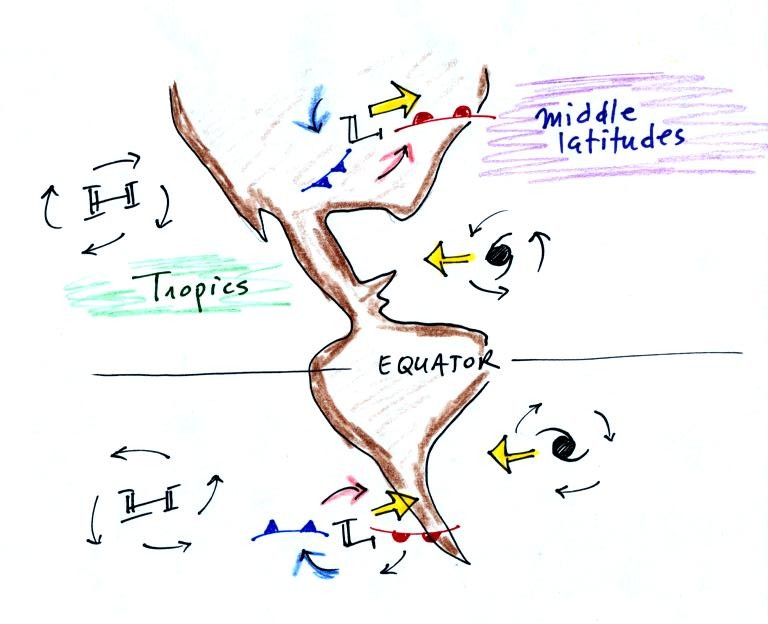
In Chapter 7 we'll learn why middle latitude storms move in the same
direction, from west to east, in both the northern and southern
hemispheres. Hurricanes move from east to west in both
hemispheres, this is also explained in Chapter 7.
Today we
will look again at upper-level charts, something we covered earlier in
the semester.

By the end of today's class you should understand what the title "850
mb Chart" on the upper level map above refers to. You should also
understand what the numbers on the contour lines represent and what
their units are. Note that the values on the contours decrease as
you move from the equator toward higher latitude. You
should understand why that happens (temperature also decreases as you
move toward higher latitude, maybe that is the explanation). You
should understand why troughs and ridges are associated with cold and
warm air, respectively.
The upper level winds blow parallel to the contour lines from west to
east in both hemispheres. The winds sometimes turn right,
sometimes left. Once we learn more about the forces that govern
wind motions, you'll understand what causes this.

You really only need to remember two things from earlier in the
semester (you'll find the figure above at the bottom of p. 115 in the
photocopied Classnotes): (1) pressure decreases with increasing
altitude, and
(2) pressure decreases rapidly in cold high-density air [it decreases
more slowly with increasing altitude in warm, low-density air].
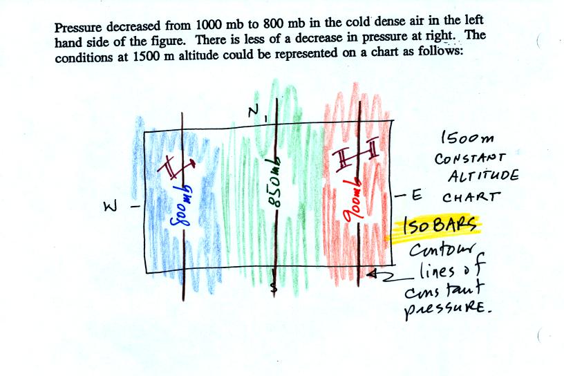
This is shown at the bottom of the figure above. Pressure drops
from 1000 mb to 800 mb when moving upward 1500 meters in the cold
air. It decreases from 1000 mb to 900 mb in the same distance in
the warm low density air.

One way of depicting upper level conditions would be
to measure
pressure values at some fixed altitude above the ground. This
approach is shown above. Pressures range from 800 mb to 900 mb at
1500 meters altitude. The
pressure pattern could then be plotted on a constant altitude chart
using isobars (figure below). Note the lowest pressures are found
in the
cold air, higher pressures would be found in the warm air.

That would
seem to be a logical way of mapping upper level atmospheric
conditions. Unfortunately that isn't how things are done.
Just to make life difficult for NATS 101 students
meterologists do
things differently. Rather than plotting conditions
at a constant altitude
above the
ground, meterologists measure and plot conditions at a particular
reference pressure level above the ground.

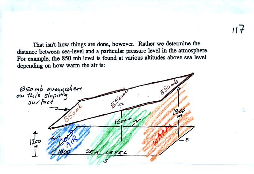
In the picture above you start at the ground (where the pressure is
1000 mb) and travel upward until you find the pressure has dropped to
850 mb. You
make a note of the altitude at which that occurs. In the cold
dense air at the left pressure decreases rapidly so you wouldn't need
to go very
high, only 1200 meters. In the warm air at right pressure
decreases more
slowly, you would have to going higher, to 1800 m.
Every point on the
sloping surface above has the same pressure, 850 mb. The altitude
above the ground is what is changing. You could draw a
topographic map of the sloping constant pressure surface by
drawing contour lines of altitude or height.

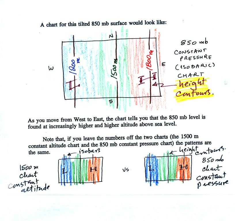
The two inds of charts (constant altitude or constant pressure) are
redrawn at the bottom of the picture above. The numbers on the
contour lines have been left off in order to clearly see that both
types of maps have
the same overall pattern (they should because they're both depicting
the same
upper level atmospheric conditions).
In the example above temperature changed smoothly from cold to warm as
you move from left to right (west to east).
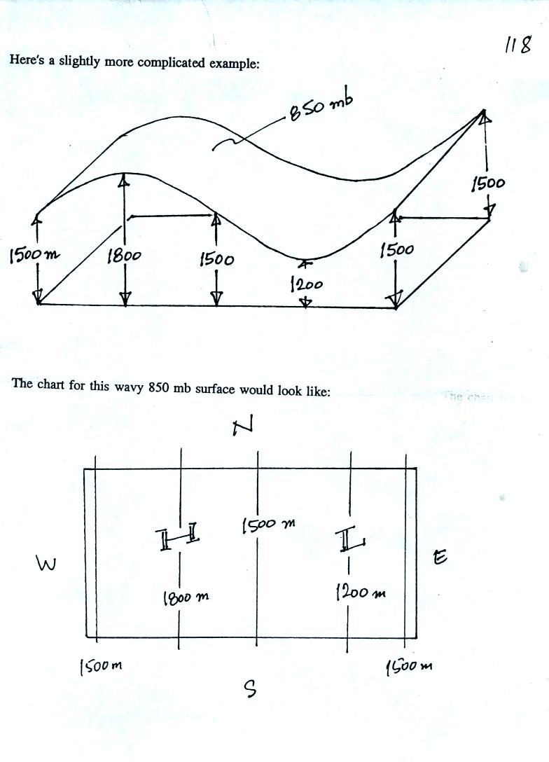
See if you can figure out what temperature pattern is producing the
wavy 850 mb constant pressure surface below.

It shouldn't be too hard if you remember that the 850 mb level will be
found at relatively high altitude in the warm air where pressure
decreases slowly with increasing altitude. The 850 mb level will
be found closer to the ground in cold air where pressure decreases
rapidly with increasing altitude. Click here when you think you
have
it figured out.
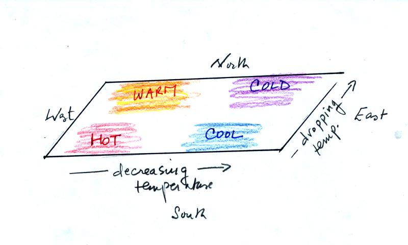
In the next figure we are going to add south to north temperature
changes in addition to the west to east temperature gradient.
Here's what the temperature pattern will look like.

Temperature drops as you move from west to east (as it did in the
previous pictures) and now it drops as you move from south to
north. What will the wavy 850 mb constant pressure surface look
like now? Click here
when you think you know (or if you just want to see the answer and
would rather not think about it).
Now let's go back to the figure at the top of p. 115 in the photocopied
Classnotes.

1. The title tells you this is a map depicting the 850 mb constant
pressure level in the atmosphere.
2. The numbers on the contour lines (height contours) are
altitudes (the units are meters)
3. The numbers get smaller as you head north because the air up
north is colder. The 850 mb level is closer to the ground.
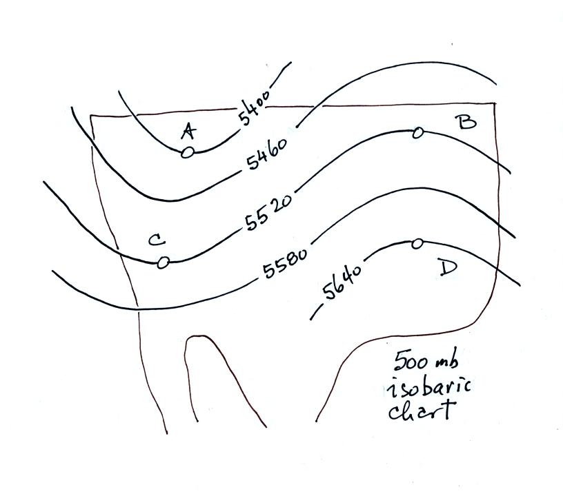
Here's
another figure with some questions to test your understanding of this
material.

This is a 500 mb constant
pressure chart not an 850 mb chart like in the previous examples.
Is the pressure at Point C greater than, less
than, or equal to the pressure at Point D (you can assume that Points C
and D are at the same latitude)? How do the pressures at Points A
and C compare?
Which of the four points is found at the lowest altitude above the
ground, or are all four points found at the same altitude?
The coldest air would probably be found below which of the four
points? Where would the warmest air be found?
What direction would the winds be blowing at Point C?
Click here
for all the
answers.
