Tuesday Sept. 23, 2008
Here's the material that we covered at the end of class. The first part
on upper level charts shouldn't have been too bad. But I suspect
the 2nd part was confusing. Sorry about dumping material like
that on you at the end of class. Fortunately it wasn't on the
quiz.
Upper level
maps show
conditions at various altitudes above the ground. Conditions up
there are important because they can strongly influence conditions at
the ground.
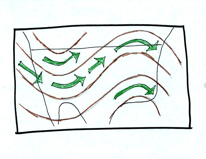
We started with three basic things to know about upper level
charts. First the overall appearance is somewhat different from a
surface weather map. On a surface map you generally find circular
(more or less) centers of high and low pressure. You can also
find closed high and low pressure centers at upper levels, but more
generally you find a wavy pattern like sketched below (the figures
below are from a previous class and were used because they are a little
clearer than the figures shown in class).
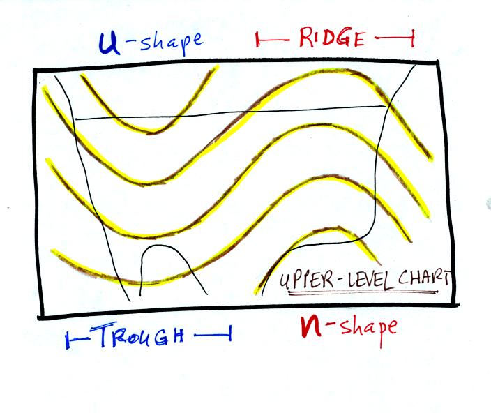
Troughs are produced by large volumes of cool or cold air (the
cold air
is found between the ground and the upper level that the map
depicts). The
western half of the country in the map above would probably be
experiencing colder than average temperatures. Large volumes of
warm or hot air produce ridges.
The winds on upper level charts blow parallel to the contour
lines. On a surface map the winds cross the isobars slightly,
spiralling into centers of low pressure and outward away from centers
of high pressure. The winds generally blow from west to east.
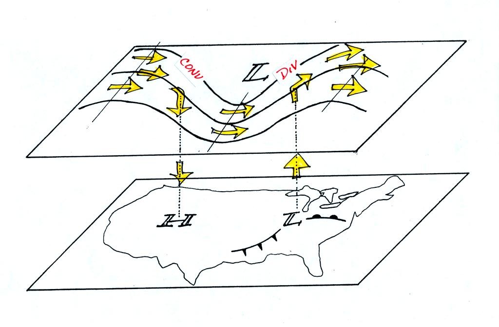
Next we will look at some of the interactions between features on
surface and upper level charts
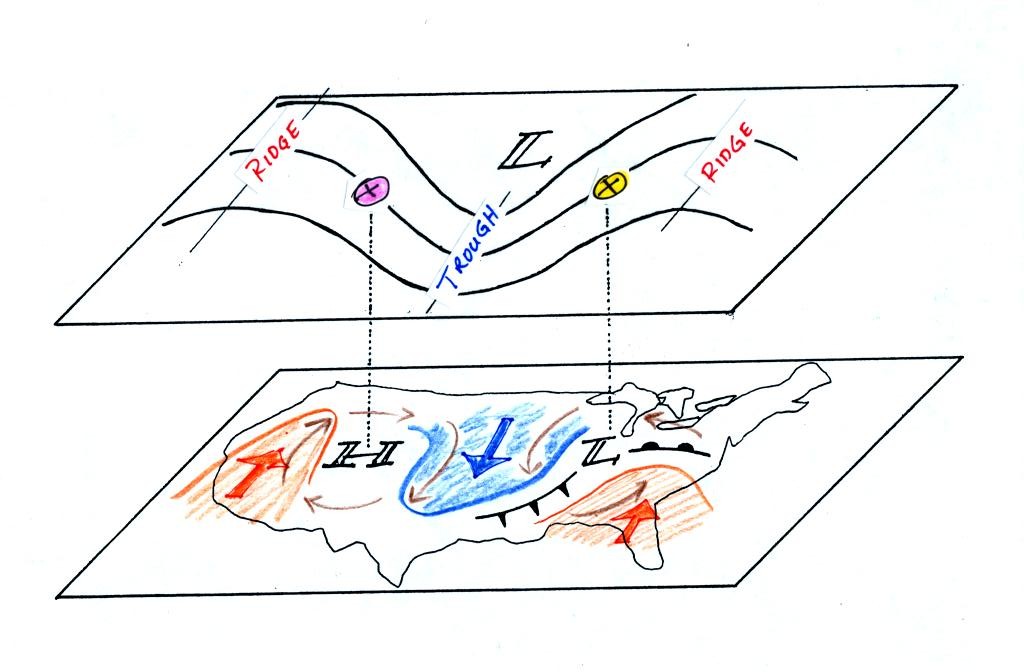
On the surface map you see centers of HIGH and LOW
pressure.
The low pressure center, together with the cold and warm fronts, is a
middle latitude storm.
Note how the counterclockwise winds spinning around the LOW
move warm
air northward (behind the warm front on the eastern side of the LOW)
and cold air southward (behind the cold front on the western side of
the LOW). Clockwise winds spinning around the HIGH also move warm
and cold air. The winds are shown with thin brown arrows on the
surface map.
Note the ridge and trough features on the upper level
chart. We
learned that warm air is found below an upper level ridge. Now
you can begin to see where this warm air comes from. Warm air is
found west of the HIGH and to the east of the LOW. This is
where the two ridges on the upper level chart are also found. You
expect to find cold air below an upper level trough. This cold
air is being moved into the middle of the US by the northerly winds
that are found between the HIGH and the LOW.
Note the yellow X marked on the upper level chart directly
above the
surface LOW. This is a good location for a surface LOW to develop
and strengthen (to strengthen the surface low pressure in the center of
the storm must get even lower than it is now) We
will find that this is frequently a location
where there is upper level divergence. Similary the pink X is
where you often find upper level convergence. This could
cause surface high pressure to get even higher.
Now we
need to look in a little more detail at how upper level winds can
affect the development or intensification of a surface storm.
This was the confusing part.
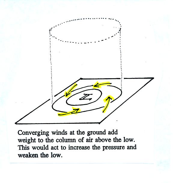
The figure shows a cylinder of air (see p. 42 in the photocopied
Classnotes). The pressure at the in the center at the bottom of
the cylinder is determined by the weight of the air overhead. The
surface winds are spinning counterclockwise and spiralling in
toward the center of the surface low. This adds air to the
cylinder of
air. Adding air to the cylinder means the cylinder will
weigh more and you would expect the surface pressure at the bottom of
the cylinder to increase.
We'll just make up some numbers, this might make this clearer.
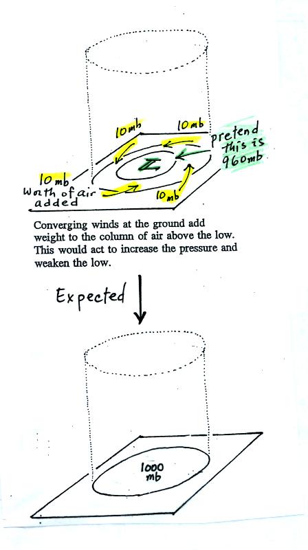
This is just like a bank account. You have $960 in the bank and
you make four $10 dollar deposits. You would expect your bank
account
balance to increase from $960 to $1000.
But what if the surface pressure decreased from 960 mb to 950 mb as
shown in the following figure?
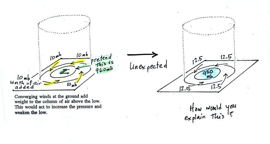
The next figure shows us what could be happening (back to p.
42 in the Class Notes).
There may be some upper level divergence (more arrows leaving the
cylinder than going in ). Upper level divergence removes air from
the cylinder and would decrease the weight of the cylinder.
We need to determine which of the two (converging winds at the surface
or divergence at upper levels) is dominant. That will determine
what happens to the surface pressure.
Again some actual numbers might help (see p. 42b in the Class Notes)

The 40 millibars worth of surface convergence is shown at Point
1. Up at Point 2 there are 50 mb of air entering the cylinder but
100 mb leaving. That is a net loss of 50 mb. At Point 3 we
see the overall result, a net loss of 10 mb. The surface pressure
should decrease from 960 mb to 950 mb. That change is reflected
in the next picture (found at the bottom of p. 42b in the Class Notes).

We're
almost done, one last figure (it's the figure on p. 41 in the
photocopied Class Notes again with some new information added (redrawn
here for improved clarity). This
figure wasn't shown in class.
Now that you
have some idea of what upper level divergence looks like
(more air leaving than is going in) you are in a position to understand
another one of the relationships
between the surface and upper level winds.
One of the things we have learned about surface LOW pressure is that
the converging surface winds create rising air motions. The
figure above gives you an idea of what can happen to this rising air
(it has to go somewhere). Note the upper level divergence in the
figure: two arrows of air coming into the point "DIV" and three arrows
of air leaving (more air going out than coming in is what makes this
divergence). The rising air can, in effect, supply the extra
arrow's worth of air.
Three arrows of air come into the point marked "CONV" on the upper
level chart and two leave (more air coming in than going out).
What happens to
the extra arrow? It sinks, it is the source of the sinking air
found above surface high pressure.