Surface Weather Map
Analysis
Example
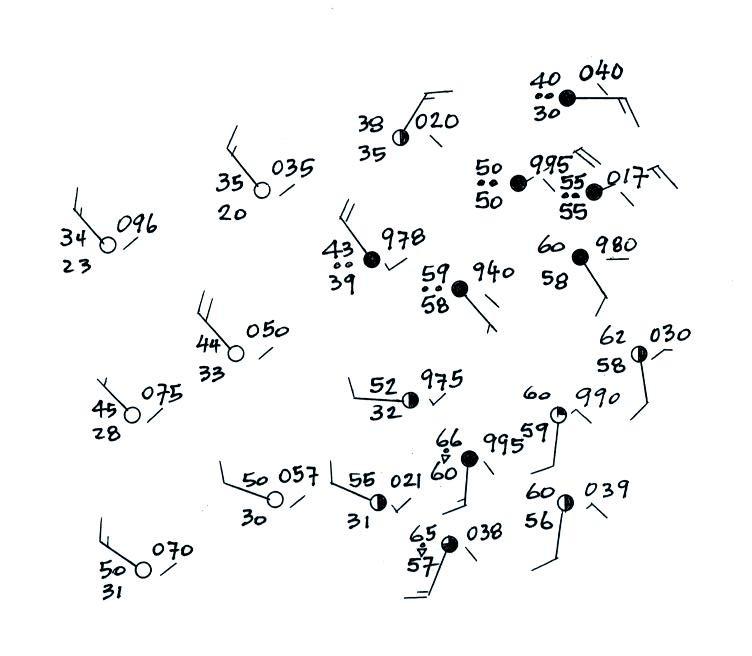
The map that we will be analyzing is shown below (you'll be
surprised at how much order we will be able to bring to what now
looks
like just a mess or lines and numbers)
Our first job will be to draw in some isobars. To make that
job
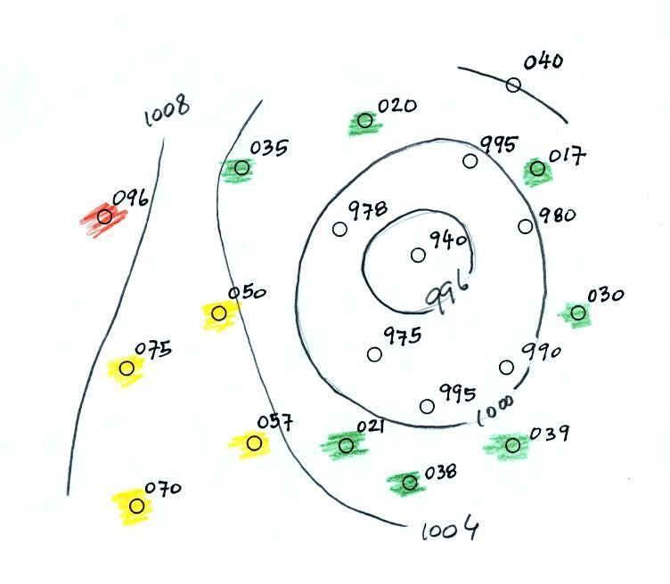
easier the map has been redrawn below with just the pressure data
shown.
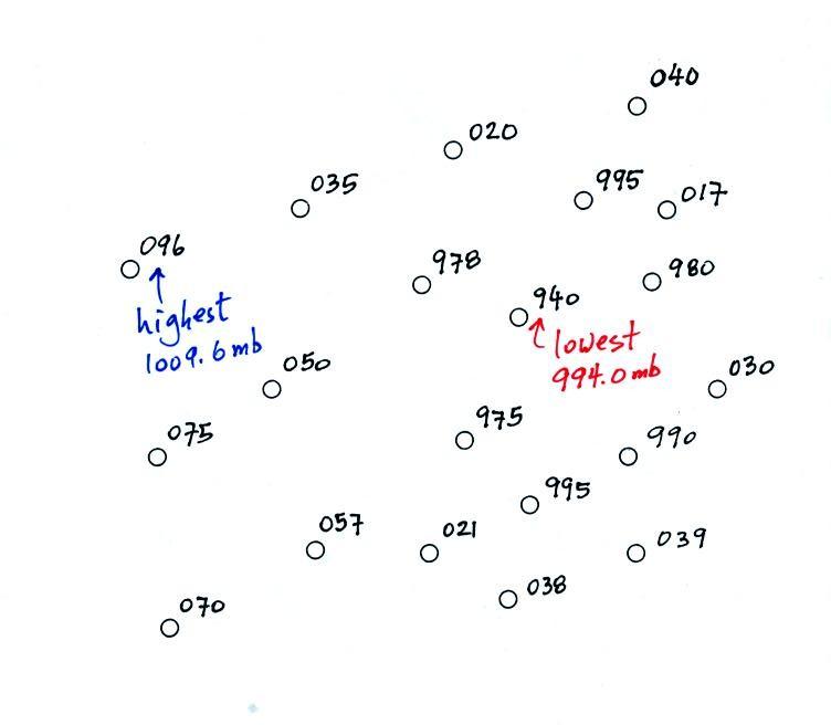
Remember you need to add either a 9 or a 10 and a decimal point to
the data plotted on the map. The 070 plotted at lower left
in the map is either 907.0 mbor 1007.0 mb.
You pick the value that is closest to 1000 mb, average sea level
pressure. In this case 1007.0 mb is the correct sea level
pressure value.
The highest pressure value on the map is 1009.6 mb, the lowest is
994.0
mb. Four of the allowed isobar values (the red values) fall
in
this range: 994.0 mb 996
1000 1004
1008
1009.6 mb. Isobars will pass through any station with a
value
that is exactly equal to the isobar's value. Otherwise
isobars
pass between pairs of stations: one with a pressure greater the
other
with a pressure smaller than the isobar's value.
On the map below stations with a pressure less than 996 mb have
been
shaded purple. Stations with pressures between 996 mb and
1000 mb
have been shaded blue. The 996 mb isobar will separate the
purple
stations from the blue stations. Stations with pressures
between
1000 mb and 1004 mb have been colored green. The 1000 mb
isobar
will separate the blue from the green stations.
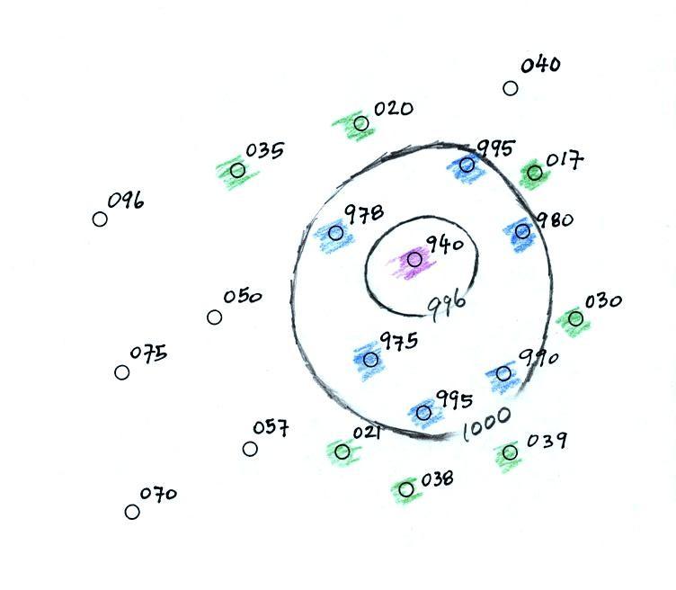
Next we color stations with pressure between 1004 and 1008
yellow. The 1004 mb isobar will separate the yellow and
green
shaded stations. Note there is one station in the upper
right
corner with a pressure of exactly 1004.0 mb, the 1004 mb isobar
will
pass through that station.
One station with a pressure greater than 1008 mb has been colored
orange. The 1008 mb isobar will separate these station from
the
other stations on the map. Note that only portions of the
1004 mb and 1008 mb isobars have been drawn. Once you reach
the edges of the map and run out of plotted data you really have
no idea where those isobars should go.
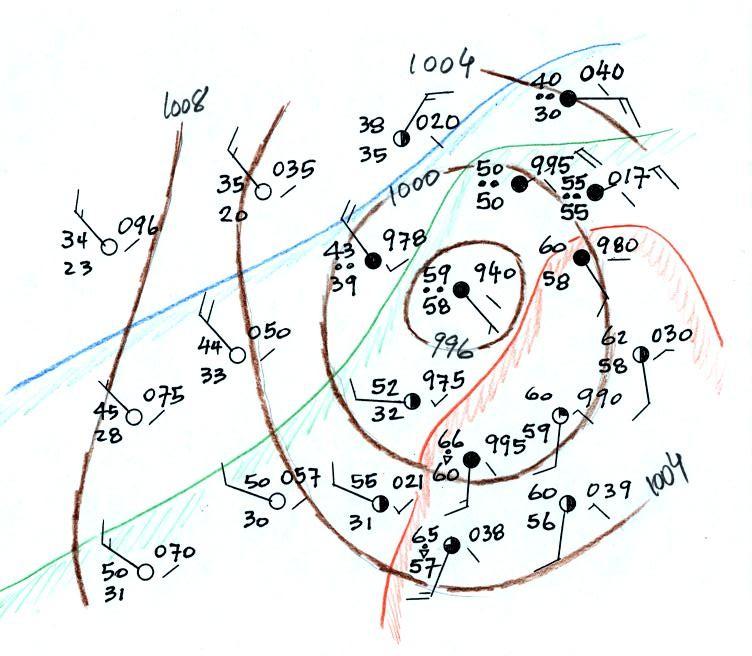
The isobaric analysis is now complete. We transfer these
isobars
onto the original weather map below.
Also on this map an attempt has been made to identify air masses
with
different temperatures. The warmest air with temperatures in
the
mid and lower 60s has been circled in orange.
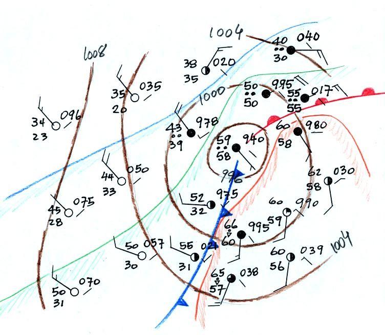
In the next figure we will locate the cold front at the western
boundary of this warm air where cold air is pushing down from the
northwest. We will locate the warm front at the northern
edge of
the cold air mass.
You should verify that some of the other criteria used to locate
fronts (changes in wind direction, changes in moisture content,
clouds
and precipitation, pressure tendency) confirm these frontal
locations. Note that the warm and cold fronts both originate
in
the center of low pressure. With time these fronts would
rotate
in a counterclockwise direction around the low pressure
center.
At the same time the low pressure center would most likely be
moving to
the east or northeast.