Monday Jan. 29, 2007
The first optional assignment was collected in class today.
Answers to the questions were handed out in class that you can use to
study for the Practice Quiz this coming Wednesday. A copy of the
Practice Quiz Study Guide was handed out in class.
The Monday afternoon review for the Practice Quiz has been cancelled.
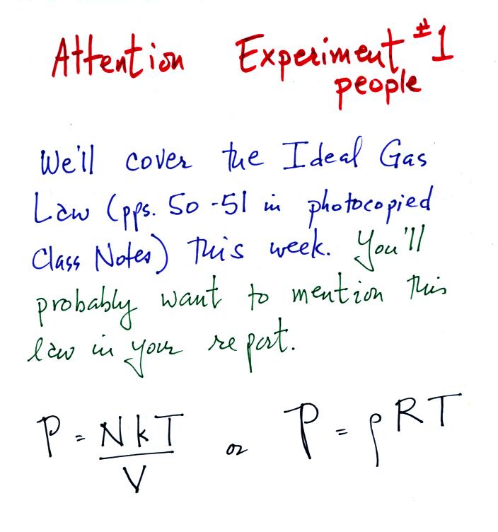
We'll cover the ideal gas law in class on Wednesday before the
Practice Quiz. Some reference to the first of the ideal gas
law equations should be made in the Experiment #1 reports.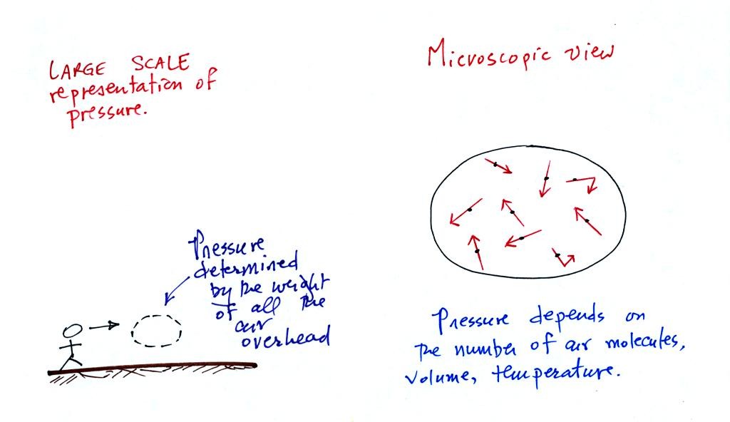
The ideal gas law is another way of thinking about and
understanding pressure.
We'll
start some new material today. This week we'll learn how
weather data is
entered onto surface weather maps and learn about some of the analyses
of the data that are done. We'll also have a brief look at upper
level weather maps.
Much of our weather is produced by relatively large
(synoptic scale)
weather systems. To be able to identify and characterize these
weather systems you must first collect weather data (temperature,
pressure, wind direction and speed, dew point, cloud cover, etc) from
stations across the country and plot the data on a map. The large
amount of data requires that the information be plotted in a clear and
compact way. The station model notation is what meterologists
use. 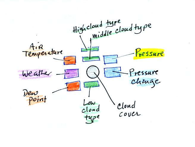
A small circle is plotted on the map at the location where the
weather
measurements were made. The circle can be filled in to indicate
the amount of cloud cover. Positions are reserved above and below
the center circle for special symbols that represent different types of
high, middle,
and low altitude clouds (a handout with many of these symbols was
distributed in class). The air temperature and dew point
temperature are entered
to the upper left and lower left of the circle respectively. A
symbol indicating the current weather (if any) is plotted to the left
of the circle in between the temperature and the dew point (weather
symbols were included on the class handout). The
pressure is plotted to the upper right of the circle and the pressure
change (that has occurred in the past 3 hours) is plotted to the right
of the circle.
Here is the example we studied in class.
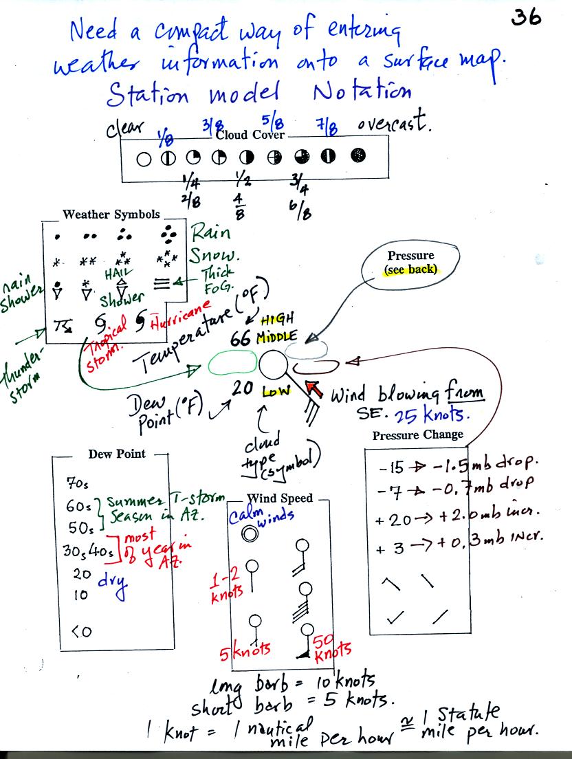
Starting at the top of the page you can see the symbols used
to
indicate the cloud cover. You leave the circle blank if the skies
are clear (that was the case on Monday afternoon). You fill in
the circle completely if the skies are
overcast. The symbols for 1/4, 1/2, and 3/4 are pretty
straightforward. You try to estimate to the nearest eighth how
much of the sky is covered with clouds.
The air temperature in this example was 66o F (this is
plotted above and to the right of the center circle). The dew
point
temperature was 20o F and is plotted below and to the left
of the center circle. The box at lower left reminds you that dew
points in the 30s and 40s occur much of the year in Tucson. Dew
points rise into the upper 50s and 60s during the summer thunderstorm
season (dew points are in the 70s in many parts of the country in the
summer). A 20 F dew point means the air is fairly dry.
Some of the common weather
symbols are
shown. A symbol representing the current weather is plotted to
the left of the center circle. There are about 100 different
weather symbols that you can choose from.
You can see and hopefully start to understand how the wind speed and
direction are
plotted. A straight line extending out from the center circle
shows the wind direction. Meteorologists always give the
direction the wind is coming from. In this example the winds are
blowing from the SW toward the NE. A meteorologist would call
these southeasterly winds. Small barbs at the end of the straight
line give the wind speed in knots. Here are some additional wind
examples (that weren't shown in
class):
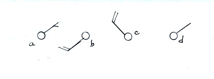
In (a) the winds are from the NE at 5 knots, in (b) from the
SW at 15
knots, in (c) from the NW at 20 knots, and in (d) the winds are from
the NE at 1 to 2 knots.
Knots are nautical miles per hour. One nautical mile per hour is
1.15 statute miles per hour. We won't worry about the distinction
in this class, you can just pretent that one knot is the same as one
mile per hour.
Pressure change data (how the pressure has changed during the preceding
3 hours) is shown to the right of the center circle. You must
remember to add a decimal point. Pressure changes are usually
pretty small. I forgot to mention the pressure tendency
information. Some examples are given below. These show
exactly how the pressure has been changing.
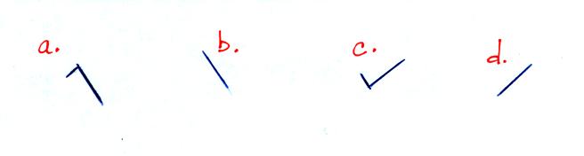
In (a) the pressure rose then started to fall, the overall change is a
drop in pressure. In (b) the pressure has been falling
steadily. In (c) the pressure fell then started to rise, the
overall change is an increase in pressure. Steadily rising
pressure is shown in (d).
The sea level pressure is shown above and to the right of the center
circle. Decoding this data is a little "trickier" because some
information is missing. Decoding the pressure is explained on p.
37 in the photocopied notes.
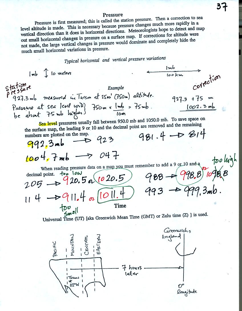
Meteorologists hope to map out small horizontal pressure
changes on
surface weather maps. Pressure changes much more quickly when
moving in a vertical direction. The pressure measurements are all
corrected to sea level altitude to remove the effects of
altitude. If this were not done large differences in pressure at
different cities at different altitudes would completely hide the
smaller horizontal changes. In the example above, a station
pressure value of 927.3 mb was measured in Tucson. Since Tucson
is about 750 meters above sea level, a 75 mb correction is added to the
station pressure (1 mb for every 10 meters of altitude). The sea
level pressure for Tucson is 927.3 + 75 = 1002.3 mb.
To save room, the leading 9 or 10 on the sea level pressure value and
the decimal
point are removed before plotting the data on the map. For
example the 10 and the . in 1002.3 mb would be removed; 023
would be plotted on the weather map (to the upper right of the center
circle). Some additional examples are shown above:
When reading pressure values off a map you must remember to add a 9 or
10 and a decimal point. For example
205 could be either 920.5 or 1020.5 mb. You pick the value that
falls between 950.0 mb and 1050.0 mb (so 1020.5 mb would be the correct
value, 920.5 mb would be too low). 114 could be either 911.4
mb or 1011.4 mb. The correct
pressure in this case would be
1011.4 mb. 998 could be either 999.8 mb or 1099.8 mb, the correct value is
999.8 mb.
We didn't have time to cover the last section on p. 27. Time on a
surface map is converted to a universally agreed upon time zone called
Universal Time (or Greenwich Mean Time, or Zulu time).
That is the time at 0 degrees longitude. There is a 7 hour time
zone difference between Tucson (Mountain
Standard Time year round) and Universal Time. You must add 7
hours to the time in Tucson to obtain Universal Time.
To convert 1 pm MST to Universal Time, you first convert the MST to the
24 hour clock format. 1 pm MST is 13:00 MST. Then you add 7
hours. 13:00 + 7:00 = 20:00 UT.
To convert 15Z to MST you subtract 7 hours. 15:00 - 7:00 = 8:00
am MST.
Here are some links to surface weather maps with data plotted using the
station model notation: UA Atmos. Sci.
Dept. Wx page, National
Weather Service Hydrometeorological Prediction Center, American
Meteorological Society.
We watched
another short video segment featuring Auguste and Jacques
Piccard. This segment recounted their September, 1953, descent,
in a bathyscaph, to a depth of over 10,000 feet in the ocean. At
that depth, a new world record, pressures exceed 5000 psi.
Jacques and another man would later to descend to the deepest point in
the ocean (35,800 feet).