Thursday Oct. 3, 2013
Music from the Fleet Foxes this morning because the harmonies
sound so good on the sound system in ILC 150. You heard "Tiger Mountain
Peasant Song", "Montezuma",
and "Bedouin
Dress" and "Lorelai"
which is probably my favorite of the bunch.
The Experiment #1 reports have been graded and were available for
pickup in class. You can revise your report and improve your
grade if you want to (a revision isn't required if you're happy
with your current grade). The revised reports are due in 2
weeks: on or before Thu., Oct. 17. You only need to change
sections where you want to earn additional credit. Please
return your original report with your revised report.
A new 1S1P Bonus Assignment
dealing with Surface Weather Map Analysis is now available.
The completed analysis is due by Thu., Oct. 10.
There's also a new
Optional Assignment.
Finally something new is being tried out for the first time in
ATMO 170. In addition to the regular online Lecture Notes, you'll find a second
link with just the figures from each class (starting with last
Tuesday's class) without any words (no explanation or
discussion). My hope is that you amy find that adding figure
titles or captions and listing some of the key points being
illustrated by each figure will be a quick and effective way of
reviewing the material covered in class.
We'll be looking at the weather changes that you might expect
to see ahead and behind warm and cold fronts. We'll also be
learning about the 3-D structure of warm fronts, something we
haven't covered yet.
Fronts are boundaries
between air masses with different temperatures
(different densities) and are another way of causing
rising air motions.
A 3-dimensional cross-sectional view of
a cold front is shown below (we've jumped to p. 148a in the
photocopied ClassNotes)
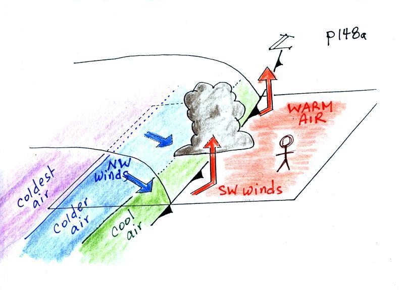
The person in the figure is positioned ahead of an approaching
cold front. Time wise, it might be the day before the
front actually passes through.
The warm air mass ahead of the front has just been sitting
there and temperatures are pretty uniform throughout.
Cold fronts are found at the leading edge of a cold air
mass. The air behind the front might have originated in
Canada. It might have started out very cold but as it
travels to a place like Arizona it can change (warm)
considerably. The air right behind the front will have
traveled the furthest and warmed the most. That's the
reason for the cool, cold, and colder temperature bands
(temperature gradient) behind the front. The temperature
behind the front should be colder than ahead of the front, but
the air behind the front may not of uniform temperature.
Here are some of the specific weather changes that might
precede and follow a cold front
Weather
variable
|
Behind
|
Passing
|
Ahead
|
Temperature
|
cool, cold,
colder*
|
|
warm
|
Dew
Point
|
usually much drier
|
|
may be moist (though
that is often
not the case here in the desert southwest)
|
Winds
|
northwest
|
gusty winds (dusty)
|
from the southwest
|
Clouds,
Weather
|
clearing
|
rain clouds,
thunderstorms in a
narrow band along the front
(if the warm air mass is moist)
|
might see some high
clouds
|
Pressure
|
rising
|
reaches a minimum
|
falling
|
* the
coldest air might follow passage of a cold front by a day or
two. It can cool off very quickly in the cold dry
cloud-free air behind a cold front.
A temperature drop is probably the most obvious change
associated with a cold front. Here is southern Arizona,
gusty winds and a wind shift are also often noticeable when a
cold front passes.
The pressure changes that precede and follow a cold front are
not something we would observe or feel but are very useful
when trying to locate a front on a weather map.
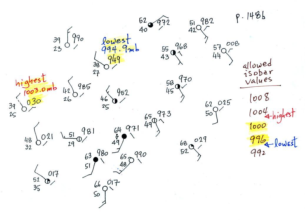
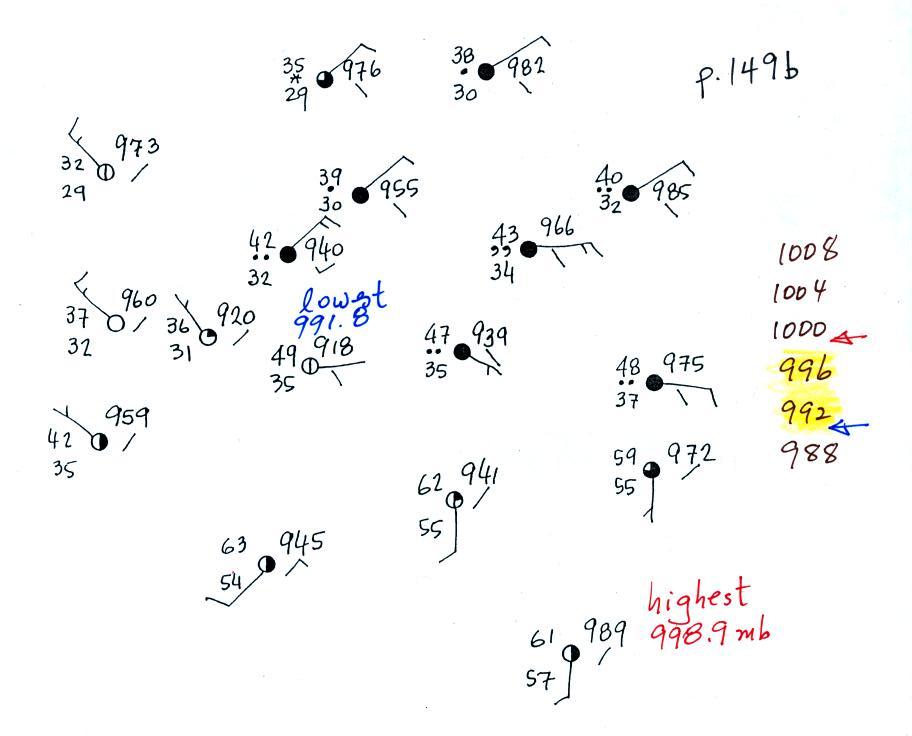
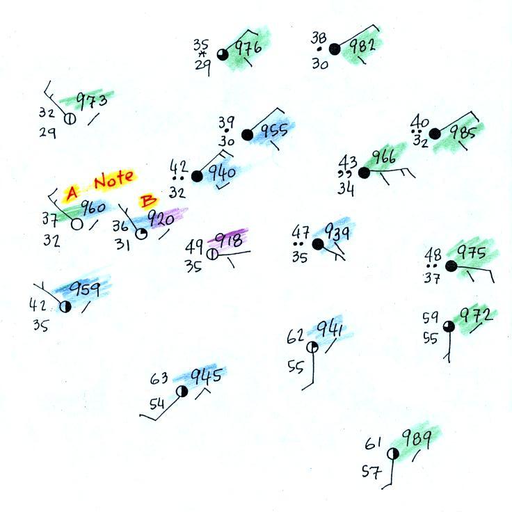
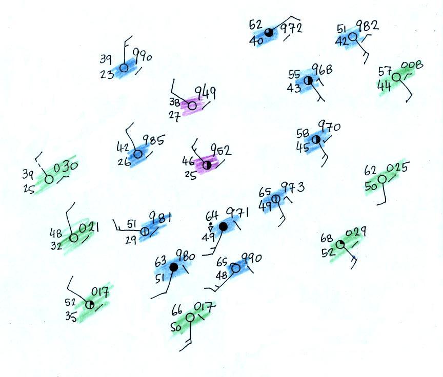
In the next figure we started with some weather
data plotted on a surface map using the station model
notation. We'll try to make a little more sense of this
data. We'll work through this example carefully because
you will be doing the same thing if you decide to do the 1S1P
Bonus Assignment.
In some respects fronts are like spokes on a wheel - they
rotate counterclockwise around centers of low pressure.
It makes sense to first determine the location of the low
pressure center. Before
trying to locate a cold front, we needed to draw in a few
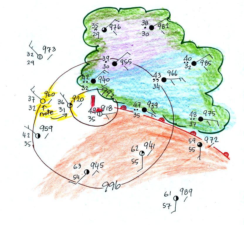
isobars and map out the pressure pattern.
Isobars are drawn at 4 mb increments above and below a
starting value of 1000 mb. Some of the allowed values
are shown on the right side of the figure (992, 996, 1000,
1004, 1008 etc). The highest pressure on the map is
1003.0 mb, the lowest is 994.9 mb. You must choose from
the allowed list of isobar values and pick only the values
that fall between the high and low pressure values on the
map. Thus we need to draw in 996 mb and 1000 mb
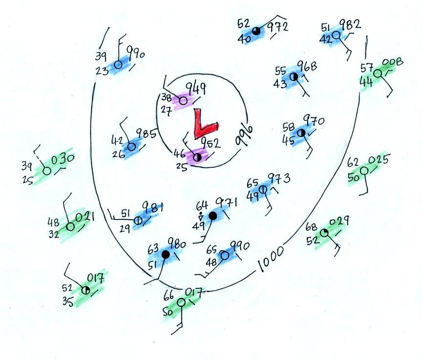
isobars.
In the figure below stations with pressures lower than 996 mb
have been colored in purple. These will be enclosed by
the 996 mb contour. Pressures between 996 and 1000 mb
have been colored blue. These stations will lie outside
the 996 mb contour but inside the 1000 mb isobar.
Finally stations with pressures greater than 1000 mb have been
colored green. The 1000 mb isobar will separate the blue
stations from the green stations.
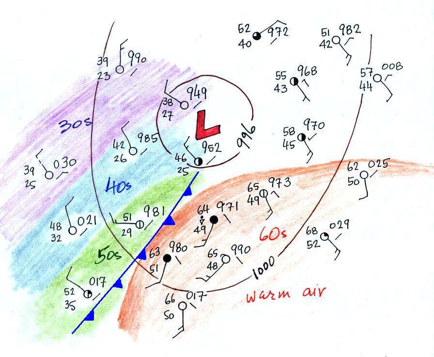
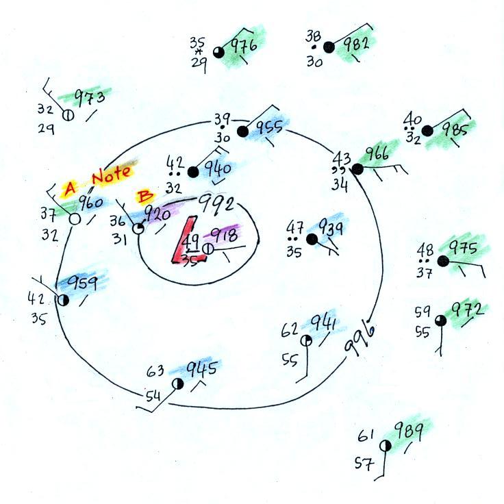
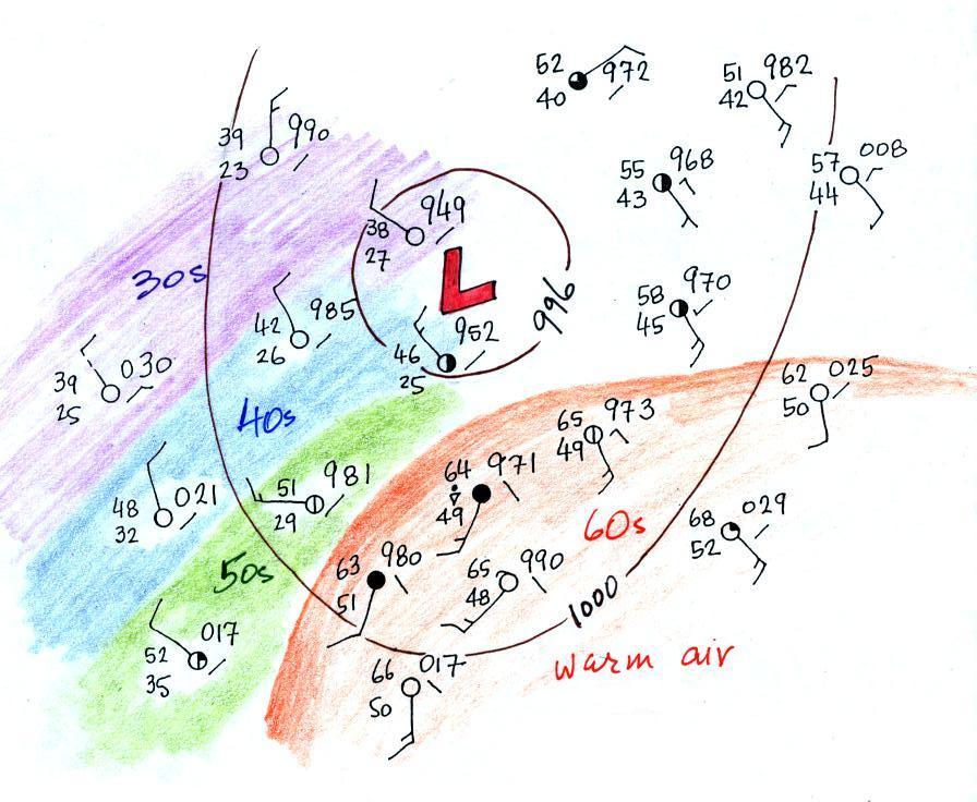
The next step was to try to
locate the warm air mass in the picture. We've left the
isobars in the figure below but now have used colors to
identify air masses with different temperatures.
Temperatures are in the 60s in the lower right
portion of the map; this area has been circled in
orange. Cooler air to the west of the Low pressure
center has also been identified. Based on just the
temperatures just should have a pretty good idea where a cold
front would be found.
The cold front on the map seems to be properly
positioned. Note
how the cold front is positioned at the leading edge of the
cold air mass, not necessarily in front of the coldest air in
the cold air mass.
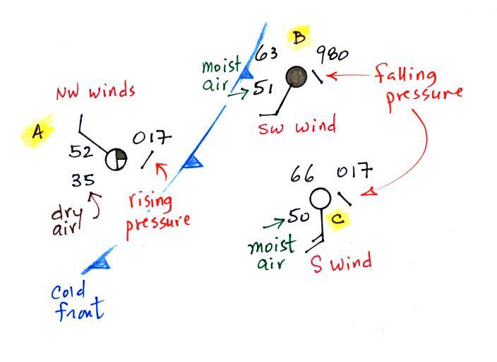
3
of
the
stations
from
the
bottom
center
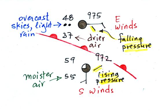
portion of the map have been redrawn below.
The air ahead of the front (Pts. B & C) is warm, moist,
has winds blowing from the S or SW, and the pressure is
falling. These are all things you would expect to find
ahead of a cold front.
Overcast skies are found at Pt. B. very near the front.
The air behind the front at Pt. A is colder, drier, winds are
blowing from the NW, and the pressure is rising. That is
just what you would expect behind a cold front. So our
location of the front looks pretty good.
We've learned a fair amount
about cold fronts: cross-sectional structure, weather changes
that precede and follow passage of a cold front, and how to
locate a cold front on a surface weather map. We
really haven't covered warm fronts yet.
We used the automobile analogy above to
understand or visualize how or why an advancing mass of cold
dense air is able to lift lighter low density air in front of
it.
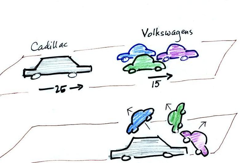
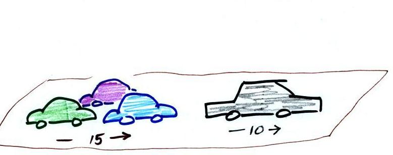
Warm fronts are more like a fleet of
Volkswagens overtaking a Cadillac
The VWs are still lighter than the Cadillac. What
will happen when the VWs catch the Cadillac?
They'll run up and over (overrun) the
Cadillac.
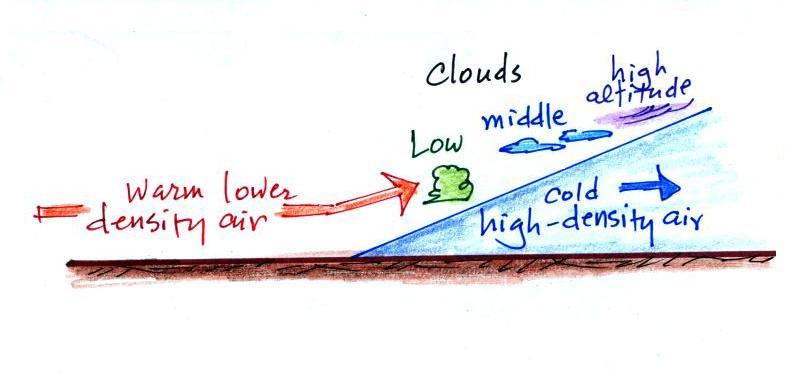
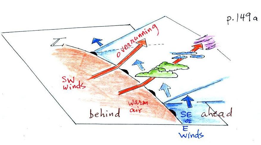
The same happens along a warm front. The approaching warm
air is still less dense than the cold air and will overrun the
cold air mass.
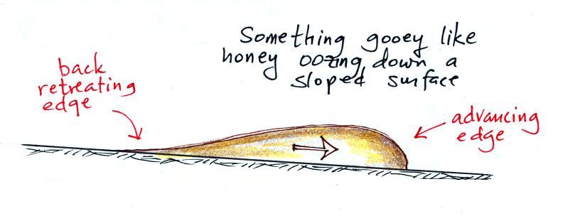
The back edge of a retreating cold mass has a
much different shape than the advancing edge. The
advancing edge bunches up and is blunt. The back edge
gets stretched out and has a ramp like shape. The warm
air rises more slowly and rises over a much larger area out
ahead of the warm front. This is an important difference
between warm and cold fronts.
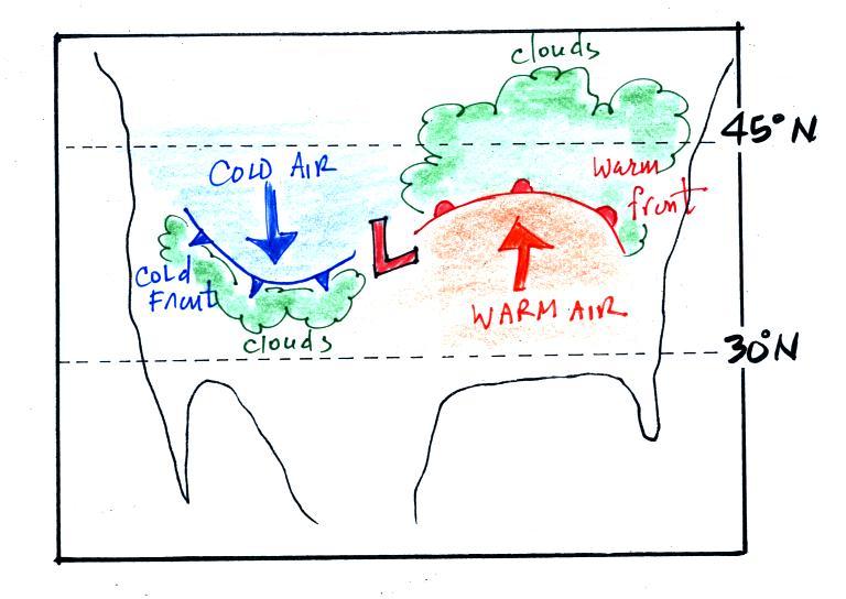
Here's the 3-dimensional view
again that's in the ClassNotes.
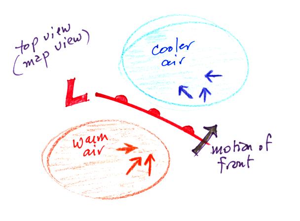
Here's a map view of a warm front.
Here are the kinds of weather changes
that would precede and follow passage of a warm front.
Weather
Variable
|
Behind
(after)
|
Passing
|
Ahead
(before)
|
Temperature
|
warmer
|
|
cool
|
Dew point
|
may be moister
|
|
drier
|
Winds
|
SW, S, SE
|
|
from the East or SE,
maybe even the S
|
Clouds,
Weather
|
clearing
|
|
wide
variety of clouds that may precede arrival of the front by
a day or two
clouds may produce a wide variety of types of
precipitation also
(snow, sleet, freezing rain, and rain)
|
Pressure
|
rising
|
minimum
|
falling
|
Probably the key difference between warm and cold
fronts (other than a cold-to-warm rather than a warm-to-cold
change) is the wide variety of clouds that a warm front cause
to form cover a much larger area out ahead of the front.
That's why it's highlighted in yellow above. Clouds
associated with a cold front are usually found in a fairly
narrow band along the front.
Now we'll follow the same procedure that we did last Friday and
try to locate a warm front on a surface weather map.
We'll start by drawing some isobars to map out the pressure
pattern. A partial list of allowed isobars is shown at the
right side of the map above (increments of 4 mb starting at 1000
mb). We've located located the highest and lowest pressure
values on the map. Then we choose allowed isobar values that
fall between these limits. In this case we'll need to draw
992 mb and 996 mb isobars.
Here's the map with color coded pressures. Pressures less
than 992 mb are purple, pressures between 992 and 996 mb are blue,
and pressures greater than 996 mb are green.
Note that station B has a pressure of exactly 992.0 mb, the 992 mb
isobar will go through that station. The 996 mb isobar will
go through station A because it has a pressure of exactly 996.0
mb.
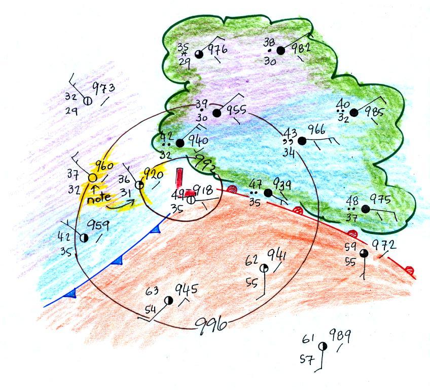
Here's the map with the isobars drawn in. On the map below
we use colors to locate the warm and cooler air masses.
The warm air mass has been
colored in orange. Cooler air east of the low pressure
center is blue. Can you see where the warm front should
go?
The station north of the front has cooler and drier air, winds
are from the east, skies are overcast and light rain is
falling. The pressure is falling as the warm front
approaches. These are all things you'd expect to find ahead
of a warm front. Behind the front at the southern station
pressure is rising, the air is warmer and moister, winds have
shifted to the south and the skies are starting to clear.
Here's the picture again with an additional front drawn in.
There's pretty good evidence of a cold front on the left
portion of the map.
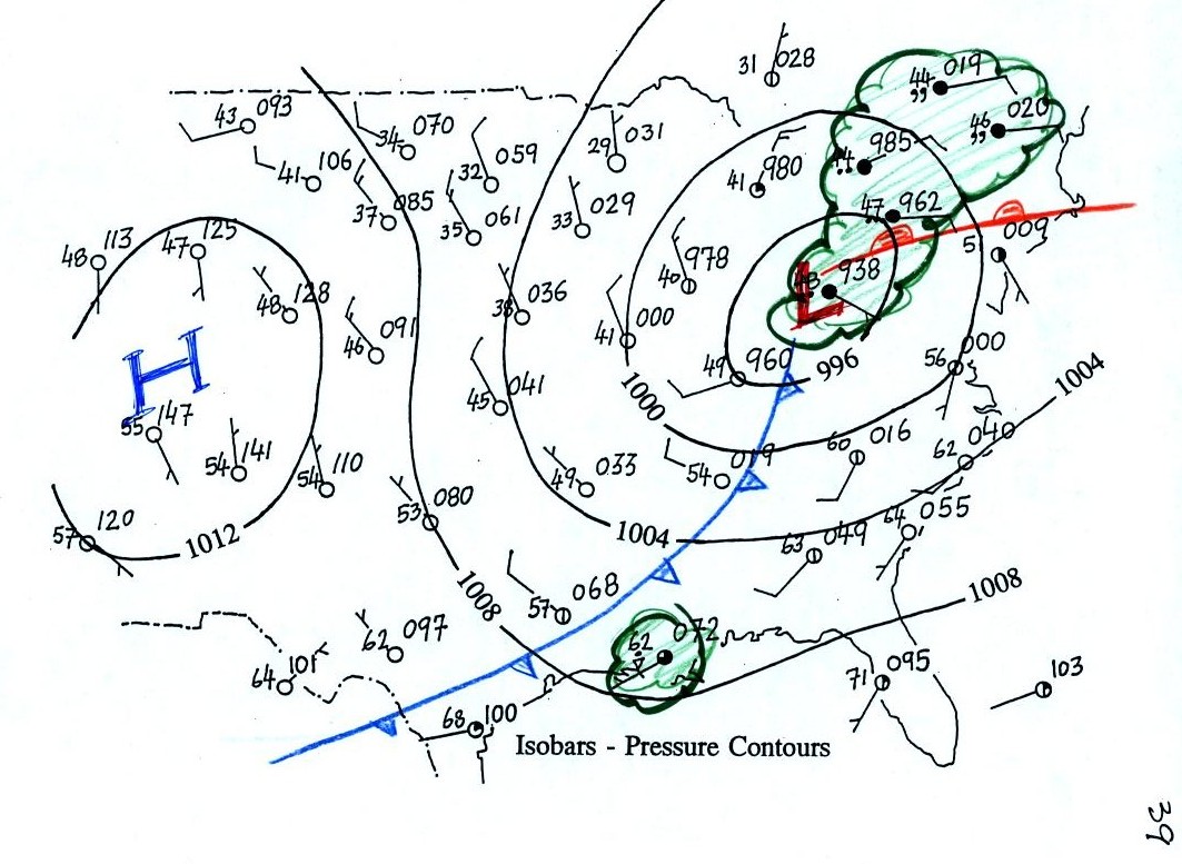
One last picture, we go back to the map on p. 39 in the
ClassNotes.
This is one of the maps that we looked at at the start of this
section of material. One of the questions we had was what
might be causing the clouds, rain, and drizzle in the northeastern
part of the country, and the rain shower along the Gulf
Coast. The cold front is almost certainly the cause of the
rain shower and much of the wet weather in the NE is probably
being caused by the warm front.
Up to this point we've been learning about surface weather
maps. Maps showing conditions at various altitudes above the
ground are also drawn. Upper level conditions can affect the
development and movement of surface features (and vice
versa).
Here we'll mostly just learn 3 basic facts about upper level
charts. The Optional
Assignment that I mentioned in class will go much further
than we went in class.
First the overall appearance is somewhat different from a
surface weather map. The pattern on a surface map can be
complex and you generally find circular (more or less) centers
of high and low pressure (see the bottom portion of the figure
below). You can also find closed high and low pressure
centers at upper levels, but mostly you find a relatively simple
wavy pattern like is shown on the upper portion of the figure
below (sort of a 3-dimensional view). You'll find this
basic picture on p. 41 in the ClassNotes.
A simple upper
level chart pattern is sketched below (a map view).
There are two basic features: wavy lines that dip southward
and have a "u-shape" and
lines that bend northward and have an "n-shape".

The u-shaped portion
of the pattern is called a trough. The n-shaped portion is called
a ridge.

Troughs are produced by large volumes of cool or cold
air (the cold air is found between the ground and the upper
level that the map depicts). The western half of the
country in the map above would probably be experiencing colder
than average temperatures. Large volumes of warm or hot
air produce ridges. You can find out why this is true by
reading "Upper level
charts pt. 2".

The winds on
upper level charts blow parallel to the contour lines
generally from west to east. This is a little different
from surface winds which blow across the isobars toward low
pressure. An example of surface winds is shown below.

That's it for this first
section. Really all you need to be able to do is
1. identify troughs and ridges,
2. remember that troughs are associated with cold air &
ridges with warm air, and
3. remember that upper level winds blow parallel to the
contour lines from west to east.
The next two figures weren't discussed in class.
I've included them here just to give you some idea of the
interaction between weather at ground level and conditions
above the ground.
Here's the earlier picture again overlaying surface and
upper-level maps.

On the surface map above you see centers
of HIGH and LOW pressure. The surface low pressure
center, together with the cold and warm fronts, is a
middle latitude storm.
Note how the counterclockwise winds spinning around the
LOW move warm air northward (behind the warm front on the
eastern side of the LOW) and cold air southward (behind
the cold front on the western side of the LOW).
Clockwise winds spinning around the HIGH also move warm
and cold air. The surface winds are shown with thin
brown arrows on the surface map.
Note the ridge and trough features on the upper level
chart. We learned that warm air is found below an
upper level ridge. Now you can begin to see where
this warm air comes from. Warm air is found west of
the HIGH and to the east of the LOW. This is
where the two ridges on the upper level chart are also
found. You expect to find cold air below an upper
level trough. This cold air is being moved into the
middle of the US by the northerly winds that are found
between the HIGH and the LOW.
Note the yellow X marked on the upper level chart directly
above the surface LOW. This is a good location for a
surface LOW to form, develop, and strengthen
(strengthening means the pressure in the surface low will
get even lower than it is now. This is also called
"deepening"). The reason for this is that the yellow
X is a location where there is often upper level
divergence. Similary the pink X is where you often
find upper level convergence. This could cause the
pressure in the center of the surface high pressure to get
even higher. You can read more about this in Upper level charts
pt. 3. The upper level
winds could also cause the surface storm to weaken (the low
pressure would get higher).
.

One of the things we have learned about surface
LOW pressure is that the converging surface winds create rising
air motions. The figure above gives you an idea of what
can happen to this rising air (it has to go somewhere).
Note the two arrows of air coming into the point "DIV" and three
arrows of air leaving (more air going out than coming in), this
is upper level divergence). The rising air can, in effect,
supply the extra arrow's worth of air.
Three arrows of air come into the point marked "CONV" on the
upper level chart and two leave (more air coming in than going
out = upper level convergence). What happens to the extra
arrow? It sinks, it is the source of the sinking air found
above surface high pressure.