Wednesday Feb. 11, 2009
click here to download today's notes in
a more printer friendly format.
A little bit of the beginning of Survivor: The Australian Outback was
shown before class today. This to celebrate the fact that the new season of
Survivor, your instructor's favorite television show, begins this
Thursday. So there was no music today (other than the Survivor
theme song).
Experiment #2 materials were handed out in
class today. More materials will be available in class on
Friday. There are several people that haven't yet returned Expt.
#1 materials. Please do so as soon as you can so that they can be
cleaned and handed out to Expt. #2 people.
The in-class Optional Assignment from Monday was returned. If you
don't see a score marked on your paper you earned full credit (0.3
extra credit points). Have a look at the answers, because we don't
always grade your entire paper.
Quiz #1 is one week from today. Here is a preliminary Quiz #1 Study Guide. Quiz #1 will
cover material from both the Practice Quiz
Study Guide and the Quiz #1 Study Guide.
A new Optional Assignment
was handed out today. This assignment is due at the start of
class next Monday, Feb. 16. Assume a 1 mb per 10 meter rate of
pressure decrease with increasing altitude in Question #10.
A handout with all the weather symbols used to plot weather data using
the station model notation together with cloud symbols was handed out
in class. You can download a copy here or pick up a copy
in class on Friday.
A bunch of weather data has been
plotted (using the station model notation) on a surface weather map in
the figure
below. 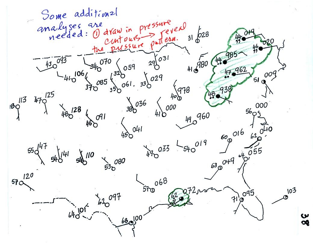
Plotting the surface weather
data
on a map is
just the
beginning.
For example you really can't tell what is causing the cloudy weather
with rain (the dot symbols are rain) and drizzle (the comma symbols) in
the NE portion of the map above or the rain
shower along the Gulf Coast. Some additional
analysis is needed. A meteorologist would usually begin by
drawing some contour lines of pressure to map out the large scale
pressure pattern. We will look first at contour lines of
temperature, they are a little easier to understand.
I told you I would finish coloring
the map when I got back to my office.
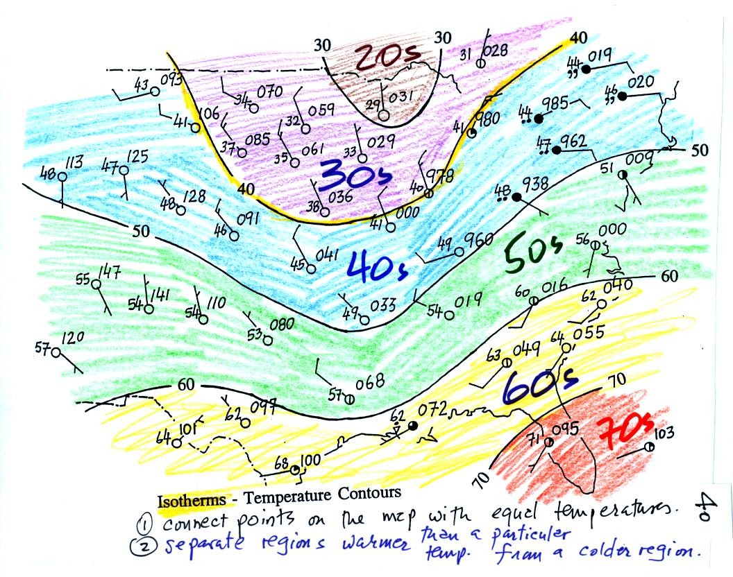
Isotherms, temperature
contour lines, are usually drawn at 10 F
intervals.
They do two things: (1) connect points on the map that all
have the same temperature, and (2) separate regions that are warmer
than a particular temperature from regions that are colder. The
40o F isotherm highlighted in yellow above passes through
a city which is reporting a temperature of exactly 40o.
Mostly it goes
between pairs of
cities: one with a temperature warmer than 40o and the other
colder
than 40o. Temperatures
generally decrease with
increasing
latitude: warmest temperatures are usually in the south, colder
temperatures in the north.

Now the same data with isobars
drawn in. Again they
separate
regions with pressure higher than a particular value from regions with
pressures lower than that value.
Isobars are generally drawn at 4 mb intervals. Isobars also connect points on the map
with the same pressure. The 1008 mb isobar (highlighted in
yellow) passes through a city at Point
A where the pressure is exactly
1008.0 mb. Most of the time the isobar
will pass between two
cities. The 1008 mb isobar passes between cities with
pressures
of 1009.7 mb at Point B and
1006.8 mb at Point C.
You would
expect to find 1008 mb somewhere in between
those two cites, that is where the 1008 mb isobar goes.
The pattern on this map is very different from the
pattern
of
isotherms. On this map the main features are the circular low and
high pressure centers.
You can really start to say alot about the
weather once you have mapped
out the pressure pattern. Differences in pressure create a force
that causes the wind to blow. Wind motions then can lead to
stormy or fair weather.
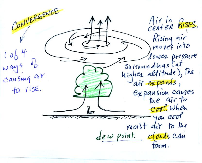
Air will start moving
toward low
pressure (like a rock sitting on a hillside that starts to roll
downhill), then something called the Coriolis force will cause
the
wind to start to spin (we'll learn more about the Coriolis force later
in the semester). Winds spin in a counterclockwise (CCW) direction
around surface
low pressure
centers. The winds also spiral inward toward the center of the
low, this is called convergence. [winds spin clockwise around low
pressure centers in the southern hemisphere but still spiral inward]
When the converging air reaches the
center of the low, the starts to rise.
Rising air expands (because it is moving into lower pressure
surroundings at higher altitude) and cools. If the air is moist
clouds can form and then begin to rain or snow. Thus you often
see
cloudy skies and stormy weather associated with surface low pressure.
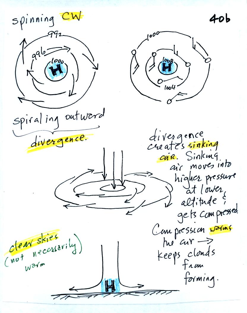
Surface high pressure
centers are pretty much just the opposite situation. Winds
spin clockwise
(counterclockwise in the southern hemisphere) and spiral outward.
The
outward motion is called divergence.
Air sinks in the center of
surface high pressure to
replace the diverging air. The sinking air is compressed and
warms. This keeps clouds from forming so clear
skies are normally found with high pressure (clear skies but not
necessarily warm weather, strong surface high pressure often forms when
the air is very cold).
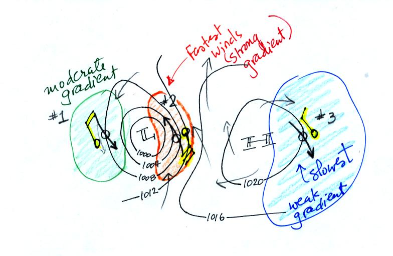
The
pressure pattern will also tell you something about where you might
expect to find fast or slow winds. In this case we look for
regions where
the isobars are either closely spaced together or widely spaced. (I'm using some more carefully drawn
pictures from the Spring 2008 class)
Closely spaced contours means pressure is changing
rapidly
with
distance. This is known as a strong pressure gradient and
produces fast winds. It is analogous to a steep slope on a
hillside. If you trip, you will roll rapidly down a steep
hillside, more slowly down a gradual slope.
The winds around a high pressure center are shown above using both the
station model notation and arrows. The winds are spinning clockwise and
spiralling inward slightly.
Winds spin counterclockwise and spiral inward around
low
pressure
centers.
This is the figure from the bottom of p. 40c. The fastest
winds (blowing from the SSE) are found in the center of the
picture. The slowest winds are found on the right side of the
figure where the contours are far apart. Note the southerly winds
in the middle of the picture would probably be warmer (because they are
coming from the south) than the NW winds at the right and left sides of
the pictures.
The
pressure pattern determines the wind direction and wind
speed. Once the winds start to blow they can affect and change
the temperature pattern. The figure below shows the
temperature pattern you would
expect to see if the wind wasn't blowing at all or if the wind was
blowing straight from west to east. The bands of different
temperature are aligned parallel to the lines of latitude.
Temperature changes from south to north but not from west to east.
This isn't a very interesting
picture. It gets a
little
more interesting if you put centers of high or low pressure in the
middle.
The clockwise spinning winds
move warm air to
the north on
the western
side of the High. Cold air moves toward the south on the eastern
side of the High. The diverging winds also move the warm and cold
air away from the center of the High.
Counterclockwise winds move cold air toward the south
on the
west side
of the Low. Warm air advances toward the north on the eastern
side of the low.
The converging winds in the case of low pressure will move the air
masses of different temperature in toward the center of low pressure
and cause them to collide with each other. The boundaries between
these colliding air masses are called fronts. Fronts are a second
way
of causing rising air motions (rising air expands and cools, if the air
is moist clouds can form)
Cold air is moving from north toward the south on the
western side of
the low. The leading edge of the advancing cold air mass is a
cold front. Cold fronts are drawn in blue on weather maps.
The small triangular symbols on the side of the front identify it as a
cold front and show what direction it is moving. The fronts are
like spokes on a wheel. The "spokes" will spin counterclockwise
around the low pressure center (the axle).
A warm front (drawn in red with half circle symbols) is shown on the
right hand side of the map at the advancing edge of warm air. It
is also rotating counterclockwise around the Low.
Clouds can form along fronts (often in a fairly narrow band along a
cold front and over a larger area ahead of a warm front). We need
to look at the crossectional structure of warm and cold fronts to
understand better why this is the case.
This type of storm system is referred to as an extratropical cyclone
(extra tropical means outside the tropics, cyclone means winds spinning
around low pressure) or a middle latitude storm. Large
storms also
form in the tropics, they're called tropical cyclones or more commonly
hurricanes.
We'll review and learn a lot more about front in class on Friday.