Project 4. Global Carbon and Temperature Trends
Due: Thursday 4/17/08
- Download the
following three data files from the Carbon Dioxide Information
Analysis Center at Oak Ridge National Laboratory:
·
Global CO2 Emissions
Estimates from Fossil Fuel Combustion (1751-2004)
Choose the fixed format or
comma delimited ASCII files, whichever you prefer.
·
Global CO2
Concentrations Measured at Mauna Loa Observatory (1958-2003)
Choose the “Annual” column
of data.
· Monthly and Annual Temperature Anomalies (1856-2000)
Choose the “Annual” column of data.
- Plot the following
three temporal trends (carbon emissions, atmospheric concentration, and
temperature), either by hand or by importing the data into a spreadsheet (much
quicker). Graph
paper can be downloaded, if necessary.
You do not need to plot every data point – just sufficient to see
the correct trends.
Tip: Highlight and then Copy the numbers (only) in the data file into a simple text editor like Word Pad. Save this new file then start Excel and use File, Open to import the data from the new file you just saved.
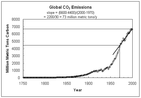
Carbon Emissions
- Plot “Total” carbon emissions (listed in the second
column of data) on the vertical axis labeled “million metric tons of
carbon” versus the year (listed in the first column of data) from 1751 to
2004 on the horizontal axis. You
can check your graph with the trend graph
published on the web.
- Estimate the global
CO2 emission rate over the period 1975-2004. Do this by “eye-balling” a straight
line through the data over this time period and calculating the slope:
(amount of carbon emitted in 2004 – amount carbon
emitted in 1975)/(2004 – 1975)
Make sure your units come out as “millions of metric
tons carbon/year”.
Write the
answer on your graph and be sure to show your calculation.
Atmospheric Concentration
- Plot “Annual” CO2 concentration at
- Estimate the rate
of increase in global CO2 concentration over the period
1975-2004. As before, do this by
“eye-balling” a straight line through the data over this time period and
calculating the slope:
(CO2 concentration in 2004 – CO2
concentration in 1975)/(2004 – 1975)
Make sure your units come out as “ppm CO2/year”.
Write the
answer on your graph and be sure to show your calculation.
Average Temperature
- Plot “Annual” global temperature anomaly (listed in
the last column of data) on the vertical axis labeled “temperature
anomaly (degrees C)”. On the
horizontal axis plot the year (listed in the first column of data) from 1856
to 2004). You can check your graph
with the graphical
trend published on the web.
The term “temperature anomaly” simply means the difference between
the temperature for a particular year minus the average temperature for
some long term period. It allows
one to focus on the change from the average, which is important,
rather than the actual temperature.
- Estimate the rate
of increase in global temperature anomaly over the period 1975-2000. As before, do this by “eye-balling” a
straight line through the data over this time period and calculating the
slope:
(temperature anomaly in 2004 – temperature anomaly in
1975)/(2004 – 1975)
Make sure your units come out as “degrees C/year”.
Write the
answer on your graph and be sure to show your calculation.
- Discuss the possible
links between these three trends (no more than one page is allowed for
this answer).
- Staple together the three
graphs, and the answer to question 3 and hand in your completed project
during class on or before the due date. Points
will be subtracted for longer write-ups, and late write ups.
Example: