Monday Sept. 10, 2007
The first optional homework assignment is due at the beginning of class
on Friday.
The first 1S1P assignment is due next
Monday (Sept. 17).
The Experiment #1 reports are also due
next Monday (Sept. 17). You should bring in your materials this
week so that you can pick up the Supplementary Information sheet for
Experiment #1. The materials for Experiment
#2 will probably be distributed in class on Wednesday next week.
A "people
pyramid" helps to understand atmospheric pressure.

Atmospheric pressure depends on the weight of the air overhead.
The person at the bottom of the pyramid feels the weight of all the
people overhead.
Pressure decreases with increasing altitude.
The higher you are on the pyramid, the less weight left above, the less
weight you must support.
Pressure pushes upward, downward, and sideways.
At any level in the pyramid, the person must support the weight of the
people above.
Mattresses
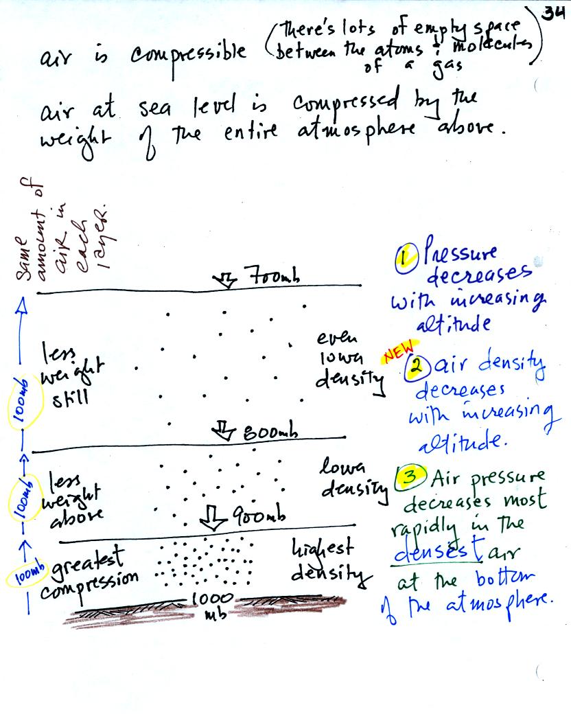
help to understand what happens to air density with altitude.

Mattresses are compressible. The mattress at the bottom of the
pile is compressed the most by the weight of all the mattresses
above. The mattresses higher up aren't squished as much because
their
is less weight remaining above.
In the case of the atmosphere you can think of layers of air instead of
mattresses.

1. You can first notice and remember that pressure decreases
with increasing altitude.
Each layer of air contain the same amount (mass) of air. You can
tell because the pressure decrease as you move upward through each
layer is the same (100 mb).
2. The densest air is found in the bottom layer because the air is
squeezed into a smaller volume than the other layers.
3. You again notice something that we covered earlier: the most rapid
rate of pressure decrease with increasing altitude is in the densest
air in the bottom air layer.
Next we
started some new material. This week we'll learn how
weather data are
entered onto surface weather maps and learn about some of the analyses
of the data that are done and what they can tell you about the
weather. We may also have a brief look at upper
level weather maps.
Much of our weather is produced by relatively large
(synoptic scale)
weather systems. To be able to identify and characterize these
weather systems you must first collect weather data (temperature,
pressure, wind direction and speed, dew point, cloud cover, etc) from
stations across the country and plot the data on a map. The large
amount of data requires that the information be plotted in a clear and
compact way. The station model notation is what meterologists
use (you'll find the station model notation discussed in Appendix C in
the textbook).

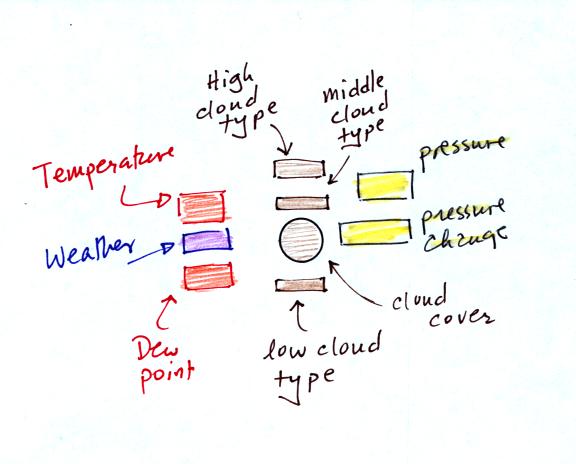
A small circle is plotted on the map at the location where
the
weather
measurements were made. The circle can be filled in to indicate
the amount of cloud cover. Positions are reserved above and below
the center circle for special symbols that represent different types of
high, middle,
and low altitude clouds (a handout with many of these symbols will be
distributed in class). The air temperature and dew point
temperature are entered
to the upper left and lower left of the circle respectively. A
symbol indicating the current weather (if any) is plotted to the left
of the circle in between the temperature and the dew point (weather
symbols were included on the class handout). The
pressure is plotted to the upper right of the circle and the pressure
change (that has occurred in the past 3 hours) is plotted to the right
of the circle. The figure
above wasn't shown in class.
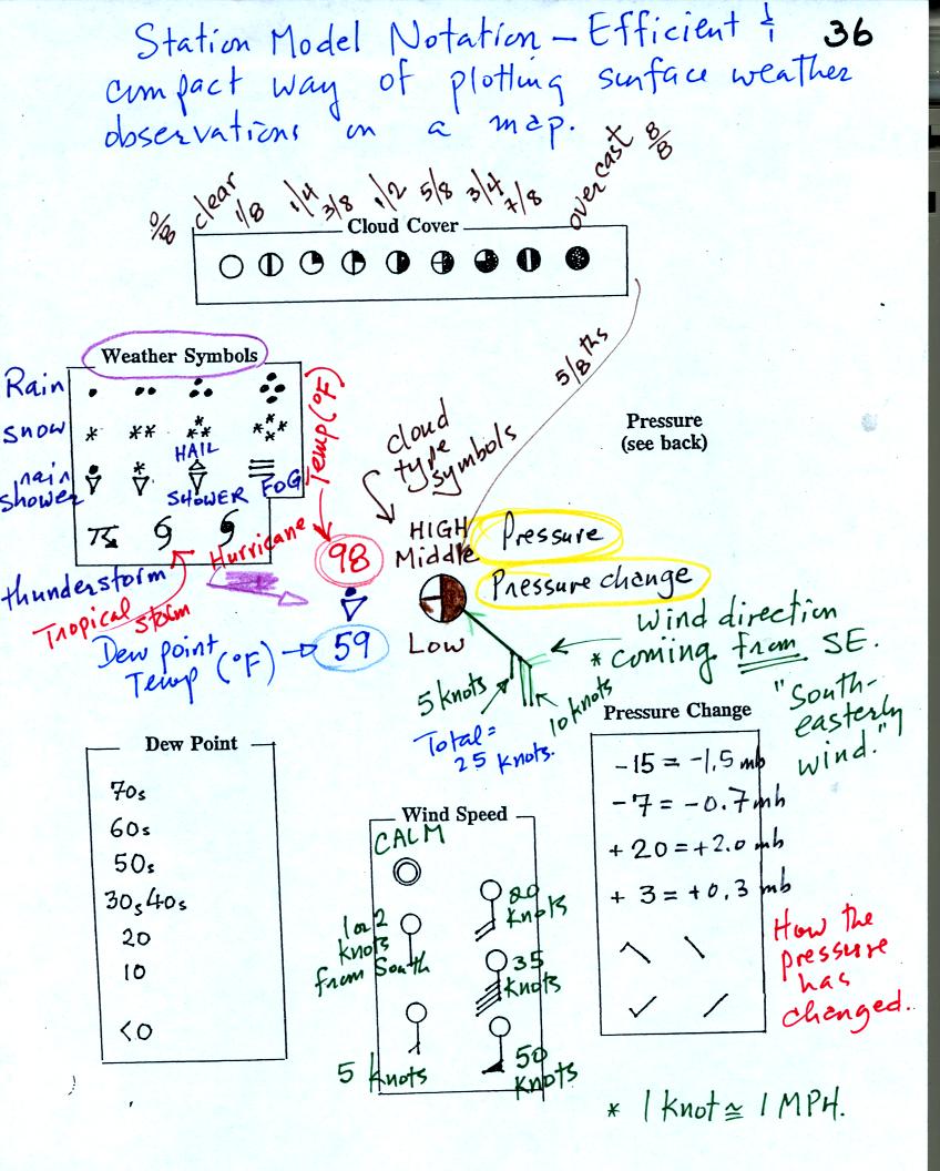
Here is the example we studied in class.

This might be a little hard to unscramble so we will look at the
picture one small portion at a time.

The center circle is filled in to indicate the portion of the sky
covered with clouds (estimate to the nearest 1/8th of the sky) using
the code at the top of the figure. Then symbols (not drawn in class) are used to
identify the actual types of high, middle, and low altitude clouds (the
symbols are on a handout that will be distributed in class on
Wednesday).

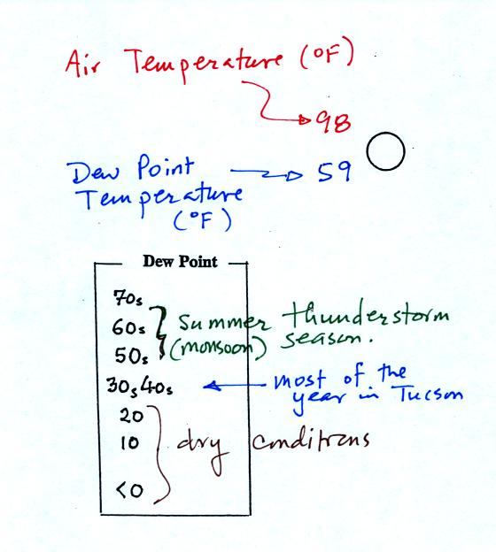
The air temperature in this example was 98o F
(this is
plotted above and to the left of the center circle). The dew
point
temperature was 59o F and is plotted below and to the left
of the center circle. The box at lower left reminds you that dew
points are in the 30s and 40s during much of the year in Tucson.
Dew
points rise into the upper 50s and 60s during the summer thunderstorm
season (dew points are in the 70s in many parts of the country in the
summer). Dew points are in the 20s, 10s, and may even drop below
0 during dry periods in Tucson.

A straight line extending out from the center circle
shows the wind direction. Meteorologists always give the
direction the wind is coming from.
In this example the winds are
blowing from the SE toward the NW at a speed of 25 knots. A
meteorologist would call
these southeasterly winds. Small barbs at the end of the straight
line give the wind speed in knots. Each long barb is worth 10
knots, the short barb is 5 knots.
Knots are nautical miles per hour. One nautical mile per hour is
1.15 statute miles per hour. We won't worry about the distinction
in this class, you can just pretend that one knot is the same as one
mile per hour.
Here are some additional wind
examples that weren't shown
in
class:

In (a) the winds are from the NE at 5 knots, in
(b) from the
SW at 15
knots, in (c) from the NW at 20 knots, and in (d) the winds are from
the NE at 1 to 2 knots.

A symbol representing the weather that is currently
occurring is plotted to the left of the center circle. Some of
the common weather
symbols are
shown. There are about 100 different
weather symbols (on the class handout) that you can choose from.

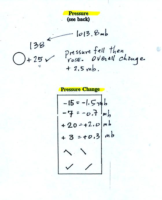
The sea level pressure is shown above and to the right of
the center
circle. Decoding this data is a little "trickier" because some
information is missing. Decoding the pressure is explained below
and on p.
37 in the photocopied notes.
Pressure change data (how the pressure has changed during
the preceding
3 hours) is shown to the right of the center circle. You must
remember to add a decimal point. Pressure changes are usually
pretty small.
Here are
some links to surface weather maps with data plotted using the
station model notation: UA Atmos. Sci.
Dept. Wx page, National
Weather Service Hydrometeorological Prediction Center, American
Meteorological Society.

Meteorologists hope to map out small horizontal pressure
changes on
surface weather maps (that produce wind and storms). Pressure
changes much more quickly when
moving in a vertical direction. The pressure measurements are all
corrected to sea level altitude to remove the effects of
altitude. If this were not done large differences in pressure at
different cities at different altitudes would completely hide the
smaller horizontal changes.
In the example above, a station
pressure value of 927.3 mb was measured in Tucson. Since Tucson
is about 750 meters above sea level, a 75 mb correction is added to the
station pressure (1 mb for every 10 meters of altitude). The sea
level pressure estimate for Tucson is 927.3 + 75 = 1002.3 mb.

To save room, the leading 9 or 10 on the sea level pressure
value and
the decimal
point are removed before plotting the data on the map. For
example the 10 and the . in 1002.3 mb would be removed; 023
would be plotted on the weather map (to the upper right of the center
circle). Some additional examples are shown above.

When reading pressure values off a map you must remember to
add a 9 or
10 and a decimal point. For example
138 could be either 913.8 or 1013.8 mb. You pick the value that
falls between 950.0 mb and 1050.0 mb (so 1013.8 mb would be the correct
value, 913.8 mb would be too low).
Another
important piece of information that is included on a surface weather
map is the time the observations were collected. We didn't have time to cover this in
class. Time on a
surface map is converted to a universally agreed upon time zone called
Universal Time (or Greenwich Mean Time, or Zulu time).
That is the time at 0 degrees longitude. There is a 7 hour time
zone difference between Tucson (Mountain
Standard Time year round) and Universal Time. You must add 7
hours to the time in Tucson to obtain Universal Time.

Here are some examples:
8 am MST:
add the 7 hour time zone
correction ---> 8:00 + 7:00 = 15:00 UT (3:00 pm in Greenwich)
2 pm MST:
first convert 2 pm to the 24 hour
clock format 2:00 +12:00 = 14:00 MST
then add the 7 hour time zone correction ---> 14:00 + 7:00 =
21:00 UT (9 pm in Greenwich)
18Z:
subtract the 7 hour time zone
correction ---> 18:00 - 7:00 = 11:00 am MST
02Z
if we subtract the 7 hour time zone correction we will get a negative
number. We will add 24:00 to 02:00 UT then subtract 7 hours
02:00 + 24:00 = 26:00
26:00 - 7:00 = 19:00 MST on the previous day
2 hours past midnight in Greenwich is 7 pm the previous day in
Tucson


