Tuesday, Sept. 11, 2007
The first optional homework assignment is due at the
beginning of class
on Thursday.
The first 1S1P assignment is due next
Tuesday (Sept. 18).
The Experiment #1 reports are also due
next Tuesday (Sept. 18). You should bring in your materials this
week so that you can pick up the Supplementary Information sheet for
Experiment #1. The materials for Experiment
#2 will probably be distributed in class on Thursday next week.
Today we
started some new material. This week we'll learn how
weather data are
entered onto surface weather maps and learn about some of the analyses
of the data that are done and what they can tell you about the
weather. We may also have a brief look at upper
level weather maps.
Much of our weather is produced by relatively large
(synoptic scale)
weather systems. To be able to identify and characterize these
weather systems you must first collect weather data (temperature,
pressure, wind direction and speed, dew point, cloud cover, etc) from
stations across the country and plot the data on a map. The large
amount of data requires that the information be plotted in a clear and
compact way. The station model notation is what meterologists
use (you'll find the station model notation discussed in Appendix C in
the textbook).
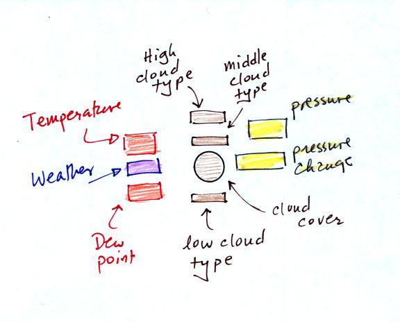
A small circle is plotted on the map at the location where
the
weather
measurements were made. The circle can be filled in to indicate
the amount of cloud cover. Positions are reserved above and below
the center circle for special symbols that represent different types of
high, middle,
and low altitude clouds (a handout with many of these symbols will be
distributed in class). The air temperature and dew point
temperature are entered
to the upper left and lower left of the circle respectively. A
symbol indicating the current weather (if any) is plotted to the left
of the circle in between the temperature and the dew point (weather
symbols were included on the class handout). The
pressure is plotted to the upper right of the circle and the pressure
change (that has occurred in the past 3 hours) is plotted to the right
of the circle. The figure
above wasn't shown in class.
Here is the example we studied in class.
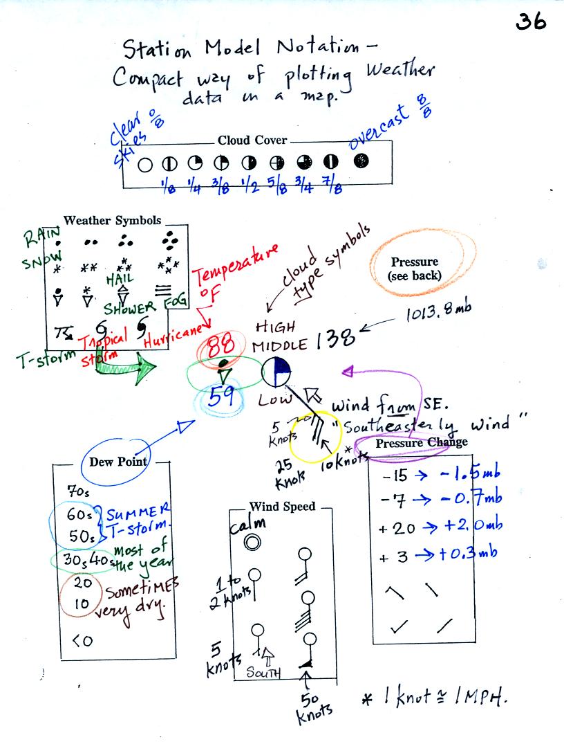
This might be a little hard to unscramble so we will look at
the
picture one small portion at a time.
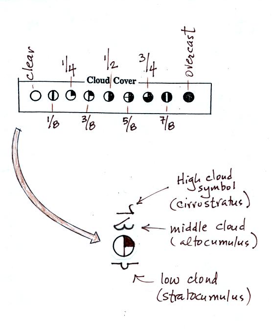
The center circle is filled in to indicate the portion of
the sky
covered with clouds (estimate to the nearest 1/8th of the sky) using
the code at the top of the figure. Then symbols (not drawn in class) are used to
identify the actual types of high, middle, and low altitude clouds (the
symbols are on a handout that was distributed in class)
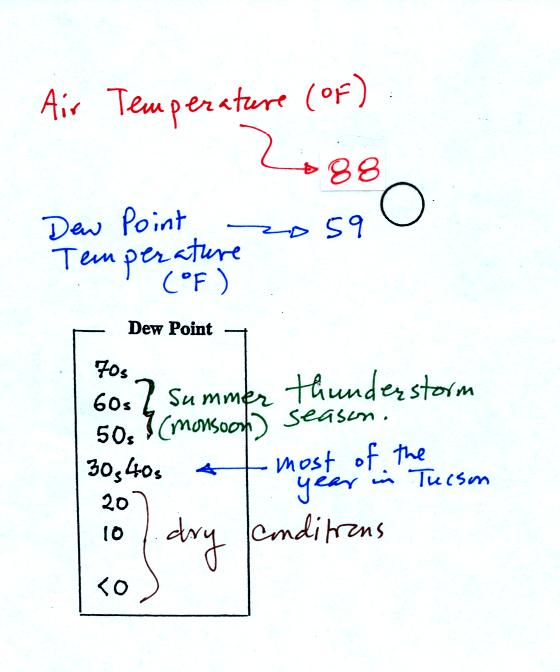
The air temperature in this example was 88o F
(this is
plotted above and to the left of the center circle). The dew
point
temperature was 59o F and is plotted below and to the left
of the center circle. The box at lower left reminds you that dew
points are in the 30s and 40s during much of the year in Tucson.
Dew
points rise into the upper 50s and 60s during the summer thunderstorm
season (dew points are in the 70s in many parts of the country in the
summer). Dew points are in the 20s, 10s, and may even drop below
0 during dry periods in Tucson.
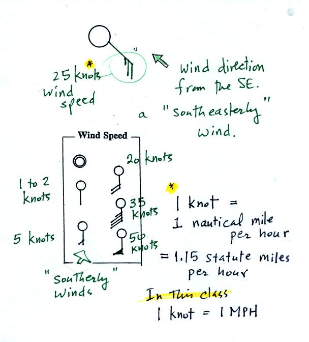
A straight line extending out from the center circle
shows the wind direction. Meteorologists always give the
direction the wind is coming from.
In this example the winds are
blowing from the SE toward the NW at a speed of 25 knots. A
meteorologist would call
these southeasterly winds. Small barbs at the end of the straight
line give the wind speed in knots. Each long barb is worth 10
knots, the short barb is 5 knots.
Knots are nautical miles per hour. One nautical mile per hour is
1.15 statute miles per hour. We won't worry about the distinction
in this class, you can just pretend that one knot is the same as one
mile per hour.
Here are some additional wind
examples that weren't shown
in
class:
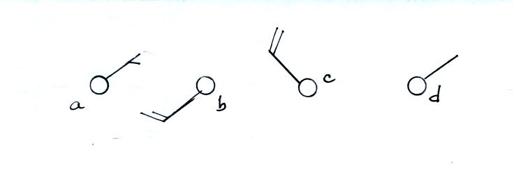
In (a) the winds are from the NE at 5 knots, in
(b) from the
SW at 15
knots, in (c) from the NW at 20 knots, and in (d) the winds are from
the NE at 1 to 2 knots.
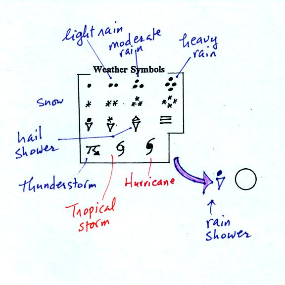
A symbol representing the weather that is currently
occurring is plotted to the left of the center circle. Some of
the common weather
symbols are
shown. There are about 100 different
weather symbols (on the class handout) that you can choose from.
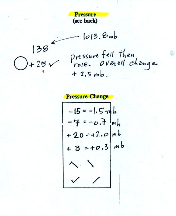
The sea level pressure is shown above and to the right of
the center
circle. Decoding this data is a little "trickier" because some
information is missing. Decoding the pressure is explained below
and on p.
37 in the photocopied notes.
Pressure change data (how the pressure has changed during
the preceding
3 hours) is shown to the right of the center circle. You must
remember to add a decimal point. Pressure changes are usually
pretty small.
Here are
some links to surface weather maps with data plotted using the
station model notation: UA Atmos. Sci.
Dept. Wx page, National
Weather Service Hydrometeorological Prediction Center, American
Meteorological Society.
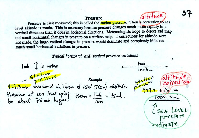
Meteorologists hope to map out small horizontal pressure
changes on
surface weather maps (that produce wind and storms). Pressure
changes much more quickly when
moving in a vertical direction. The pressure measurements are all
corrected to sea level altitude to remove the effects of
altitude. If this were not done large differences in pressure at
different cities at different altitudes would completely hide the
smaller horizontal changes.
In the example above, a station
pressure value of 927.3 mb was measured in Tucson. Since Tucson
is about 750 meters above sea level, a 75 mb correction is added to the
station pressure (1 mb for every 10 meters of altitude). The sea
level pressure estimate for Tucson is 927.3 + 75 = 1002.3 mb.
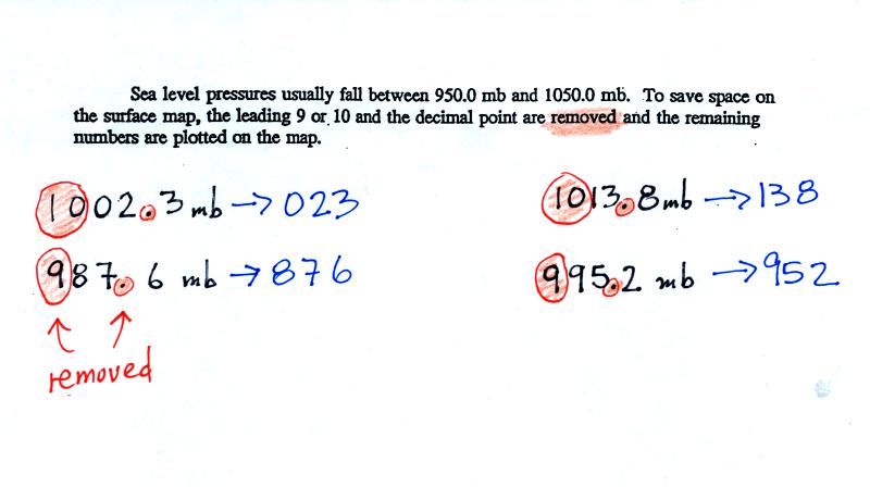
To save room, the leading 9 or 10 on the sea level pressure
value and
the decimal
point are removed before plotting the data on the map. For
example the 10 and the . in 1002.3 mb would be removed; 023
would be plotted on the weather map (to the upper right of the center
circle). Some additional examples are shown above.
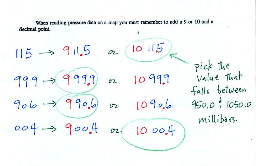
When reading pressure values off a map you must remember to
add a 9 or
10 and a decimal point. For example
138 could be either 913.8 or 1013.8 mb. You pick the value that
falls between 950.0 mb and 1050.0 mb (so 1013.8 mb would be the correct
value, 913.8 mb would be too low).
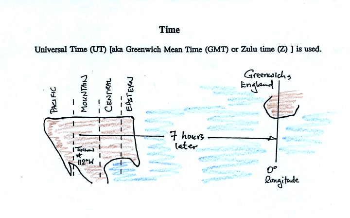
Another
important piece of information that is included on a surface weather
map is the time the observations were collected. We covered this very briefly in
class. Time on a
surface map is converted to a universally agreed upon time zone called
Universal Time (or Greenwich Mean Time, or Zulu time).
That is the time at 0 degrees longitude. There is a 7 hour time
zone difference between Tucson (Mountain
Standard Time year round) and Universal Time. You must add 7
hours to the time in Tucson to obtain Universal Time.
Here are some examples of conversions to and from GMT.
8 am MST:
add the 7 hour time zone
correction ---> 8:00 + 7:00 = 15:00 UT (3:00 pm in Greenwich)
2 pm MST:
first convert 2 pm to the 24 hour
clock format 2:00 +12:00 = 14:00 MST
then add the 7 hour time zone correction ---> 14:00 + 7:00 =
21:00 UT (9 pm in Greenwich)
18Z:
subtract the 7 hour time zone
correction ---> 18:00 - 7:00 = 11:00 am MST
02Z:
if we subtract the 7 hour time zone correction we will get a negative
number. We will add 24:00 to 02:00 UT then subtract 7 hours
02:00 + 24:00 = 26:00
26:00 - 7:00 = 19:00 MST on the previous day
2 hours past midnight in Greenwich is 7 pm the previous day in
Tucson
Now we
will put what we have learned to use and plot a bunch of weather data
on a surface map:
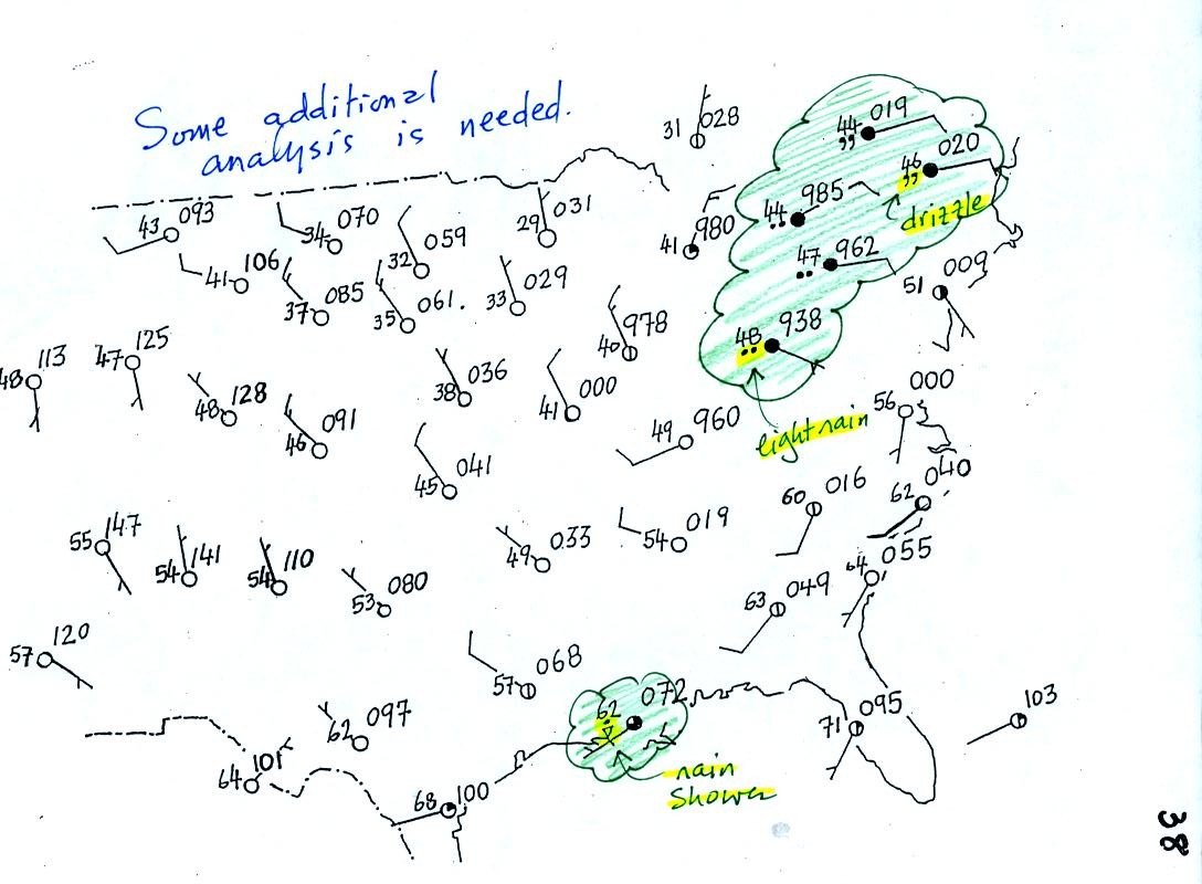
Plotting the surface weather data on a map is just the
beginning.
For example you really can't tell what is causing the cloudy weather
with rain and drizzle in the NE portion of the map above or the rain
shower at the location along the Gulf Coast. Some additional
analysis is needed. A meteorologist would usually begin by
drawing some contour lines of pressure to map out the large scale
pressure pattern. We will look first at contour lines of
temperature, they are a little easier to understand.
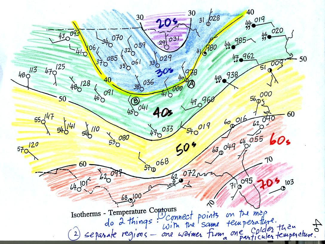
Isotherms, temperature contour lines, are drawn at 10 F
intervals.
They do two things: (1) connect points on the map that all
have the same temperature, and (2) separate regions that are warmer
than a particular temperature from regions that are colder. The
40o F isotherm highlighted in yellow above passes through
one City A reporting a temperature of exactly 40o.
Mostly it goes
between pairs of
cities: one with a temperature warmer than 40o and the other
colder
than 40o (such as near Point B).. Temperatures
generally decrease with
increasing
latitude.
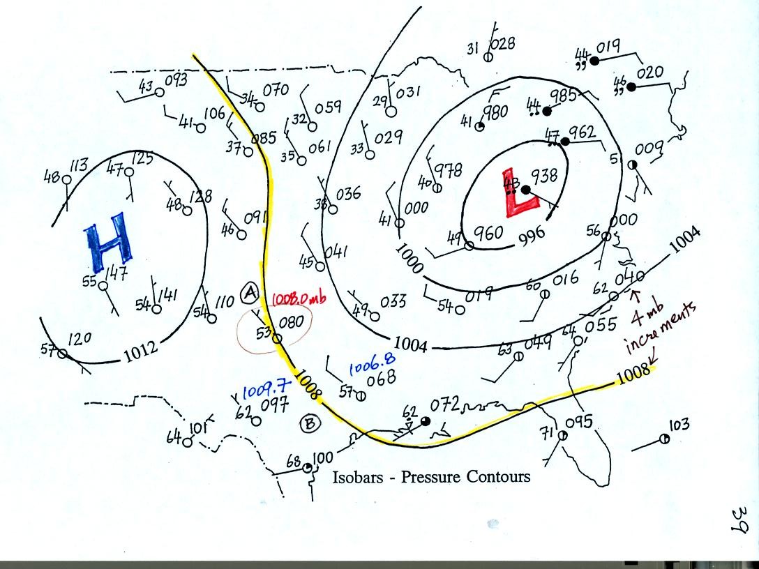
Now the same data with isobars drawn in. Again they
separate
regions with pressure higher than a particular value from regions with
pressures lower than that value.
Isobars are generally drawn at 4 mb intervals. Isobars also connect points on the map
with the same pressure. The 1008 mb isobar (highlighted in
yellow) passes through City A where the pressure is exactly
1008.0 mb. Most of the time the isobar
will pass between two
cities. The 1008 mb isobar passes between cities with pressures
of 1006.8 mb and 1009.7 mb in the vicinity of Point B. You would
expect to find 1008 mb about halfway between
those two cites, that is where the 1008 mb isobar goes.
The pattern on this map is very different from the pattern of
isotherms. On this map the main features are the circular low and
high pressure centers.
What kind of weather can you expect in the vicinity of a low pressure
center?
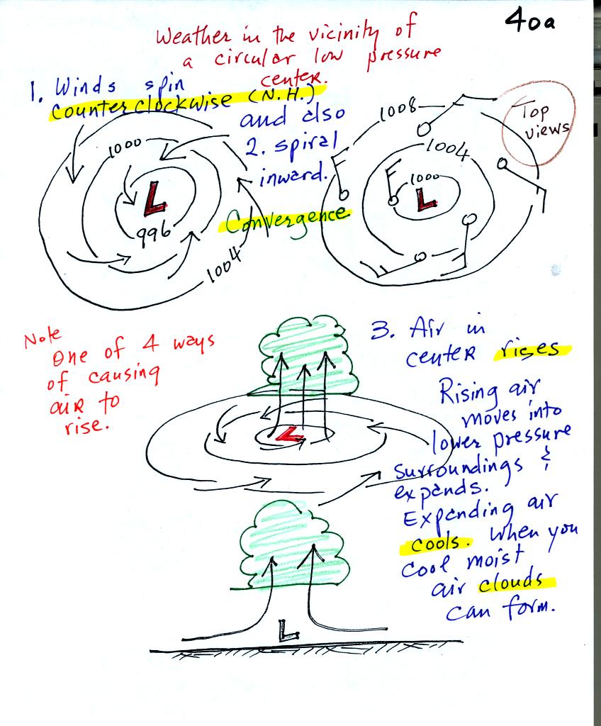
A pressure difference will first start air moving
toward low
pressure (imagine a rock sitting on a hillside that starts to roll
downhill). Then something called the Coriolis force will cause
the
wind to start to spin (we'll learn more about the Coriolis force later
in the semester). Winds spin in a counterclockwise (CCW) direction
around surface
low pressure
centers. The winds also spiral inward toward the center of the
low, this is called convergence. [winds spin clockwise around low
pressure centers in the southern hemisphere but still spiral inward]
The convergence causes the air to rise at the center of the low.
Rising air expands and cools. If the air is sufficiently moist
clouds can form and then begin to rain or snow. Thus you often
see
cloudy skies and stormy weather associated with surface low pressure.
We didn't have time to look at
what happens in the vicinity of a circular high pressure center.
Here are the notes from the other section of the class.
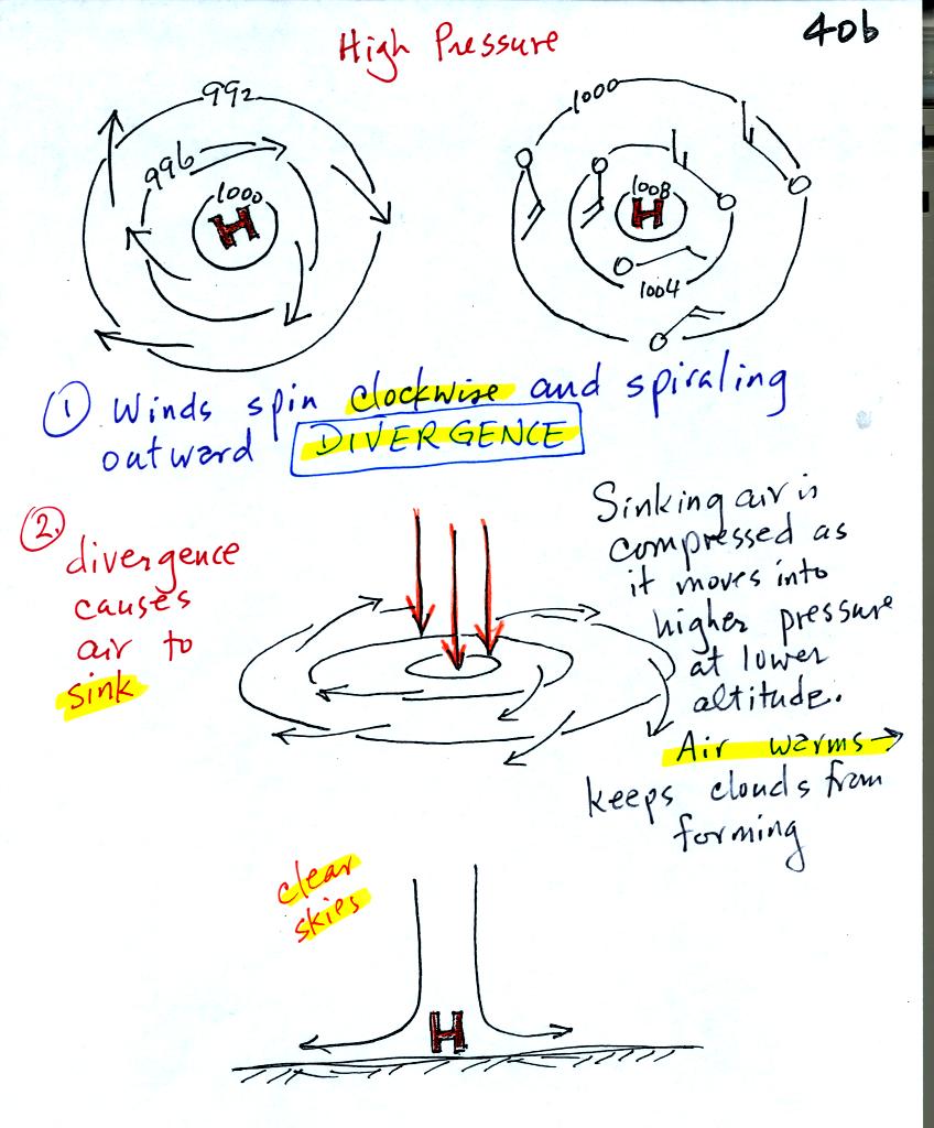
It is pretty much the opposite situation with surface high
pressure
centers. Winds spin clockwise and spiral outward. The
outward motion is called divergence. Air sinks in the center of
surface high pressure to
replace the diverging air. The sinking air is compressed and
warms. This keeps clouds from forming so clear
skies are normally found with high pressure.
Finally we
had a quick look ahead at another topic that we will be covering on
Thursday and early next week before the quiz.
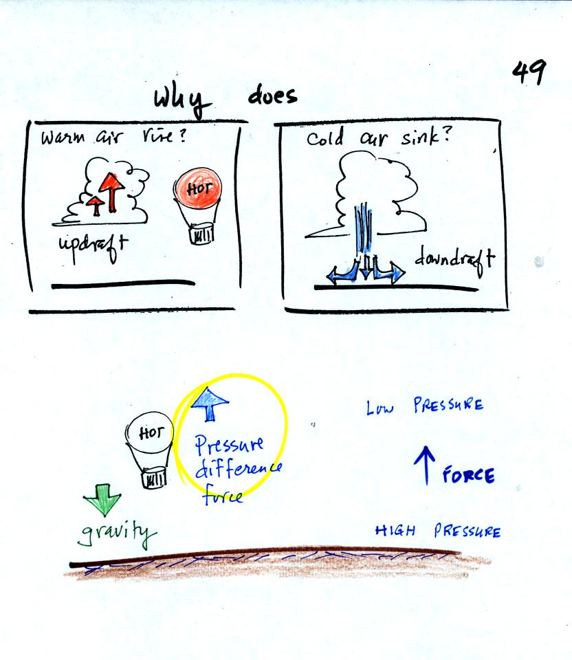
We are going to try to understand why warm air rises and cold air sinks.
It is always a good idea to have a picture in mind, a hot air balloon
for example.
Hot air balloons do sometimes fall from the sky; most everyone in the
classroom would understand that gravity was the force responsible for
bringing down a hot air balloon.
But what causes a hot air balloon to rise? We will see that it is
a pressure difference force. Pressure decreases with increasing
altitude. This creates a force that points upward from high
toward low pressure.
Understanding rising and sinking air is a 3-step process. The
first step is learning about the ideal gas law.
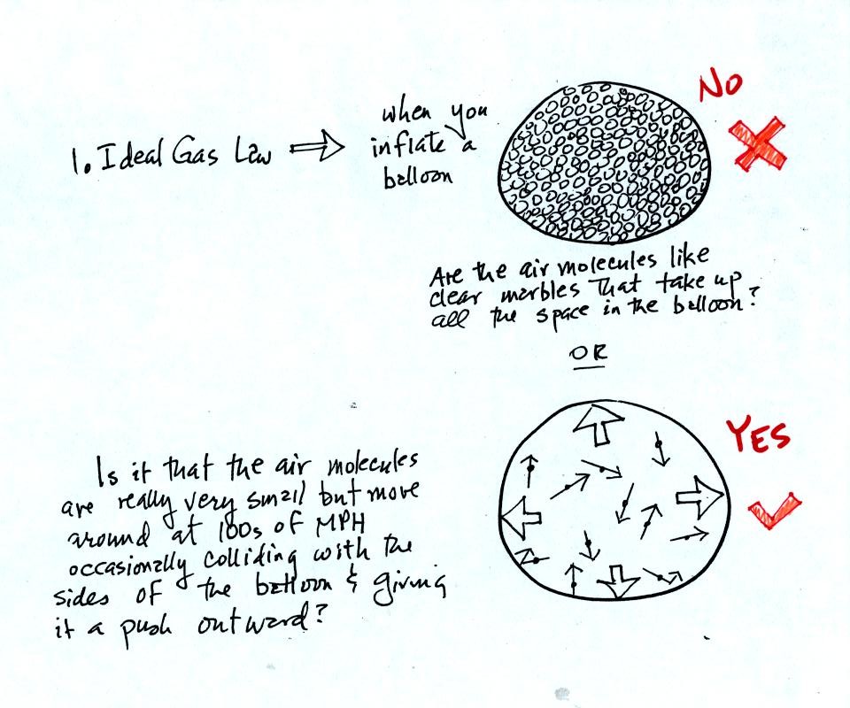
When you fill a balloon with air you don't really fill it with
air. That is the inside of the balloon is mostly empty
space. The balloon is kept inflated by the rapid motions of the
air molecules which are zipping around inside the balloon and colliding
with the walls of the balloon. The outward push from each
collision is very weak but the collisions are so numerous and frequent
that the total effect is large.
The ideal gas law equation (that we will learn about in class on
Thursday) explains how pressure depends on variables such as the volume
of the balloon, the temperature and number of air molecules in the
balloon.