Tuesday Sep. 22, 2009
click here to download today's notes in
a more printer friendly format
3 or 4 songs from Pink
Martini to start class today ("Let's Never Stop
Falling in Love," "Sympathique," "Hey Eugene," and
perhaps
"Lilly").
Pink Martini will be at the Rialto
Theatre this coming
Friday.
The Expt. #1 reports and Optional Assignment #1 were collected
today. Here are the answers to
the Optional Assignment. Materials for Expt. #2 will be
distributed this week.
Quiz #1 is on Thursday this week.
The final version of the Quiz #1 Study Guide
is available online. Quiz #1 will cover material on the Quiz #1
Study Guide and the Practice Quiz Study Guide.
Here are the answers
to the five Optional Assignment questions that were asked in class
today.
We started
by reviewing some information about the troposphere and stratosphere
that was stuck onto the end of the Thu. Sep. 17
online notes
I think we did cover Archimedes Law in class last Thursday.
Basically, you can determine whether an object will
float or sink if it is immersed in a fluid by comparing the object's
density to that of the surrounding fluid. The fluid can be a gas
like air or a liquid like water. If the object is less dense than
the fluid it will float. If it is denser than the surrounding
fluid it will sink.
There's a colorful demonstration that illustrates this.
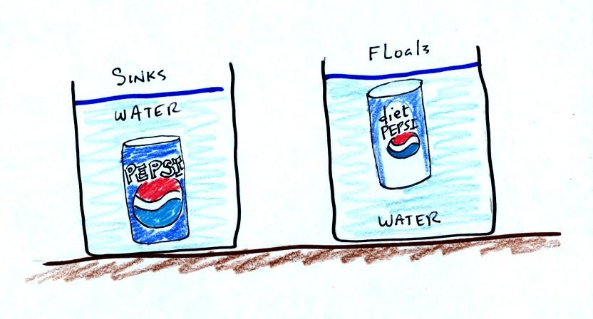
Both cans are made of aluminum which has a density almost three times
higher than water. The drink itself is largely water. The
regular Pepsi also has a lot of corn syrup, the diet
Pepsi
doesn't. The mixture of water and corn syrup has a density
greater than plain
water. There is also a little air (or perhaps carbon dioxide gas)
in each can.
The average density of the can of regular Pepsi (water & corn syrup
+
aluminum + air) ends up being slightly greater than the density of
water. The average density of the can of diet Pepsi (water +
aluminum + air) is slightly less than the density of water.
We repeated the demonstration with a can of Pabst Blue Ribbon
beer. That also floated, the beer doesn't contain any corn
syrup. So the mixture of aluminum, beer, and gas in the can has a
density slightly less than water.
In some respects people in swimming pools are like cans of regular and
diet soda. Some people float (they're a little less dense than
water), other people sink (slightly more dense than water).
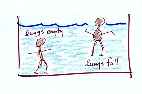
People must have a density that is about the same as water.
Next it was on to a new and completely different topic - weather
maps. We began by learning how
weather data are
entered onto surface weather maps. After the quiz we'll learn
about some of the
analyses of surface data that are done and learn a little bit about
upper-level weather charts.
Much of our weather is produced by relatively large
(synoptic scale)
weather systems. To be able to identify and characterize these
weather systems you must first collect weather data (temperature,
pressure, wind direction and speed, dew point, cloud cover, etc) from
stations across the country and plot the data on a map. The large
amount of data requires that the information be plotted in a clear and
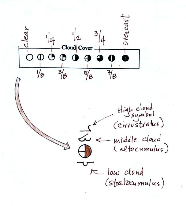
compact way. The station model notation is what meterologists
use.

A small circle is plotted on the map at the location where
the
weather
measurements were made. The circle can be filled in to indicate
the amount of cloud cover. Positions are reserved above and below
the center circle for special symbols that represent different types of
high, middle,
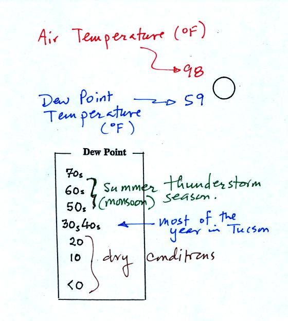
and low altitude clouds. The air temperature and dew point
temperature are entered
to the upper left and lower left of the circle respectively. A
symbol indicating the current weather (if any) is plotted to the left
of the circle in between the temperature and the dew point; you can
choose from close to 100 different weather
symbols (I distributed a handout with these symbols
). The
pressure is plotted to the upper right of the circle and the pressure
change (that has occurred in the past 3 hours) is plotted to the right
of the circle.
So
we'll work through this material one step at a time (refer to pps 36-37
in the photocopied ClassNotes).
The center circle is filled in to indicate the portion
of
the sky
covered with clouds (estimated to the nearest 1/8th of the sky) using
the code at the top of the figure. Then symbols are used to
identify the actual types of high, middle, and low altitude clouds (the
symbols can be found on the handout to be distributed in class, don't
worry about trying to learn them).
The air temperature in this example was 98o
F
(this is
plotted above and to the left of the center circle). The dew
point
temperature was 59o F and is plotted below and to the left
of the center circle. The box at lower left reminds you that dew
points are in the 30s and 40s during much of the year in Tucson.
Dew
points rise into the upper 50s and 60s during the summer thunderstorm
season (dew points are in the 70s in many parts of the country in the
summer). Dew points are in the 20s, 10s, and may even drop below
0 during dry periods in Tucson.
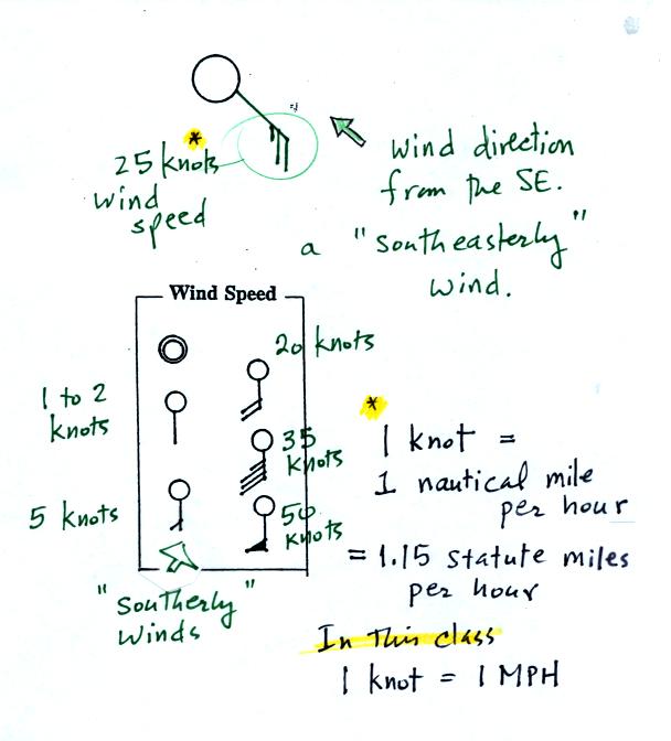
A straight line extending out from the center circle
shows the wind direction. Meteorologists always give the
direction the wind is coming from.
In this example the winds are
blowing from the SE toward the NW at a speed of 25 knots. A
meteorologist would call
these southeasterly winds. Small barbs at the end of the straight
line give the wind speed in knots. Each long barb is worth 10
knots, the short barb is 5 knots.
Knots are nautical miles per hour. One nautical mile per hour is
1.15 statute miles per hour. We won't worry about the distinction
in this class, you can just pretend that one knot is the same as one
mile per hour.
Here are some additional wind
examples that you were supposed to decode as part of the In-class
Optional Assignment.
In (a) the winds are from the NE at 5 knots, in
(b) from the
SW at 15
knots, in (c) from the NW at 20 knots, and in (d) the winds are from
the NE at 1 to 2 knots.
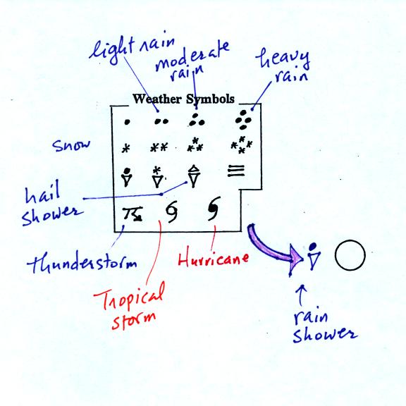
A symbol representing the weather that is currently
occurring is plotted to the left of the center circle. Some of
the common weather
symbols are
shown. There are about 100 different
weather symbols that you can choose
from (these weather symbols were on the class handout)
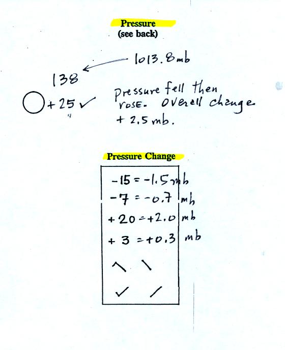
The sea level pressure is shown above and to the right
of
the center
circle. Decoding this data is a little "trickier" because some
information is missing.
Pressure change data (how the pressure has changed during
the preceding
3 hours and not covered in class)
is shown to the right of the center circle. You must
remember to add a decimal point. Pressure changes are usually
pretty small.
Here are
some links to surface weather maps with data plotted using the
station model notation: UA Atmos. Sci.
Dept. Wx page, National
Weather Service Hydrometeorological Prediction Center, American
Meteorological Society.
We haven't
learned how to decode the pressure data yet.
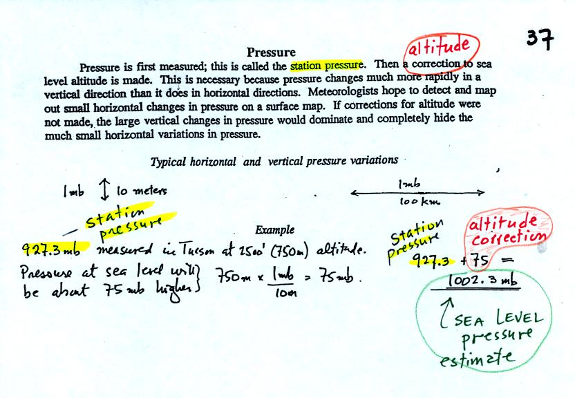
Meteorologists hope to map out small horizontal pressure
changes on
surface weather maps (that produce wind and storms). Pressure
changes much more quickly when
moving in a vertical direction. The pressure measurements are all
corrected to sea level altitude to remove the effects of
altitude. If this were not done large differences in pressure at
different cities at different altitudes would completely hide the
smaller horizontal changes.
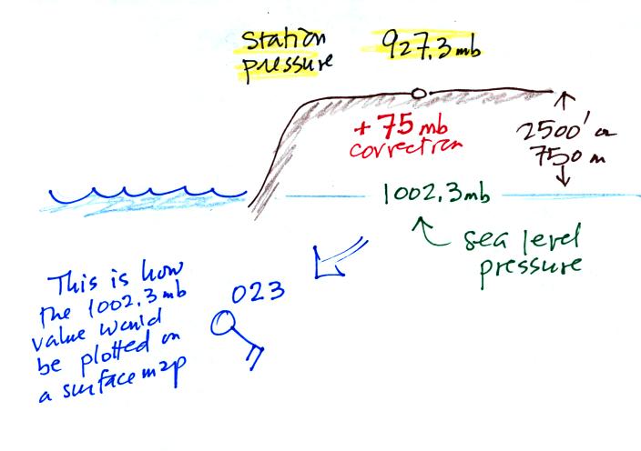
In the example above, a station
pressure value of 927.3 mb was measured in Tucson. Since Tucson
is about 750 meters above sea level, a 75 mb correction is added to the
station pressure (1 mb for every 10 meters of altitude). The sea
level pressure estimate for Tucson is 927.3 + 75 = 1002.3 mb.
This is also shown on the figure below
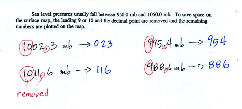
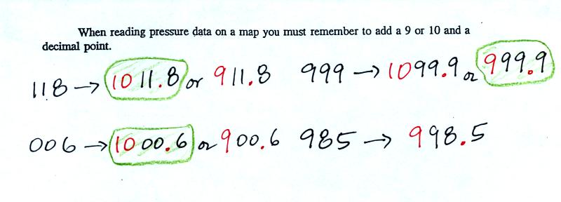
To save room, the leading 9 or 10 on the sea level pressure
value and
the decimal
point are removed before plotting the data on the map. For
example the 10 and the . in
1002.3 mb would
be removed; 023
would be plotted on the weather map (to the upper right of the center
circle). Some additional examples are shown above.
When reading pressure values off a
map you must remember to
add a 9 or
10 and a decimal point. For example
118 could be either 911.8 or 1011.8 mb. You pick the value that
falls between 950.0 mb and 1050.0 mb (so 1011.8 mb would be the correct
value, 911.8 mb would be too low).
Another
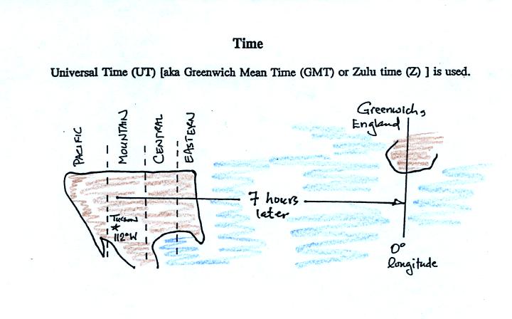
important piece of information that is included on a surface weather
map is the time the observations were collected. Time on a
surface map is converted to a universally agreed upon time zone called
Universal Time (or Greenwich Mean Time, or Zulu time).
That is the time at 0 degrees longitude. There is a 7 hour time
zone difference between Tucson (Tucson stays on Mountain
Standard Time year round) and Universal Time. You must add 7
hours to the time in Tucson to obtain Universal Time.
Here are some examples
2:45 pm MST:
first convert 2:45 pm to the 24
hour clock format 2:45 + 12:00 = 14:45 MST
then add the 7 hour time zone correction ---> 14:45
+ 7:00 = 21:45 UT (9:45 pm in Greenwich)
9:05 am MST:
add the 7 hour time zone
correction ---> 9:05 + 7:00 = 16:05 UT (4:05 pm in England)
18Z:
subtract the 7 hour time zone
correction ---> 18:00 - 7:00 = 11:00 am MST
02Z:
if we subtract the 7 hour time
zone correction we will get a negative
number.
We will add 24:00 to 02:00 UT then subtract 7 hours
02:00 + 24:00 = 26:00
26:00 - 7:00 = 19:00 MST on the previous day
2 hours past midnight in Greenwich is 7 pm the previous day in
Tucson
The following topic won't be
on this week's quiz either
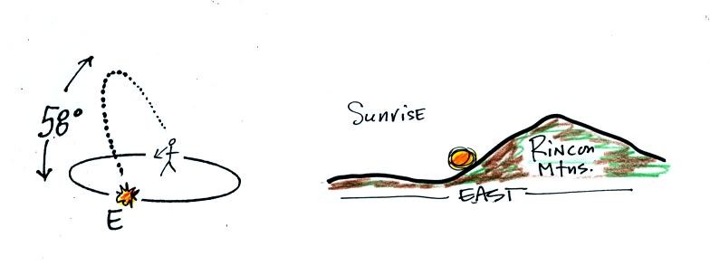
Today, Tue., Sep. 22, is the fall equinox!
On the equinoxes, the sun rises exactly in the east and
sets
exactly in the
west. The picture below shows the position of the sun at sunrise
(around 6:30 am on the spring and fall equinox in Tucson).
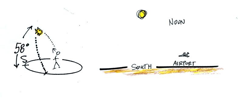
At noon you need to look about 60 degrees above the southern
horizon to see the sun
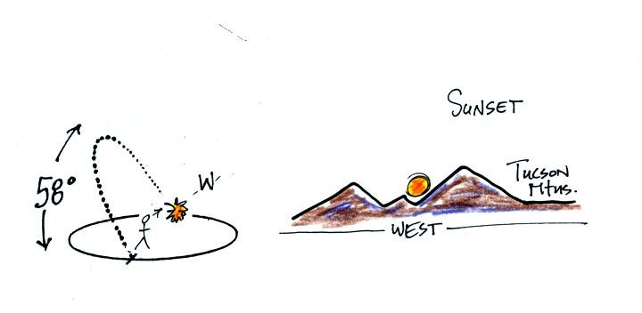
The sun sets exactly in the west at around 6:30 pm on the
equinoxes in Tucson
Even though this is the 8 am class and you are up much earlier
than many of my 2 pm students, most of you are more likely to see the
sun set (perhaps) than see the
sun
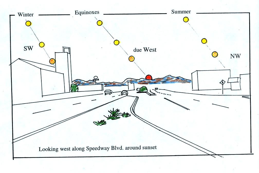
rise. The figure below shows you about what you would see if you
looked west on Speedway (from Treat Ave.) at sunset. In the
winter the sun will set south of west, in the summer north of west
(probably further south and north than shown here). On the
equinoxes the sun sets exactly in the west.
If you aren't careful, you can get yourself seriously
injured, even killed,
on
or around the equinoxes. Can you figure out how
that might happen?
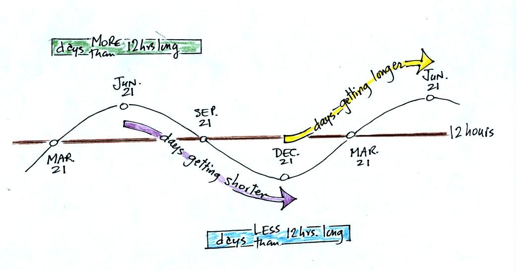
June 21, the summer solstice, is the longest day
of the
year (about 14 hours of daylight in Tucson). The days have slowly
been getting shorter all semester. This will continue up until Dec. 21,
the winter solstice, when there will be about 10 hours of
daylight. After that the days will start to shorten as we make
our way back to
the summer solstice.
The length of the day changes most rapidly on the equinoxes. The
fall equinox is on Sep. 22 this year.