Thursday Jan. 19, 2006
A few remaining sets of Experiment #1 materials were distributed in
class. A couple of handouts that discussed the Donora,
Pennsylvania air pollution disaster and SO2 pollution in
Russia were
distributed in class.
A couple
more things concerning increasing carbon dioxide concentrations and its
possible effect on climate (you might want to refer back to the last
paragraph in the class notes from Jan. 17.

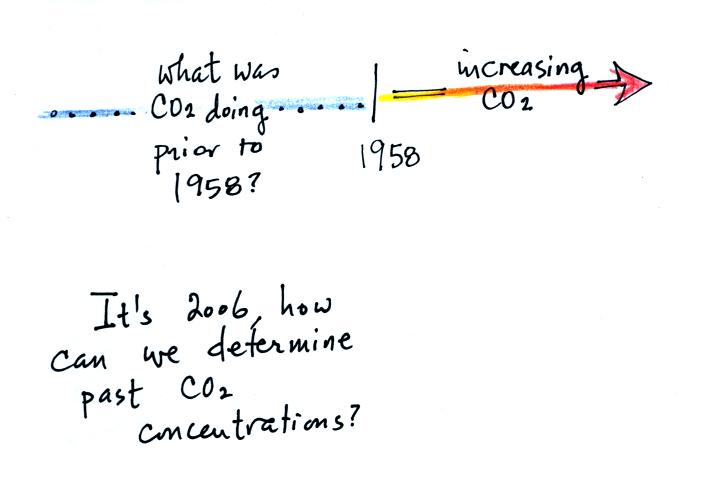
The Keeling curve shows us that the atmospheric CO2
concentration has
been increasing since 1958. What was happening before that?
How can we determine atmospheric concentrations in the past anyways?

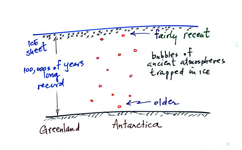
Ice has been accumulating in Antarctica and Greenland for
hundreds of
thousands
perhaps millions of years. The ice sheets are two miles thick in
some locations. As this ice was deposited (in the form of snow)
small volumes of the ancient atmosphere were also trapped in bubbles in
the ice. Scientists have drilled into the ice sheets and removing
cores of ice. They have then been able to extract and analyze the
gases in the bubbles. They are actually able to measure CO2
concentrations in past atmospheres.
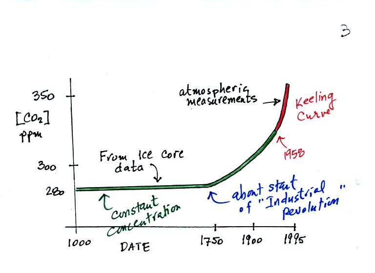
A small portion of what they have found is shown in the following
figure (the top of p. 3 in the photocopied notes).

The red portion of the graph above shows the Keeling curve
measurements
that were made starting in 1958. The green portion shows CO2
concentration measurements based on ice cores. You can see that
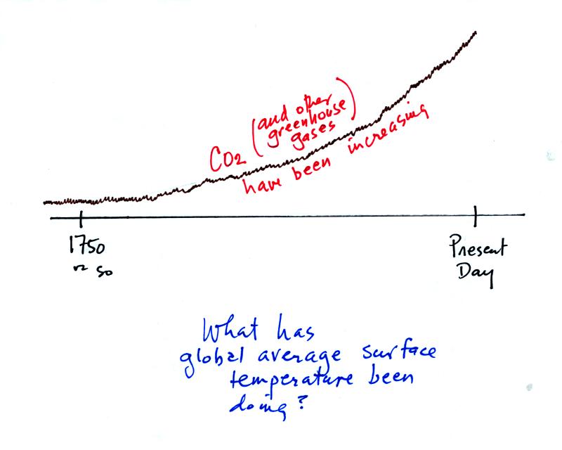
CO2 concentration was fairly constant up until 1750 or
so. That
is about the time of the start of the "Industrial Revolution."
Burning fossil fuels to power machines and factories began adding
larger amounts of CO2 to the atmosphere.
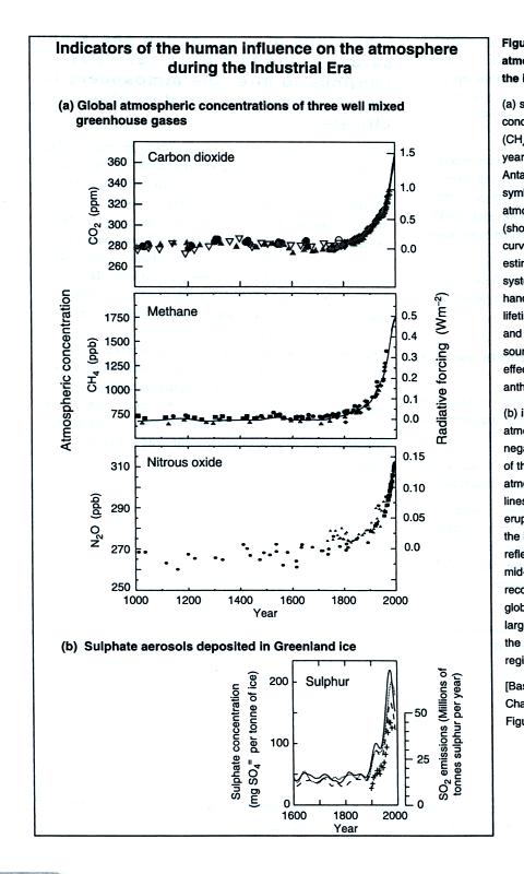
The figure below shows that other greenhouse gases (methane [CH4]
and
nitrous oxide [N2O]) have also been increasing since the
start of the
industrial revolution.

This figure is from "Climate Change 2001: The Scientific
Basis,"
published by the Intergovernmental Panel on Climate Change
(www.ipcc.ch).

OK if greenhouse gas concentrations have been increasing
since about
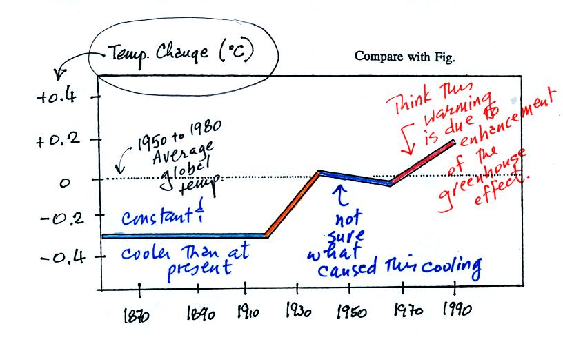
1750, What has the global average surface temperature been doing during
this same time period? The overall change in shown on the bottom part
of p. 3 in the photocopied notes.

This figure doesn't show the average temperature rather how
the average
temperature has changed
over the past 130 or 140 years. The
change is relative to the 1950 to 1980 30-year average (the dotted
line). Between 1860 and about 1920 the global average temperature
was about 0.3o C cooler than the 1950 to 1980 average.
The
temperature rose between 1920 and 1940. The 1940 to 1970 section
is somewhat puzzling. The exact cause of this slight cooling is
unknown. Temperatures have increased from 1970 to the present
day. Many scientists think that this second period of warming can
be attributed to increasing greenhouse gas concentrations.
Detecting such a small overall change in temperature for the earth is
difficult. Instruments and locations at which measurements were
made have changed (imagine how Tucson has changed in the last 130 years
or so). There is also a considerable amount of year to year
variation. About 70% of the earth is covered by oceans and
measurements over oceans are more difficult to make.
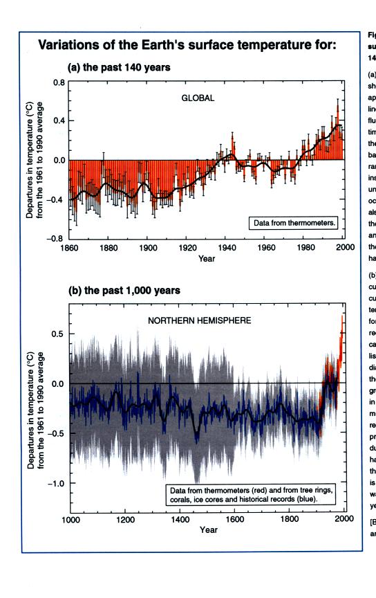
The graph above was smoothed to show the overall change. The top
figure below shows the actual year to year variation (red bars) and
gives you an idea of the uncertainly in the yearly average temperature
measurements (black vertical lines).

The lower curve shows estimates of global average surface
temperature
for times before 1860. This is more difficult. This is not
based on actual measurements of temperature. We can't
directly measure the temperature of the air trapped in the bubbles of
polar ice (like can be done with CO2 concentration), the
temperature
has changed. Scientists have come up with other techniques to try
to indirectly determine temperatures in the past. We will
probably discuss some of this work later in the semester. [These
two figures are also from the Intergovernmental Panel on Climate Change
report].
In the
remainder of the class today and during the first part of next
Tuesday's class we will learn about two more pollutants: tropospheric
ozone and carbon monoxide.

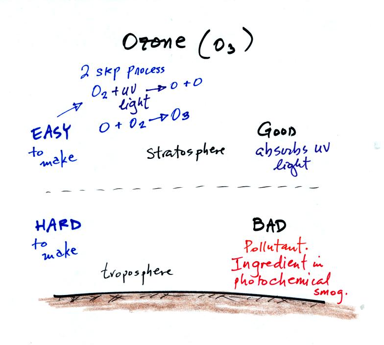
Ozone has a kind of "Dr. Jeckell and Mr Hyde personality."
Stratospheric ozone is beneficial because it absorbs dangerous
high-energy ultraviolet light. Tropospheric ozone is bad, it is a
pollutant.. It is also a key ingredient in photochemical
smog.
We will try to make some photochemical smog later in a class
demonstration. That will require ozone. We will make use of
the relatively simple stratospheric process for making ozone (see 2
step process above). As we will see a more complex series of
reactions is used in the troposphere.
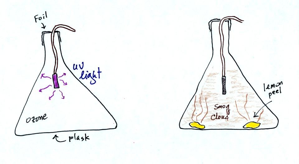
At this
point a small mercury vapor lamp was inserted into a large 4 liter
flask. The lamp emits a lot of ultraviolet radiation and is used
to produce ozone inside the flask. The flask was sealed with foil
so that the ozone couldn't escape. The glass walls of the flask
should absorb the dangerous UV radiation. But just to play it
safe the flask was covered with a black cloth. The ozone will be
used later in the class to make photochemical smog.

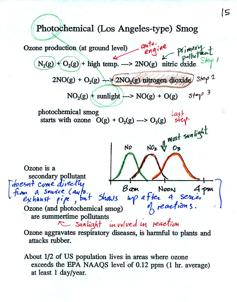
The production of tropospheric ozone begins with nitric oxide
(NO). NO is produced when nitrogen and oxygen are heated (in an
automobile engine for exampe) and react. The NO can then react
with oxygen to make nitrogen dioxide, a poisonous brown-colored
gas. Sunlight can dissociate (split) the nitrogen dioxide
molecule producing atomic oxygen (O) and NO. O and O2
react (just
as they do in the stratosphere) to make ozone (O3).
Because ozone
does not come directly from an automobile tailpipe or factory chimney,
but only shows up after a series of reactions, it is a secondary
pollutant. The nitric oxide would be an example of a
primary pollutant.
NO is produced early in the day. The concentration of NO2
peaks
somewhat later. Peak ozone concentrations are usually found in
the afternoon. Ozone concentrations are also usually higher in
the summer than in the winter. This is because sunlight plays a
role in ozone production and summer sunlight is more intense than
winter sunlight.

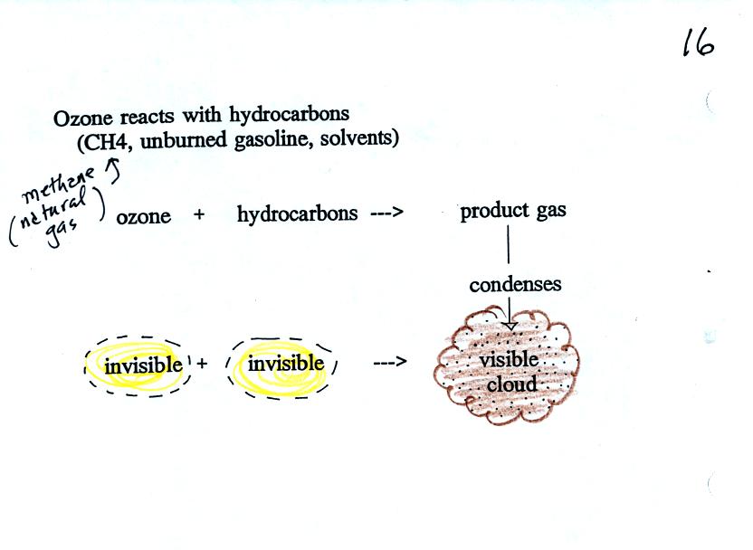
Ozone reacts with a hydrocarbon of some kind to make a product
gas. This product gas sometimes condenses to make a visible smog
cloud or haze.
The class demonstration of photochemical smog is summarized
below. We begin by using the UV lamp to fill the flask with
ozone. Then a few pieces of fresh lemon peel were added to the
flask. A whitish cloud quickly became visible (colored brown in
the figure below).

We next
briefly discussed the first experiment. With the experiment
materials students instructions concerning the experiment and also the
report they will write about the experiment.

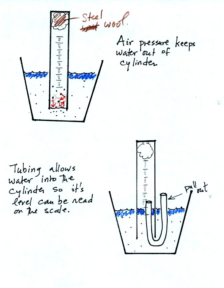
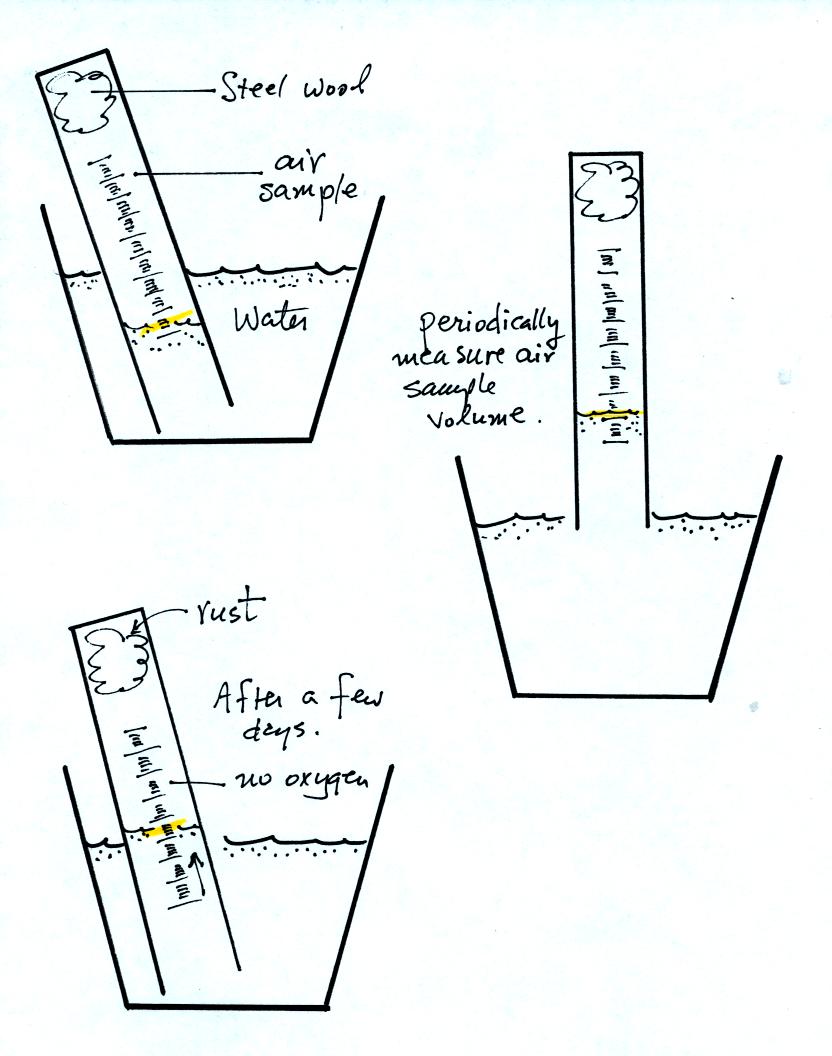
The object of Experiment #2 is to measure the percentage oxygen
concentration in the air. A moist piece of steel wool is stuck
into a graduated cylinder and the open end of the cylinder is immersed
in a cup of water. Note water won't just enter the cylinder when
you try to immerse it. Air pressure keeps the water out.
You must first insert a piece of flexible tubing into the cylinder
(half inside half outside) and then immerse the cylinder. Lower
it until the water level can just be read on the cylinder scale then
remove the tubing. The experiment is underway.

Oxygen in the air inside the cylinder will react with the steel wool to
make rust. Oxygen is removed from the air sample. As this
occurs the water level will gradually rise (you should explain in your
report why removal of the oxygen causes the water level to
change). Eventually the water level will stop rising, this
indicates that all of the oxygen has been used up and that the
experiment is over.

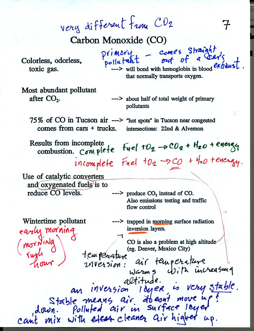
Carbon monoxide (CO) is a colorless, odorless, toxic gas. It is a
primary pollutant that results from incomplete combustion (complete
combustion would produce carbon dioxide). The highest CO
concentrations are observed on winter mornings. CO is trapped in
stable morning surface inversion layers.
