Thursday Sept. 14, 2006
The first of the optional assignments was collected today. These
will be returned in class next Tuesday. Answers
to the optional assignment questions are available online.
Quiz #1 is next Thursday (Sept. 21). A preliminary version of the
Quiz #1 Study Guide is now available
online. Note the quiz next week will cover material on both the Practice Quiz Study Guide and the Quiz #1
Study Guide.
We'll
start some new material today. We'll learn how weather data is
entered onto surface weather maps and learn about some of the analyses
of this data that are done. We'll also have a brief look at upper
level weather maps next Tuesday.
Much of our weather is produced by relatively large
(synoptic scale)
weather systems. To be able to identify and characterize these
weather systems you must first collect weather data (temperature,
pressure, wind direction and speed, dew point, cloud cover, etc) from
stations across the country and plot the data on a map. The large
amount of data requires that the information be plotted in a clear and
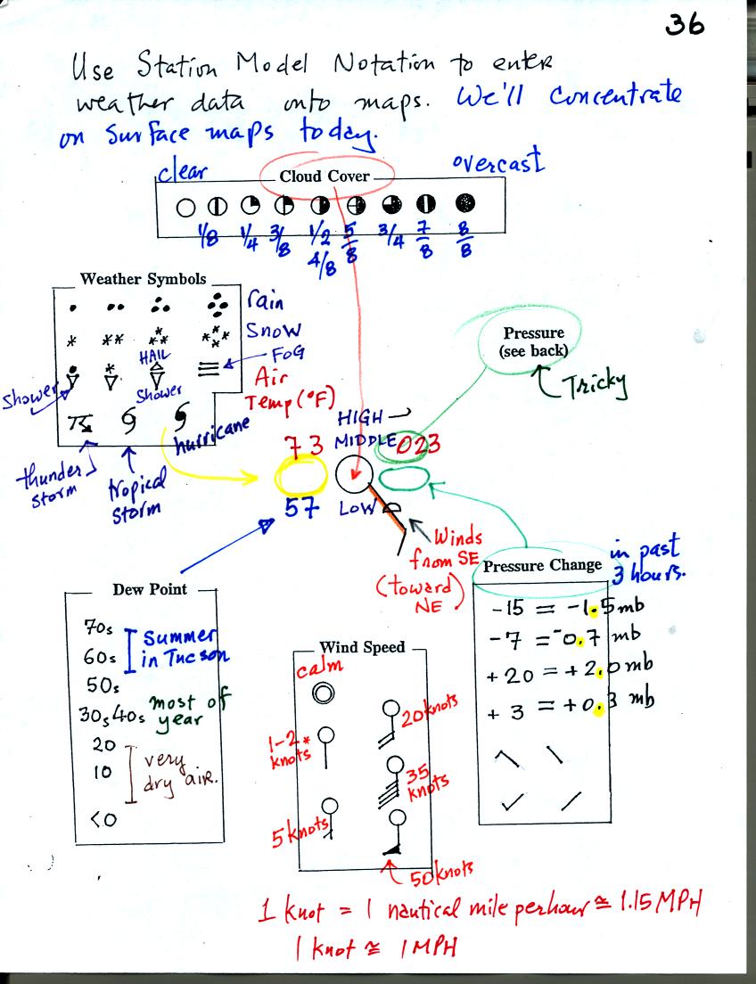
compact way. The station model notation is what meterologists
use.

The figure above wasn't shown in
class.
A small circle is plotted on the map at the location where the weather
measurements were made. The circle can be filled in to indicate
the amount of cloud cover. Positions are reserved above and below
the center circle for special symbols that represent different types of
high, middle,
and low altitude clouds. The air temperature and dew point
temperature are entered
to the upper left and lower left of the circle respectively. A
symbol indicating the current weather (if any) is plotted to the left
of the circle in between the temperature and the dew point. The
pressure is plotted to the upper right of the circle and the pressure
change (that has occurred in the past 3 hours) is plotted to the right
of the circle.
Now we'll look at the example studied in class.
Starting at the top of the page you can see the symbols used to
indicate the cloud cover. You leave the circle blank is the skies
are clear. You fill in the circle completely if the skies are
overcast. The symbols for 1/4, 1/2, and 3/4 are pretty
straightforward.
The air temperature in this example was 73o F and the dew
point
temperature was 57o F. Some of the common weather
symbols are
shown.
You can start to understand how the wind speed and direction are
plotted. A straight line extending out from the center circle
shows the wind direction. Meteorologists always give the
direction the wind is coming from. In this example the winds are
blowing from the SE toward the NW. A meteorologist would call
these southeasterly winds. Small barbs at the end of the straight
line give the wind speed in knots. Here are some additional wind
examples (that weren't shown in class):

In (a) the winds are from the NE at 5 knots, in (b) from the SW at 15
knots, in (c) from the NW at 20 knots, and in (d) the winds are from
the NE at 1 to 2 knots.
The pressure data is a little "tricky," we'll look at what is done
there on the next page.
With the pressure change data you must remember to insert a decimal
point.

Meteorologist hope to map out small horizontal pressure
changes on
surface weather maps. Pressure changes much more quickly when
moving in a vertical direction. The pressure measurements are all
corrected to sea level altitude to remove the effects of
altitude. If this were not done large differences in pressure at
different cities at different altitudes would completely hide the
smaller horizontal changes..
The leading 9 or 10 on the sea level pressure value and the decimal
point are removed before plotting the data on the map. For
example the 10 and the . in 1002.3 mb would be removed; 023
would be plotted on the weather map (to the upper right of the circle).
When reading pressure values off a map you must remember to add a 9 or
10 and a decimal point. For example
128 could be either 912.8 mb or 1012.8 mb. You pick the value
that falls between 950.0 mb and 1050.0 mb, the usual range of sea level
pressure values. Thus the correct pressure in this case would be
1012.8 mb.
Time on a surface weather map is usually given in Universal Time.
There is a 7 hour time zone difference between Tucson (Mountain
Standard Time year round) and Universal Time.
Here are some links to surface weather maps with data plotted using the
station model notation: UA Atmos. Sci.
Dept. Wx page, National
Weather Service Hydrometeorological Prediction Center, American
Meteorological Society.

Plotting the surface weather data on a map is just the
beginning.
For example you really can't tell what is causing the cloudy weather
with rain and drizzle in the NE portion of the map above or the rain
shower at the location along the Gulf Coast. Some additional
analysis is needed. A meteorologist would usually begin by
drawing some contour lines of pressure to map out the large scale
pressure pattern. We will look first at contour lines of
temperature, they are a little easier to understand.

Isotherms, temperature contour lines, are drawn at 10 F
intervals.
They do two things: (1) connect points on the map that all
have the same temperature, and (2) separate regions that are warmer
than a particular temperature from regions that are colder. The
60o F isotherm highlighted in yellow above passes through
one city
reporting a temperature of exactly 60o. Mostly it goes
between pairs of
cities: one with a temperature warmer than 60o and the other
colder
than 60o. Temperatures generally decrease with
increasing
latitude.
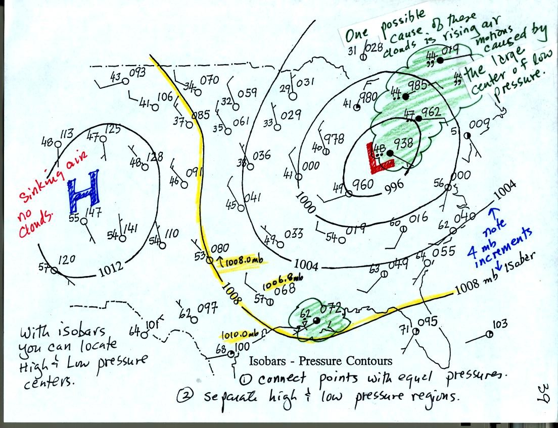
Now the same data with isobars drawn in. Again they separate
regions with pressure higher than a particular value from regions with
pressures lower than that value.
Isobars are generally drawn at 4 mb intervals. Isobars also connect points on the map
with the same pressure. The 1008 mb isobar (highlighted in
yellow) passes through a city where the pressure is exactly
1008.0 mb. Most of the time the isobar will pass between two
cities. The 1008 mb isobar passes between cities with pressures
of 1006.8 mb and 1010.0 mb highlighted in yellow. You would
expect to find 1008 mb about halfway between
those two cites, that is where the 1008 mb isobar goes.
Next we'll look at what you can expect to see in the vicinity of
centers of Low and High pressure. By the way, two more questions
have been added to the hidden optional
assignment.

The winds blowing around a surface center of low pressure are shown
above. In the top view at upper left the winds are shown with
arrows. The winds are shown using the station model notation in
the top view at upper right.

Surface winds converge into surface low pressure
centers. The air
in the center of the low rises. Rising air cools. Cooling
is what you need to make clouds. Thus cloudy stormy weather is
found with surface lows.
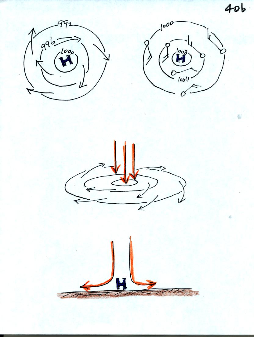
The winds associated with a surface center of high pressure.
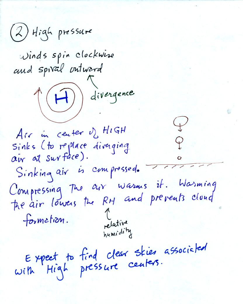
Surface winds spin clockwise and spiral outward away from surface
centers of high pressure. Air from higher in the atmosphere sinks
in the center of the high to replace the diverging air at the
surface. Sinking air is compressed and warms. This keeps
clouds from forming and you generally find clear skies with surface
high pressure.