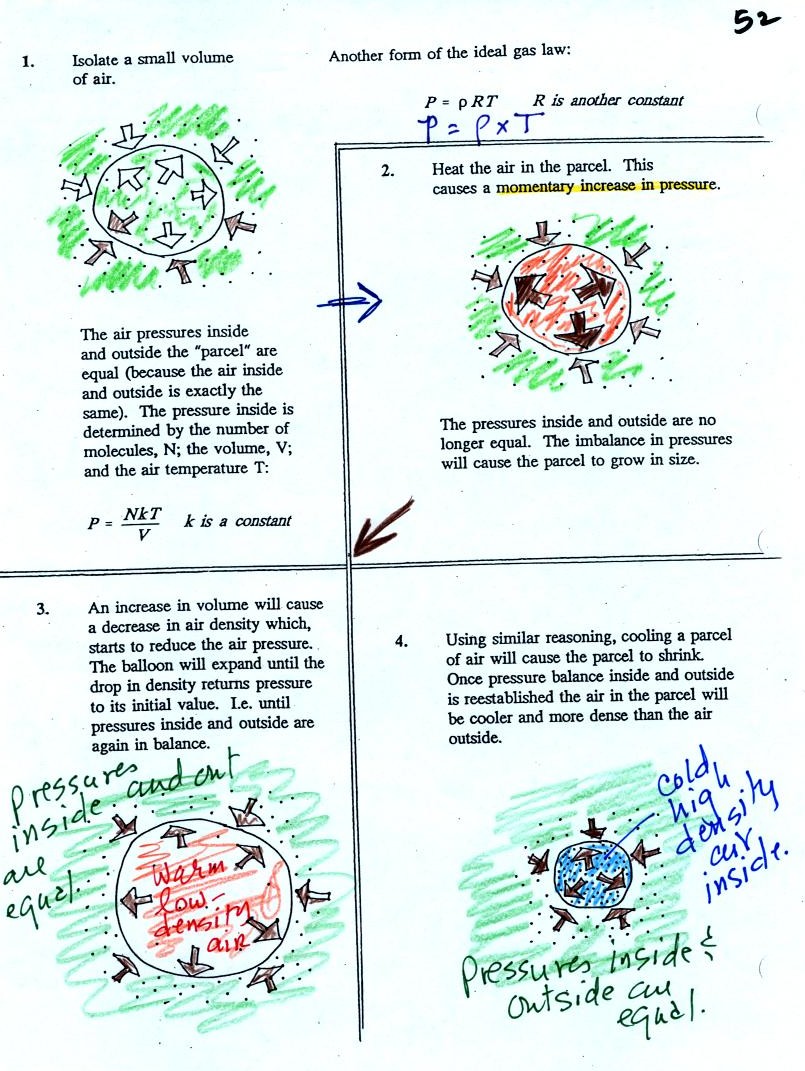
Read through the explanation on p.
52 in the photocopied
Classnotes.
These two associations:
(i) warm air = low
density air
(ii) cold air = high density air
are important and will come up a lot during the remainder of the
semester.
Click here if you would like a little
more detailed, more step-by-step,
explanation of Charles Law. Otherwise proceed on to the Charles'
Law demonstration that we did in class.
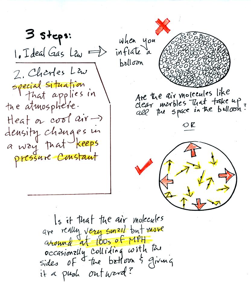
Charles Law can be demonstrated by dipping a balloon in
liquid
nitrogen. You'll find an explanation on the top of p. 54 in the
photocopied ClassNotes.
The balloon had shrunk down to practically no volume when
pulled from the liquid nitrogen. It was filled with cold high
density air. As
the balloon warmed the balloon expanded and the density of the air
inside
the balloon decreased. The volume and temperature kept changing
in a way that kept pressure constant.
Here's a summary
Now for one of those abrupt
transitions from one topic to another, completely different, topic
that sometimes occurs in NATS 101. This might be a good time to
go outside for a smoke, or a drink, or a stretch, or maybe just a good
yell.
We're well into the semester and are now ready to move into
the
last part of Chapter 1. I hope you aren't too unhappy with the
slow
progress we're making (if you are you can send me an email and let me
know about it).
This
week and early next week we'll learn how
weather data are
entered onto surface weather maps and learn about some of the analyses
of the data that are done and what they can tell you about the
weather. We will also (time permitting) have a brief look at
upper
level (higher altitude) weather maps.
Much of our weather is produced by relatively large
(synoptic scale)
weather systems. To be able to identify and characterize these
weather systems you must first collect weather data (temperature,
pressure, wind direction and speed, dew point, cloud cover, etc) from
stations across the country and plot the data on a map. The large
amount of data requires that the information be plotted in a clear and
compact way. The station model notation is what meterologists
use (you'll find the station model notation discussed in Appendix C,
pps 525-529, in
the textbook).

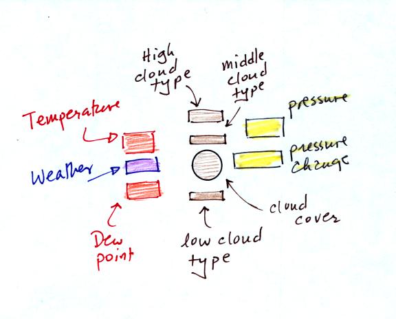
A small circle is plotted on the map at the location where
the
weather
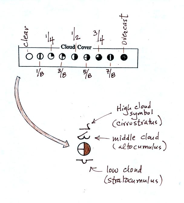
measurements were made. The circle can be filled in to indicate
the amount of cloud cover. Positions are reserved above and below
the center circle for special symbols that represent different types of
high, middle,
and low altitude clouds (I didn't mention these in class but they are
in the textbook). The air temperature and dew point
temperature are entered
to the upper left and lower left of the circle respectively. A
symbol indicating the current weather (if any) is plotted to the left
of the circle in between the temperature and the dew point (you can
choose from close to 100 different weather
symbols included in the textbook ). The
pressure is plotted to the upper right of the circle and the pressure
change (that has occurred in the past 3 hours) is plotted to the right
of the circle.
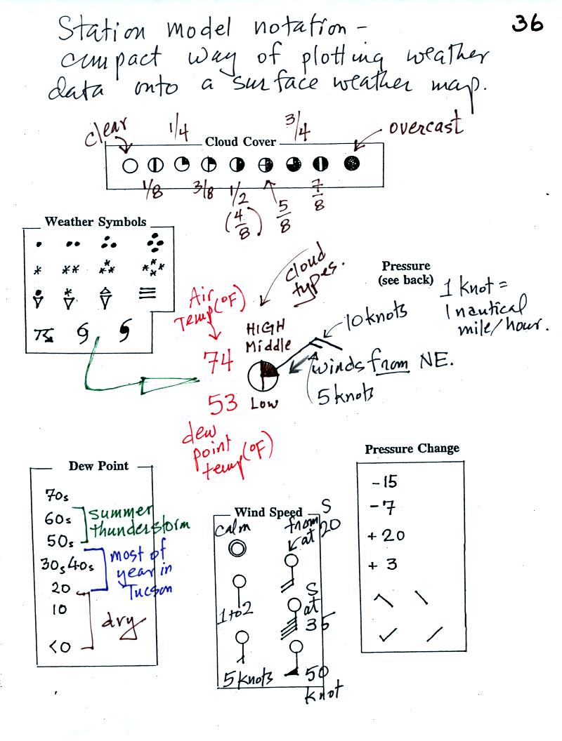
Here's the actual example we started
on in class.

This is frankly a mess and would be very hard to unscramble if you are
seeing it for the first time. So we'll work through another
example one step at a time.
The center circle is filled in to indicate the portion
of
the sky
covered with clouds (estimated to the nearest 1/8th of the sky) using
the code at the top of the figure. Then symbols (not drawn in class) are used to
identify the actual types of high, middle, and low altitude clouds (the
symbols can be found in Appendix C in the textbook).
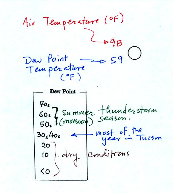
The air temperature in this example was 98o
F
(this is
plotted above and to the left of the center circle). The dew
point
temperature was 59o F and is plotted below and to the left
of the center circle. The box at lower left reminds you that dew
points are in the 30s and 40s during much of the year in Tucson.
Dew
points rise into the upper 50s and 60s during the summer thunderstorm
season (dew points are in the 70s in many parts of the country in the
summer). Dew points are in the 20s, 10s, and may even drop below
0 during dry periods in Tucson.
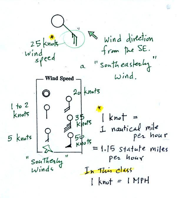
A straight line extending out from the center circle
shows the wind direction. Meteorologists always give the
direction the wind is coming from.
In this example the winds are
blowing from the SE toward the NW at a speed of 25 knots. A
meteorologist would call
these southeasterly winds. Small barbs at the end of the straight
line give the wind speed in knots. Each long barb is worth 10
knots, the short barb is 5 knots.
Knots are nautical miles per hour. One nautical mile per hour is
1.15 statute miles per hour. We won't worry about the distinction
in this class, you can just pretend that one knot is the same as one
mile per hour.
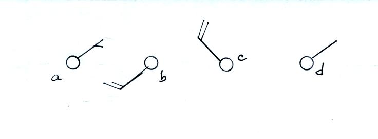
Here are some additional wind
examples that weren't shown
in
class:
In (a) the winds are from the NE at 5 knots, in
(b) from the
SW at 15
knots, in (c) from the NW at 20 knots, and in (d) the winds are from
the NE at 1 to 2 knots.
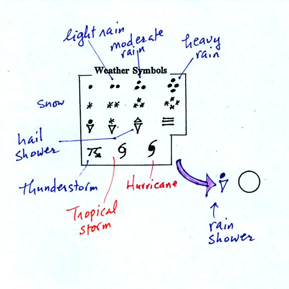
A symbol representing the weather that is currently
occurring is plotted to the left of the center circle. Some of
the common weather
symbols are
shown. There are about 100 different
weather symbols that you can choose
from.
The sea level pressure is shown above and to the right
of
the center
circle. Decoding this data is a little "trickier" because some
information is missing. We'll learn about decoding the pressure
in class on Friday.
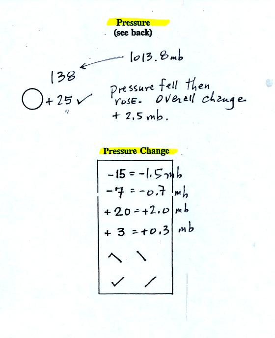
Pressure change data (how the pressure has changed during
the preceding
3 hours and not covered in class)
is shown to the right of the center circle. You must
remember to add a decimal point. Pressure changes are usually
pretty small.
Here are
some links to surface weather maps with data plotted using the
station model notation: UA Atmos. Sci.
Dept. Wx page, National
Weather Service Hydrometeorological Prediction Center, American
Meteorological Society.


