Monday Feb. 9, 2009
click here to download today's notes in
a more printer friendly format
Umm, some music today from Pink Martini.
The Experiment #1 reports were collected today. It will probably
take at least a week to get the reports graded.
The materials for Expt. #2 should be available in class on Wednesday or
Friday this week.
The day
has started out well: I successfully got one of
my two cats, the wilder of the two, to the vet (for shots) and safely
back home this morning.
And what I call a Cosmic Convergence of Events might just be underway.
I was feeling so good that I decided an In-Class Optional Assignment
seemed appropriate. Here
are the answers to the assignment.
Today is the Full Moon. Did you know that every month's Full Moon
has a name?
I certainly didn't, one of my NATS 101 students from last semester
turned me on to that fact. The January full moon was the "wolf
moon."
The January full moon was the biggest full moon that we'll have in 2009
and rivaled the Dec., 2008 perigee moon (click here
for more details). Here are a couple of (not so good) haiku poems
about the Jan. wolf moon:
Cold dark morning sky
Silhouettes on the full moon
Are they trees or wolves?
On the horizon
The wolf moon is running from
The approach of dawn
There was a chance that we might see snow in Tucson early Tuesday
morning.
What do you think February's full moon is called? It's called the
"snow moon." Doesn't that seem like an odd coincidence?
Rather than write another haiku poem I drew a picture of the snow moon:
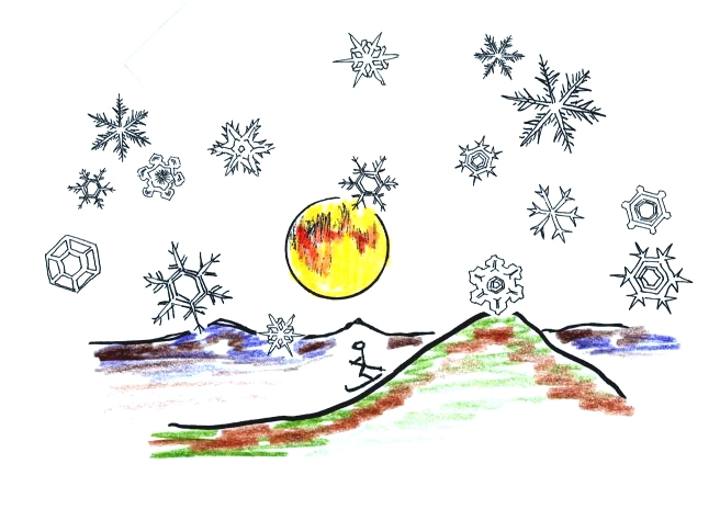
Snow on the ground in Tucson is pretty rare. Here's a picture
from the Arizona Daily Star.
Last Friday we looked at how the relative strengths of the
downward graviational force and the upward pressure difference force
determine whether a parcel of air will rise or sink. Archimedes
Law is another way of trying to understand the situation.
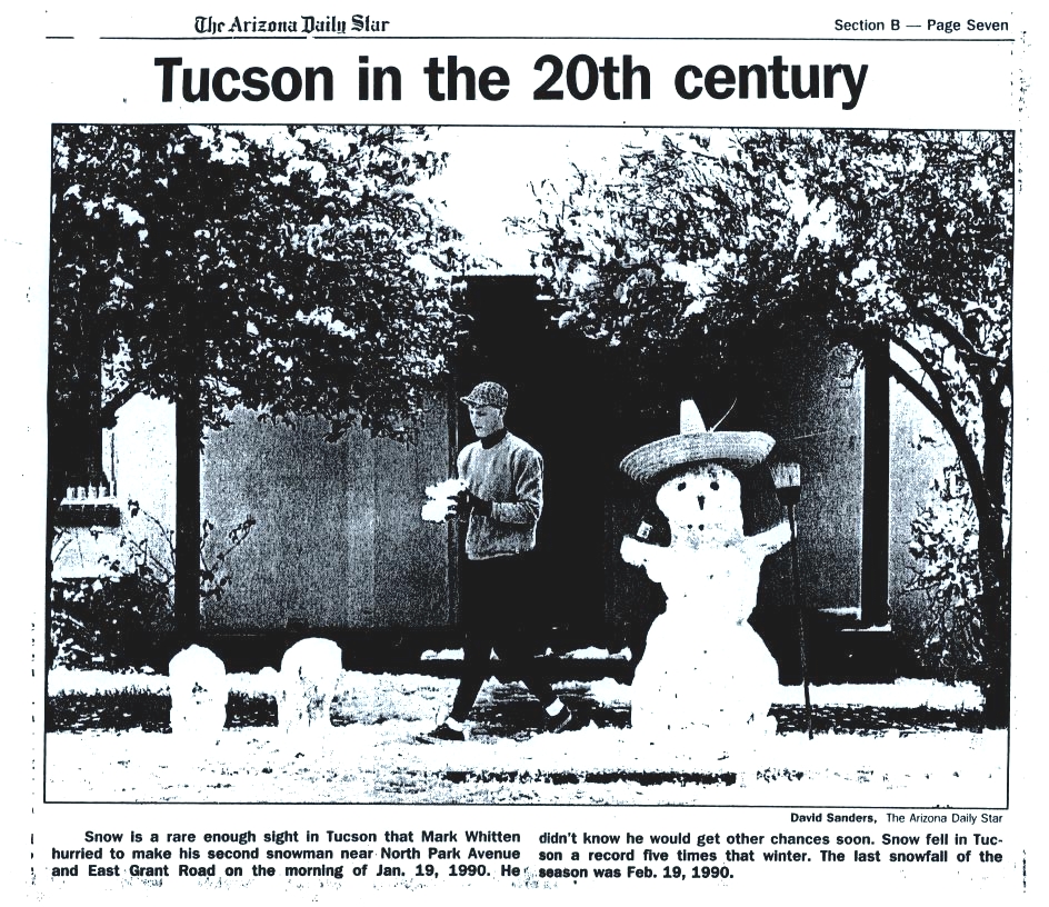
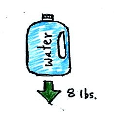
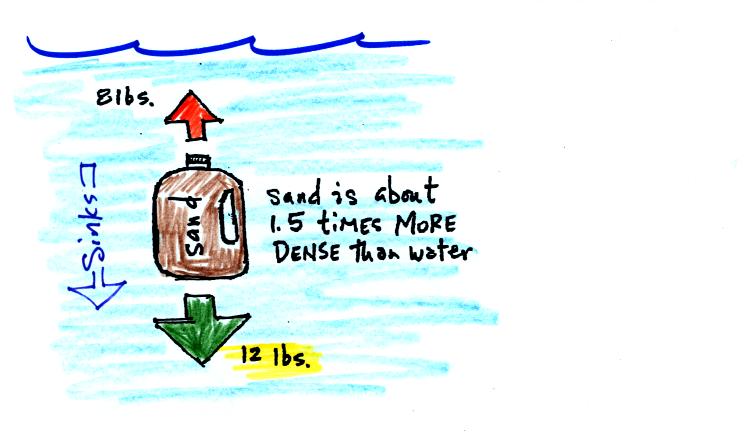
A gallon of water weighs about 8 pounds (lbs).
If you submerge a 1 gallon jug of water in a swimming pool, the jug
becomes, for all intents and purposes, weightless. Archimedes'
Law (see figure below) explains why this is true.
The upward bouyant force is really just another name for the
pressure difference force covered on Wednesday (higher pressure pushing
up on the bottle and low pressure at the top pushing down, resulting in
a net upward force). A 1 gallon bottle will displace 1 gallon of
pool water. One
gallon of pool
water weighs 8 pounds. The upward bouyant force will be 8 pounds,
the same as the downward force on the jug due to gravity. The two
forces are equal and opposite.
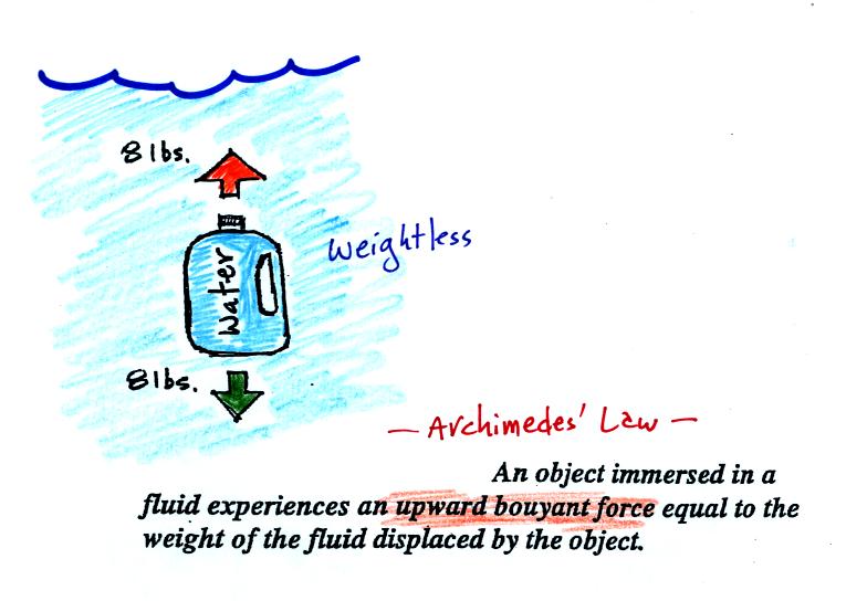
Now we imagine pouring out all the water and filling the 1 gallon jug
with air. Air is about 1000 times less dense than water; the jug
will weigh practically nothing.
If you submerge the jug in a pool it will displace 1 gallon of
water
and experience an 8 pound upward bouyant force again. Since there
is no downward force the jug will float.
One gallon of sand (which is about 1.5 times denser than water) jug
will weigh 12 pounds.
The jug of sand will sink because the downward force is greater
than
the upward force.
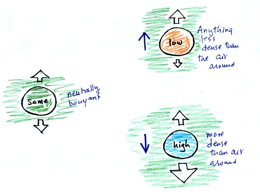
You can sum all of this up by saying anything that is less dense than
water will float in water, anything that is more dense than water will
float in water.
The same reasoning applies to air in the atmosphere.
Air that is less dense (warmer) than the air around it will
rise.
Air that is more dense (colder) than the air around it will sink.
Here's a little more
information about Archimedes which
wasn't covered in class.
It was time for a colorful demonstration involving water and objects
that either float or sink in water.
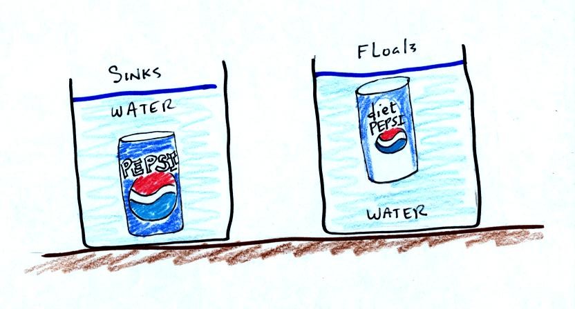
Both cans are made of aluminum which has a density almost three times
higher than water. The drink itself is largely water. The
regular Pepsi also has a lot of high-fructose corn syrup, the diet
Pepsi
doesn't. The mixture has a density greater than plain
water. Both cans contain a little air (or perhaps carbon dioxide
gas) or neither one would float. This is much less dense than
water.
The average density of the can of regular Pepsi (water&sugar +
aluminum + air) ends up being slightly greater than the density of
water. The average density of the can of diet Pepsi (water +
aluminum + air) is slightly less than the density of water.
In some respects people in swimming pools are like cans of regular and
diet Pepsi. Some people float (they're a little less dense than
water), other people sink (slightly more dense than water).
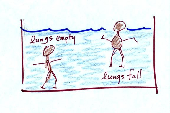
People must have a density that is about the same as water.
For the
next 2 or 3 days we'll be learning how
weather data are
entered onto surface weather maps and learn about some of the analyses
of the data that are done and what they can tell you about the
weather. We will also have a brief look at
upper
level (higher altitude) weather maps.
Much of our weather is produced by relatively large
(synoptic scale)
weather systems. To be able to identify and characterize these
weather systems you must first collect weather data (temperature,
pressure, wind direction and speed, dew point, cloud cover, etc) from
stations across the country and plot the data on a map. The large
amount of data requires that the information be plotted in a clear and
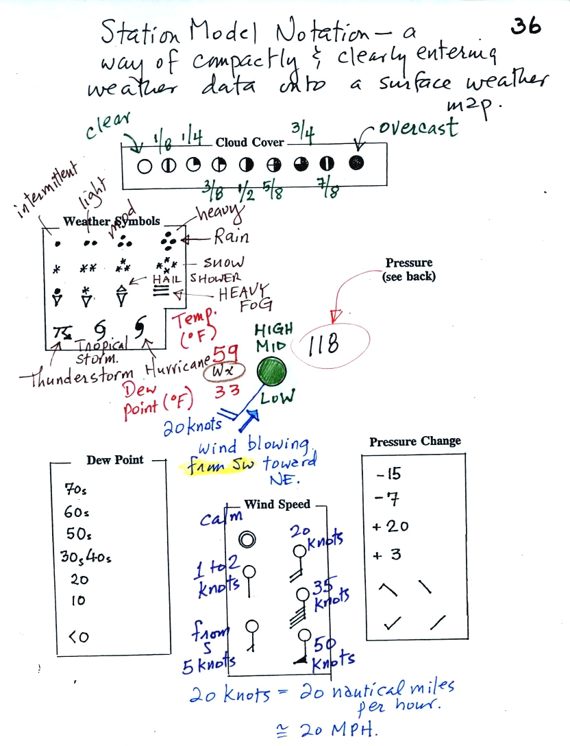
compact way. The station model notation is what meterologists
use (you'll find the station model notation discussed in Appendix C,
pps 525-529, in
the textbook).
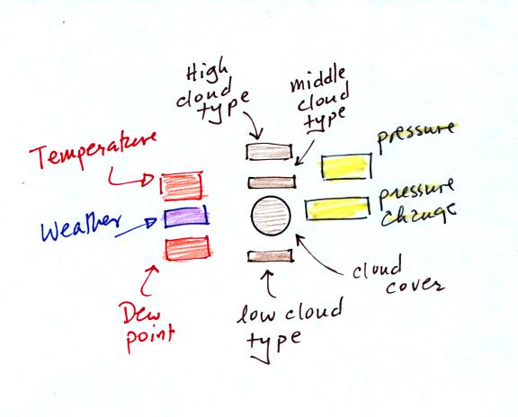
A small circle is plotted on the map at the location where
the
weather
measurements were made. The circle can be filled in to indicate
the amount of cloud cover. Positions are reserved above and below
the center circle for special symbols that represent different types of
high, middle,
and low altitude clouds. The air temperature and dew point
temperature are entered
to the upper left and lower left of the circle respectively. A
symbol indicating the current weather (if any) is plotted to the left
of the circle in between the temperature and the dew point (you can
choose from close to 100 different weather
symbols included in the textbook ). The
pressure is plotted to the upper right of the circle and the pressure
change (that has occurred in the past 3 hours) is plotted to the right
of the circle.
Here's the actual example we started
on in class.
This is frankly a mess and would be very
hard to unscramble if you are
seeing it for the first time. So we'll work through another
example one step at a time.
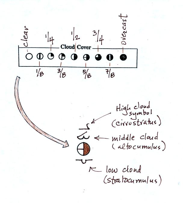
The center circle is filled in to indicate the portion
of
the sky
covered with clouds (estimated to the nearest 1/8th of the sky) using
the code at the top of the figure. Then symbols (not drawn in class) are used to
identify the actual types of high, middle, and low altitude clouds (the
symbols can be found on a handout to be distributed in class).
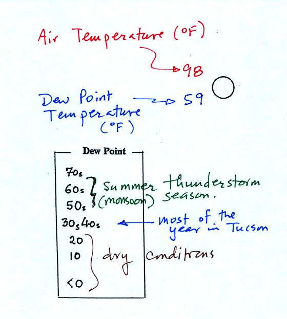
The air temperature in this example was 98o
F
(this is
plotted above and to the left of the center circle). The dew
point
temperature was 59o F and is plotted below and to the left
of the center circle. The box at lower left reminds you that dew
points are in the 30s and 40s during much of the year in Tucson.
Dew
points rise into the upper 50s and 60s during the summer thunderstorm
season (dew points are in the 70s in many parts of the country in the
summer). Dew points are in the 20s, 10s, and may even drop below
0 during dry periods in Tucson.
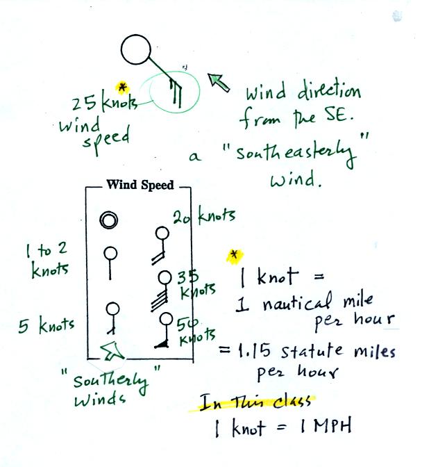
A straight line extending out from the center circle
shows the wind direction. Meteorologists always give the
direction the wind is coming from.
In this example the winds are
blowing from the SE toward the NW at a speed of 25 knots. A
meteorologist would call
these southeasterly winds. Small barbs at the end of the straight
line give the wind speed in knots. Each long barb is worth 10
knots, the short barb is 5 knots.
Knots are nautical miles per hour. One nautical mile per hour is
1.15 statute miles per hour. We won't worry about the distinction
in this class, you can just pretend that one knot is the same as one
mile per hour.
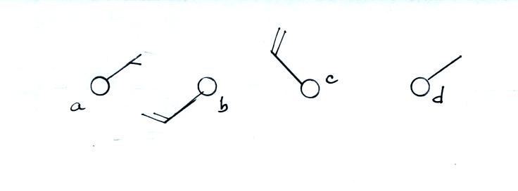
Here are some additional wind
examples that weren't shown
in
class:
In (a) the winds are from the NE at 5 knots, in
(b) from the
SW at 15
knots, in (c) from the NW at 20 knots, and in (d) the winds are from
the NE at 1 to 2 knots.
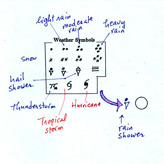
A symbol representing the weather that is currently
occurring is plotted to the left of the center circle. Some of
the common weather
symbols are
shown. There are about 100 different
weather symbols that you can choose
from.
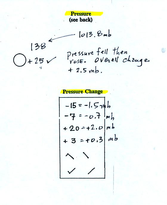
The sea level pressure is shown above and to the right
of
the center
circle. Decoding this data is a little "trickier" because some
information is missing. We'll learn about decoding the pressure
in class on Friday.
Pressure change data (how the pressure has changed during
the preceding
3 hours and not covered in class)
is shown to the right of the center circle. You must
remember to add a decimal point. Pressure changes are usually
pretty small.
Here are
some links to surface weather maps with data plotted using the
station model notation: UA Atmos. Sci.
Dept. Wx page, National
Weather Service Hydrometeorological Prediction Center, American
Meteorological Society.
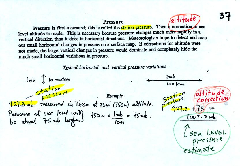
We haven't
learned how to decode the pressure data yet.
Meteorologists hope to map out small horizontal pressure
changes on
surface weather maps (that produce wind and storms). Pressure
changes much more quickly when
moving in a vertical direction. The pressure measurements are all
corrected to sea level altitude to remove the effects of
altitude. If this were not done large differences in pressure at
different cities at different altitudes would completely hide the
smaller horizontal changes.
In the example above, a station
pressure value of 927.3 mb was measured in Tucson. Since Tucson
is about 750 meters above sea level, a 75 mb correction is added to the
station pressure (1 mb for every 10 meters of altitude). The sea
level pressure estimate for Tucson is 927.3 + 75 = 1002.3 mb.
This is also shown on the figure below
Here's the remainder of p. 37 in
the photocopied ClassNotes.
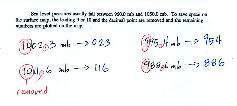
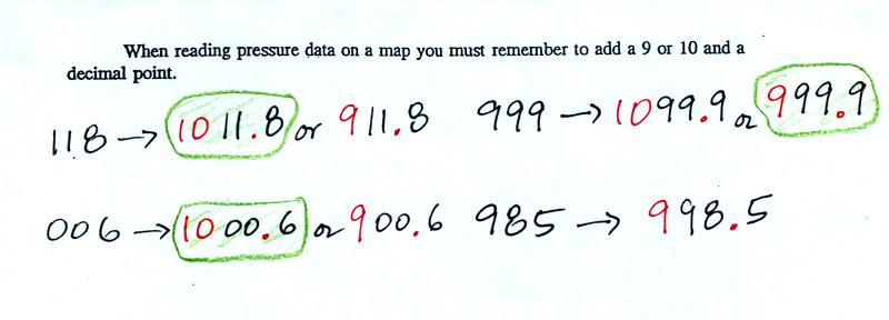
To save room, the leading 9 or 10 on the sea level pressure
value and
the decimal
point are removed before plotting the data on the map. For
example the 10 and the . in
1002.3 mb would
be removed; 023
would be plotted on the weather map (to the upper right of the center
circle). Some additional examples are shown above.
When reading pressure values off a
map you must remember to
add a 9 or
10 and a decimal point. For example
118 could be either 911.8 or 1011.8 mb. You pick the value that
falls between 950.0 mb and 1050.0 mb (so 1011.8 mb would be the correct
value, 911.8 mb would be too low).
Another
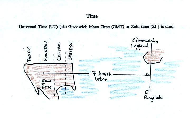
important piece of information that is included on a surface weather
map is the time the observations were collected. Time on a
surface map is converted to a universally agreed upon time zone called
Universal Time (or Greenwich Mean Time, or Zulu time).
That is the time at 0 degrees longitude. There is a 7 hour time
zone difference between Tucson (Tucson stays on Mountain
Standard Time year round) and Universal Time. You must add 7
hours to the time in Tucson to obtain Universal Time.
Here are some examples (only
the first example was worked in class):
2:45 pm MST:
first convert 2:45 pm to the 24
hour clock format 2:45 + 12:00 = 14:45 MST
then add the 7 hour time zone correction ---> 14:45
+ 7:00 = 21:45 UT (9:45 pm in Greenwich)
9:05 am MST:
add the 7 hour time zone
correction ---> 9:05 + 7:00 = 16:05 UT (4:05 pm in England)
18Z:
subtract the 7 hour time zone
correction ---> 18:00 - 7:00 = 11:00 am MST
02Z:
if we subtract the 7 hour time
zone correction we will get a negative
number.
We will add 24:00 to 02:00 UT then subtract 7 hours
02:00 + 24:00 = 26:00
26:00 - 7:00 = 19:00 MST on the previous day
2 hours past midnight in Greenwich is 7 pm the previous day in
Tucson