"Super Tuesday" Feb. 5, 2008
A busy week ahead. The first Optional
Assignment of the semester was handed out. It is due in class
next Tuesday (Feb. 12). You should complete the assignment before
coming to class.
This coming Thursday is the first of the 1S1P
Assignment #1 due dates. If you plan on doing 3 reports, at
least one of them must be turned in Thu. this week.
Thursday this week is also the date of the Practice
Quiz.
The Experiment #1 reports are due one week
from today. You should be finishing up the data collection so
that
you can return the materials this week and pick up the Supplementary
Information sheet.
A couple
of loose ends to finish up today before we move into some new material
at the end of Chapter 1 (check the updated reading assignment page)
We used a
stack of bricks to help understand air pressure and why it decreases
with
increasing altitude. Now we will imagine a stack of matresses to
understand why air density decreases with increasing altitude.

Mattresses are compressible. The mattress at the
bottom of the
pile is compressed the most by the weight of all the mattresses
above. The mattresses higher up aren't squished as much because
there
is less weight remaining above.
In the case of the atmosphere you can think of layers of air instead of
mattresses.

1. You can first notice and remember that pressure decreases
with increasing altitude.
Perhaps the subtlest point is that each air layer contains the same
amount (mass) of air. You can
tell because the pressure decrease as you move upward through each
layer is the same (100 mb).
2. The densest air is found in the bottom layer because the air is
squeezed into a thinner layer (into a smaller volume) than the other
layers. This is new information - air density decreases with
increasing altitude.
3. You again notice something that we covered earlier: the most rapid
rate of pressure decrease with increasing altitude is in the densest
air in the bottom air layer.
We spent a
few minutes at the beginning of the period looking again at the upward
pressure force demonstration that was conducted in class last
Thursday. You'll find this discussion at the end of
the Thurs., Jan. 31 online notes.
Next we
looked
at how air temperature changes with altitude.

The atmosphere can be split
into layers
depending on whether
temperature is increasing or decreasing with increasing altitude.
The two lowest layers are shown in the figure above. There are
additional layers (the mesosphere and the thermosphere) above 50 km but
we won't worry about them.
1. We live in
the troposphere. The troposphere is found, on average, between 0
and about 10 km altitude, and is where temperature usually decreases
with
increasing altitude. [the troposphere is usually a little higher
in the tropics and lower at polar latitudes]
The troposphere contains most of the water vapor
in the atmosphere (the water vapor comes from evaporation of ocean
water) and is
where most of the clouds and weather occurs. The
troposphere can be stable or unstable (tropo means to turn over and
refers to the fact that air can move up and down).
2a. The thunderstorm shown in
the figure indicates unstable conditions, meaning that strong up and
down air motions are occurring. When the thunderstorm reaches the
top of the troposphere, it runs into the stable stratosphere. The
air can't continue to rise into the stable stratosphere so the cloud
flattens out and forms an anvil (anvil is the name given to the flat
top of the thunderstorm). The flat anvil top is something
that you can go outside and see and often marks the top of the
troposphere. Not indicated on the picture is the tropopause, the
boundary between the troposphere and the stratosphere.
2b. The summit of Mt. Everest is a little over 29,000
ft. tall and is
close to the top of the troposphere.
2c. Cruising altitude in a passenger jet is usually between
30,000 and 40,000, near or just above the top of the troposphere.
3. Temperature remains constant between 10 and 20 km
and then
increases with increasing altitude between 20 and 50 km. These
two sections form the stratosphere. The stratosphere is a
very stable air layer. Increasing temperature with increasing
altitude is called an
inversion. This is what makes the stratosphere so stable.
4. A kilometer is one
thousand meters. Since 1 meter is about 3 feet, 10 km is about
30,000 feet. There are 5280 feet in a mile so this is about 6
miles.
5. Sunlight is a mixture of ultraviolet,
visible, and
infrared light. We can see the visible light.
5a. Much of the sunlight arriving at the top of
the atmosphere passes through the atmosphere and is absorbed at the
ground. This warms the ground. The air in contact with the
ground is warmer than air just above. As you get further and
further from the warm ground,
the air is
colder and colder. This
explains why air temperature decreases with increasing altitude.
5b. How do you explain increasing temperature with
increasing
altitude in the stratosphere?
The ozone layer is found in the stratosphere
(peak concentrations are found near 25 km altitude). Absorption
of
ultraviolet light by ozone warms the air in the stratosphere and
explains why the air can warm. The air in the stratosphere is
much less dense (thinner) than in the troposphere. It doesn't
take as much energy to warm this thin air as it would to warm denser
air closer to the ground.
6. That's a manned
balloon; Auguste Piccard and Paul Kipfer are
inside. They were to first men to travel into the
stratosphere (see pps 31 & 32 in
the photocopied Class Notes). We'll see a short video showing
part of their adventure before the Practice Quiz on Wednesday.
Now we
ready to move into the last part of Chapter 1. This
week and next we'll learn how
weather data are
entered onto surface weather maps and learn about some of the analyses
of the data that are done and what they can tell you about the
weather. We will also have a brief look at upper
level weather maps.
Much of our weather is produced by relatively large
(synoptic scale)
weather systems. To be able to identify and characterize these
weather systems you must first collect weather data (temperature,
pressure, wind direction and speed, dew point, cloud cover, etc) from
stations across the country and plot the data on a map. The large
amount of data requires that the information be plotted in a clear and
compact way. The station model notation is what meterologists
use (you'll find the station model notation discussed in Appendix C in
the textbook).

The figure above wasn't
shown in class.
A small circle is plotted on the map at the location where
the
weather
measurements were made. The circle can be filled in to indicate
the amount of cloud cover. Positions are reserved above and below
the center circle for special symbols that represent different types of
high, middle,
and low altitude clouds (a handout with many of these symbols was
distributed in class). The air temperature and dew point
temperature are entered
to the upper left and lower left of the circle respectively. A
symbol indicating the current weather (if any) is plotted to the left
of the circle in between the temperature and the dew point (weather
symbols were included on the class handout). The
pressure is plotted to the upper right of the circle and the pressure
change (that has occurred in the past 3 hours) is plotted to the right
of the circle.
Here's the actual page we worked on
in class.

This might be a little hard to unscramble so
we will
look at the
picture one small portion at a time.

The center circle is filled in to indicate the
portion of
the sky
covered with clouds (estimated to the nearest 1/8th of the sky) using
the code at the top of the figure. Then symbols (not drawn in class) are used to
identify the actual types of high, middle, and low altitude clouds (the
symbols are on a handout that will be distributed in class on Friday).

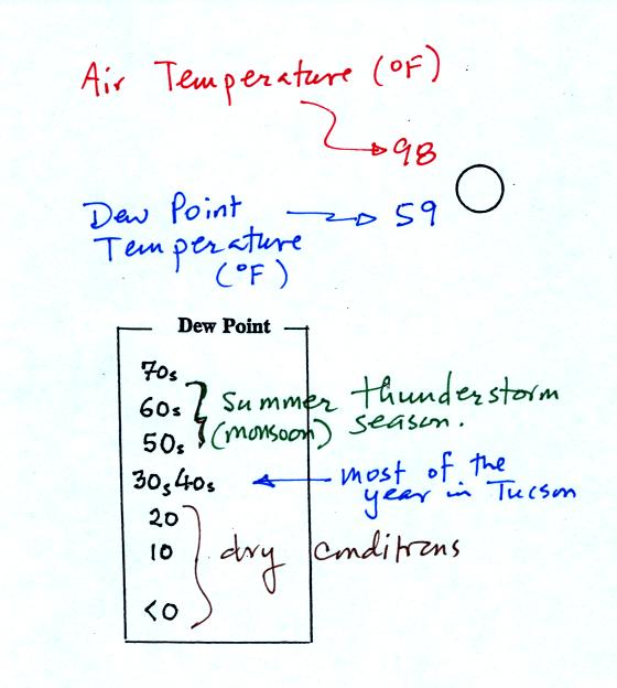
The air temperature in this example was 98o F
(this is
plotted above and to the left of the center circle). The dew
point
temperature was 59o F and is plotted below and to the left
of the center circle. The box at lower left reminds you that dew
points are in the 30s and 40s during much of the year in Tucson.
Dew
points rise into the upper 50s and 60s during the summer thunderstorm
season (dew points are in the 70s in many parts of the country in the
summer). Dew points are in the 20s, 10s, and may even drop below
0 during dry periods in Tucson.

A straight line extending out from the center circle
shows the wind direction. Meteorologists always give the
direction the wind is coming from.
In this example the winds are
blowing from the SE toward the NW at a speed of 25 knots. A
meteorologist would call
these southeasterly winds. Small barbs at the end of the straight
line give the wind speed in knots. Each long barb is worth 10
knots, the short barb is 5 knots.
Knots are nautical miles per hour. One nautical mile per hour is
1.15 statute miles per hour. We won't worry about the distinction
in this class, you can just pretend that one knot is the same as one
mile per hour.
Here are some additional wind
examples that weren't shown
in
class:

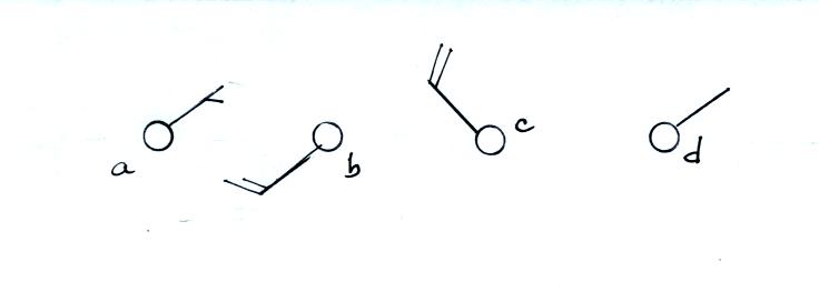
In (a) the winds are from the NE at 5 knots, in
(b) from the
SW at 15
knots, in (c) from the NW at 20 knots, and in (d) the winds are from
the NE at 1 to 2 knots.

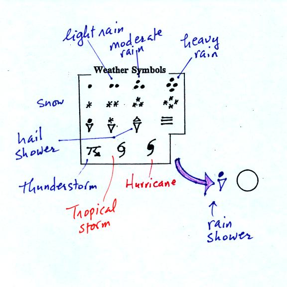
A symbol representing the weather that is currently
occurring is plotted to the left of the center circle. Some of
the common weather
symbols are
shown. There are about 100 different
weather symbols (on the class handout) that you can choose from.

The sea level pressure is shown above and to the right of
the center
circle. Decoding this data is a little "trickier" because some
information is missing. Decoding the pressure is explained below
and on p.
37 in the photocopied notes.
Pressure change data (how the pressure has changed during
the preceding
3 hours) is shown to the right of the center circle. You must
remember to add a decimal point. Pressure changes are usually
pretty small.
Here are
some links to surface weather maps with data plotted using the
station model notation: UA Atmos. Sci.
Dept. Wx page, National
Weather Service Hydrometeorological Prediction Center, American
Meteorological Society.


